
The USM warehouse photographed by Lucas Creighton for PIN–UP 33.
Ben Ganz photographed by Lucas Creighton for PIN–UP
Hans Ulrich Obrist: I would like to begin at the beginning and ask you how you came to design or how design came to you.
Ben Ganz: I think design found me first. I was a troubled teenager, and not very good in high school — I didn’t really see the value in it, and eventually dropped out. Though I’d always loved drawing, I didn’t really discover it for myself until I started doing graffiti with friends in Bern. I loved the mixture of visual expression and delinquency, and it was also my first exposure to what are essentially typographic systems. My parents urged me to study something, so I enrolled in a preliminary year for design in Langenthal, and suddenly realized school has meaning when you learn about what you love doing. From there I went to technical college in Luzern, then worked for a few years in Berlin, before going to graduate school in the U.S., after which I moved to New York. So design not only found me, but has shaped my life ever since.
Switzerland has a rich history of graphic design. Has that legacy informed your approach?
I didn’t really appreciate it at the time, but the Swiss focus on craftsmanship that was present in my education is now proving very useful. The multidisciplinary practices of seminal designers like Armin Hofmann and Karl Gerstner have been a big influence, because they show how typography and formal design studies can be expanded into spatial contexts, and that the precision and diligence learned in type design can be applied in other fields as well. That said, I’ve always been a little frustrated with the narrow-mindedness and rigidity of the Swiss scene. That’s what I appreciate about working in New York — the borders of the profession are less clearly defined.
The USM warehouse photographed by Lucas Creighton for PIN–UP 33.
USM NYC by Ben Ganz photographed by Lucas Creighton for PIN–UP 33.
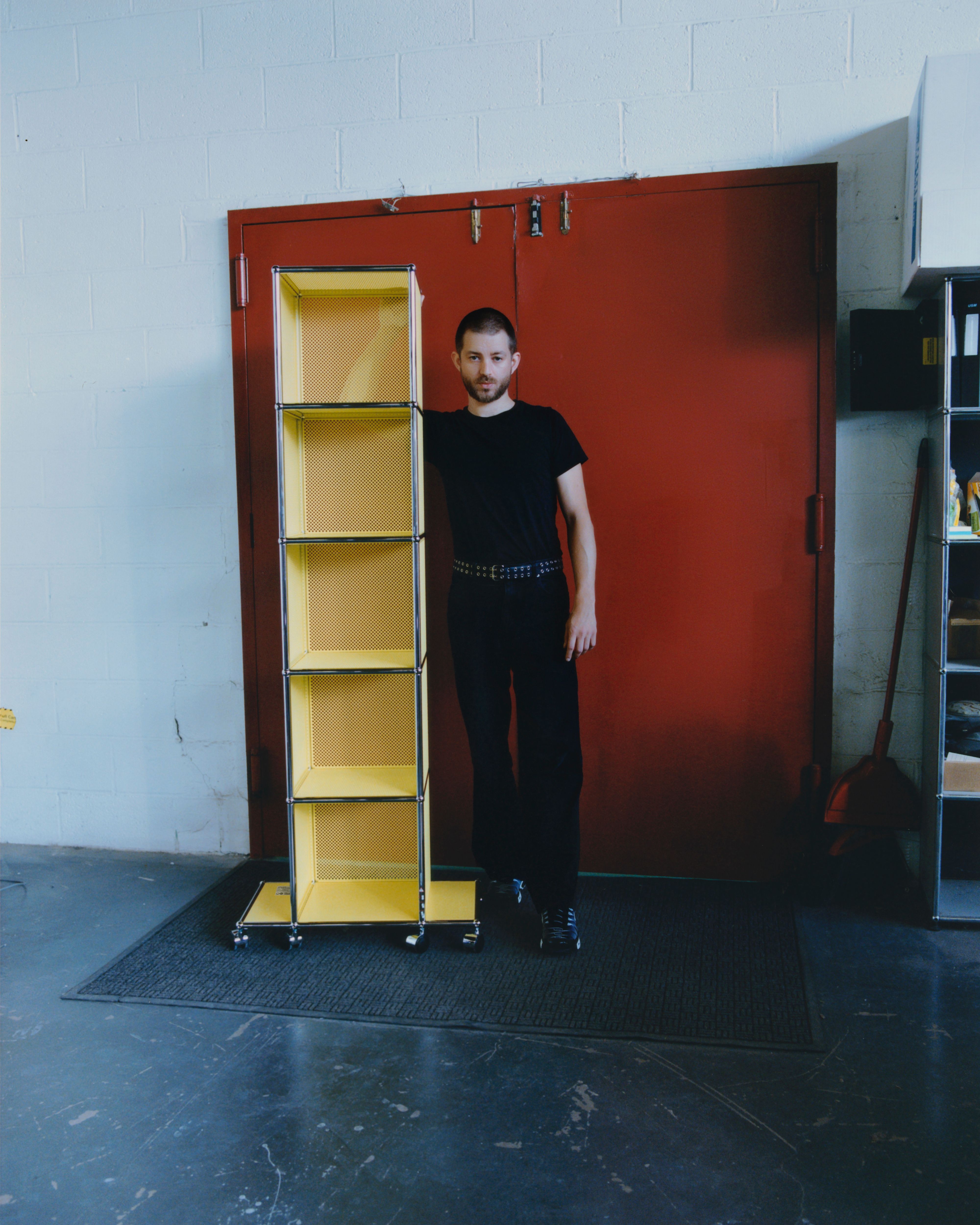
Ben Ganz in the USM warehouse photographed by Lucas Creighton for PIN–UP 33.
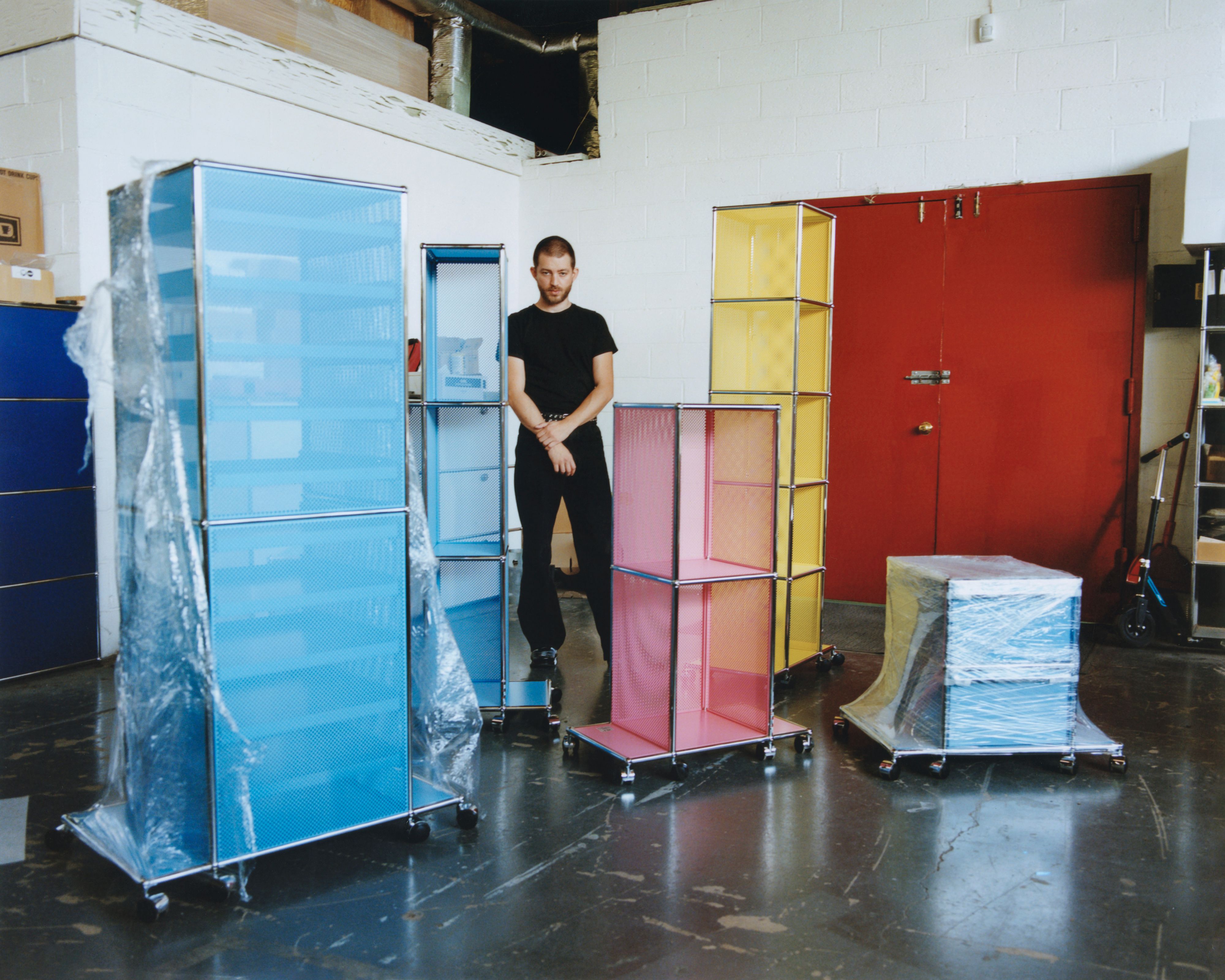
Let’s talk about your collaboration with USM. Originally founded as a metal and locksmith business in the 19th century, the company was developed into a modular-furniture supplier by the Swiss engineer Paul Schärer and the architect Fritz Haller in the 1960s. It has a long history of collaborations with artists, but you are one of the first designers to create a USM collection. What were your personal associations with the firm before this project?
I grew up in Bern just a couple of miles from the USM factory and found myself surrounded by the Haller system from a very young age. USM is an archetype of the Swiss design tradition and permeates an astonishing number of public and private spaces in Switzerland — it’s in the parliament, at the airport, in dentists’ and lawyers’ offices, universities, hospitals, concept stores, pharmacies, banks, even my grandmother’s living room. It’s part of the fabric of daily life. When I moved to New York, I lived very close to the USM showroom in SoHo and used to fantasize about one day collaborating with them. While working on PIN–UP’s 15th-anniversary issue in 2021, we started talking to USM about a special project. From there the idea grew bigger and bigger until it became the USM NYC collection.
Ben Ganz in the USM warehouse photographed by Lucas Creighton for PIN–UP
How did you engage with USM’s Haller modular system?
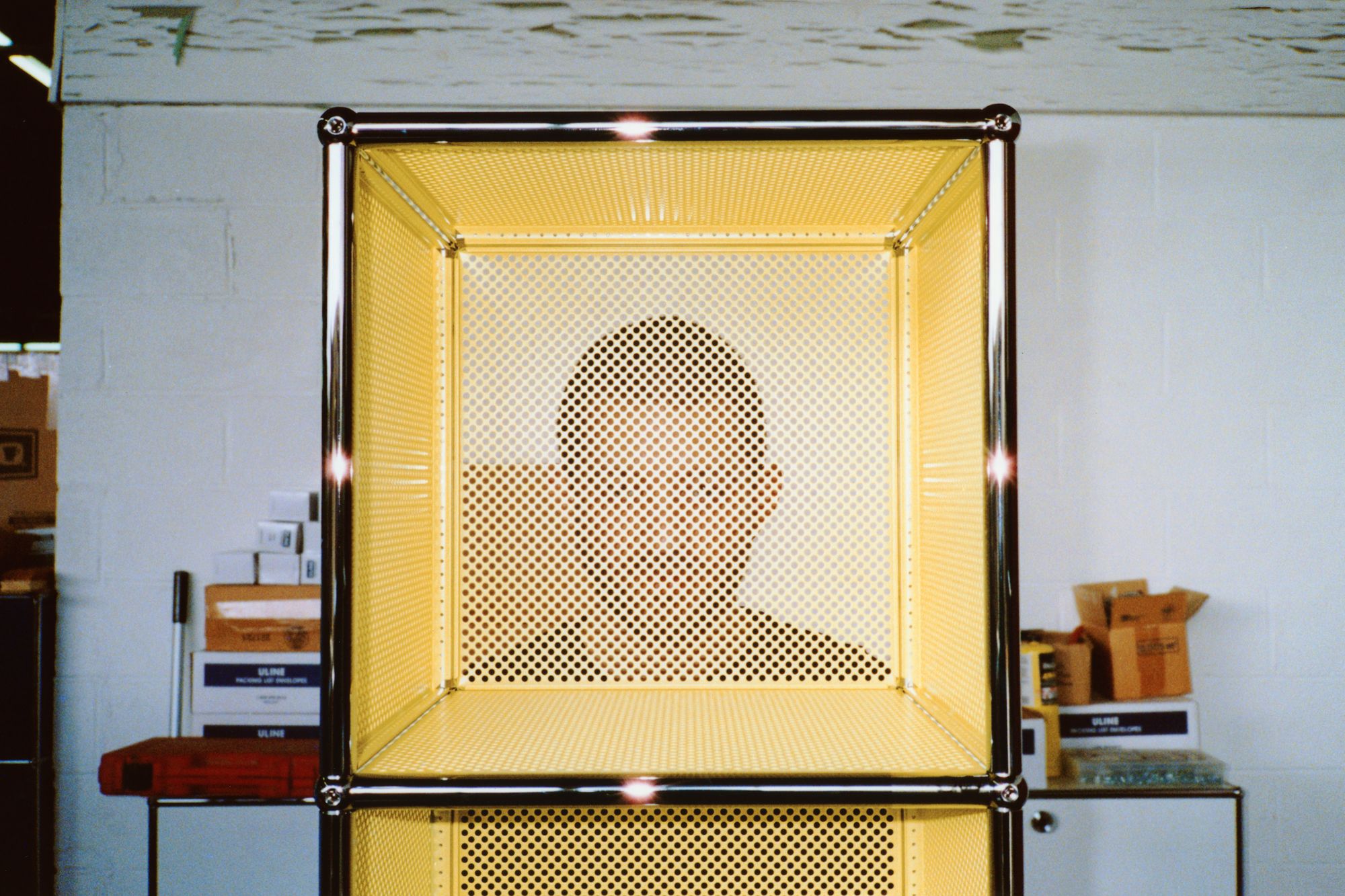
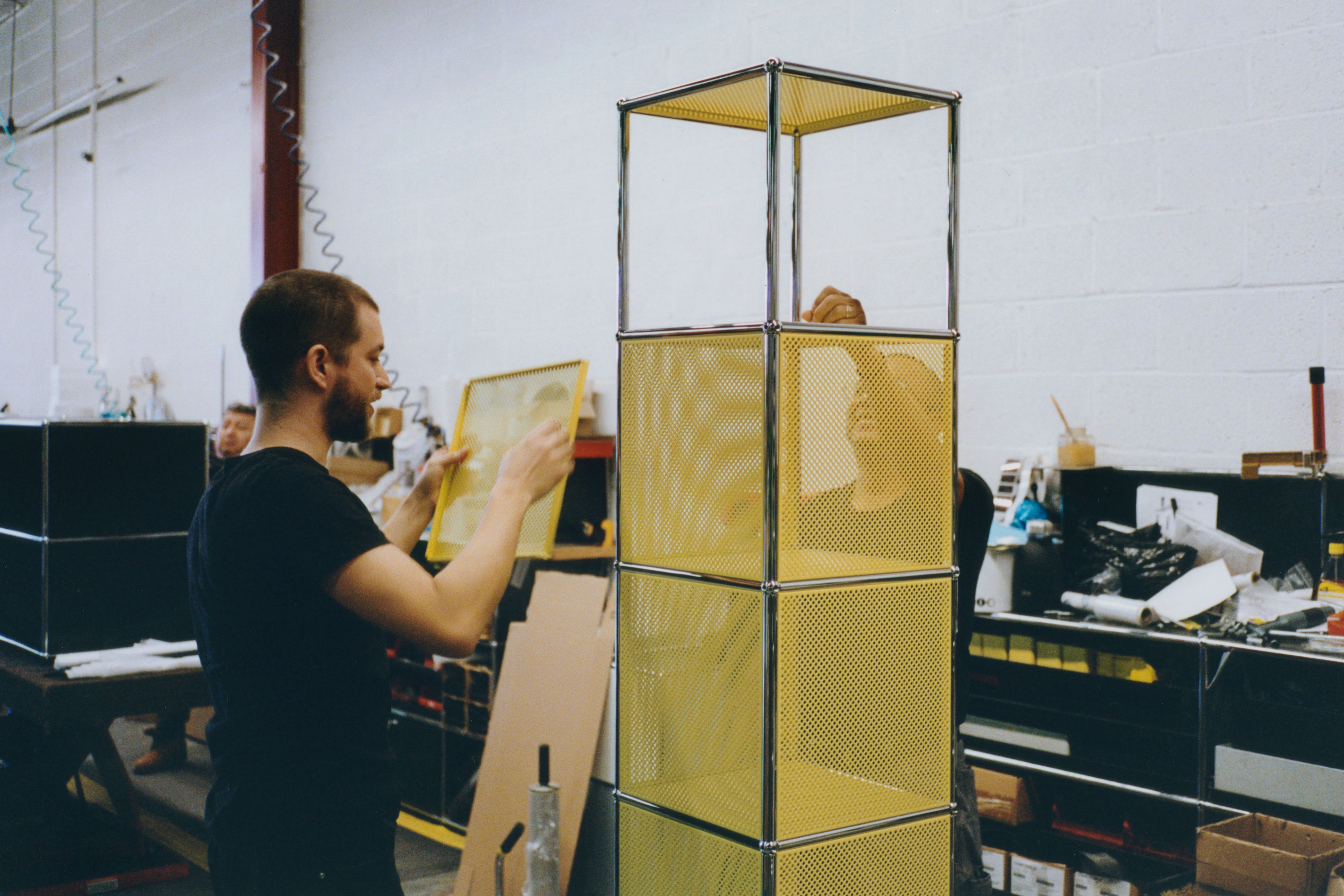
I did a lot of research into its origins. It derived from an architectural construction system developed by Fritz Haller, which featured modules he called MINI, MIDI, and MAXI that could be scaled according to building size. As was often the case at the time, Haller’s universal approach to architecture and city planning completely disregarded contextual or cultural specificity, which makes it a bit outdated today. Scaled down to furniture, however, his approach is extremely versatile and enduring. That’s why it was important to me to use only the existing prefabricated pieces from the USM system,to show the diversity and possibilities inherent within it, rather than adding custom-made ornamentation. I love that even though USM continuously improves the production process and the materials, the system still functions in the exact same way as 60 years ago. If, in 20 years, someone wants to build a new library, they can simply disassemble a piece of our USM NYC collection and combine it with a set that was bought on Craigslist years before to create something completely new. This sustainable and timeless aspect was important to me.
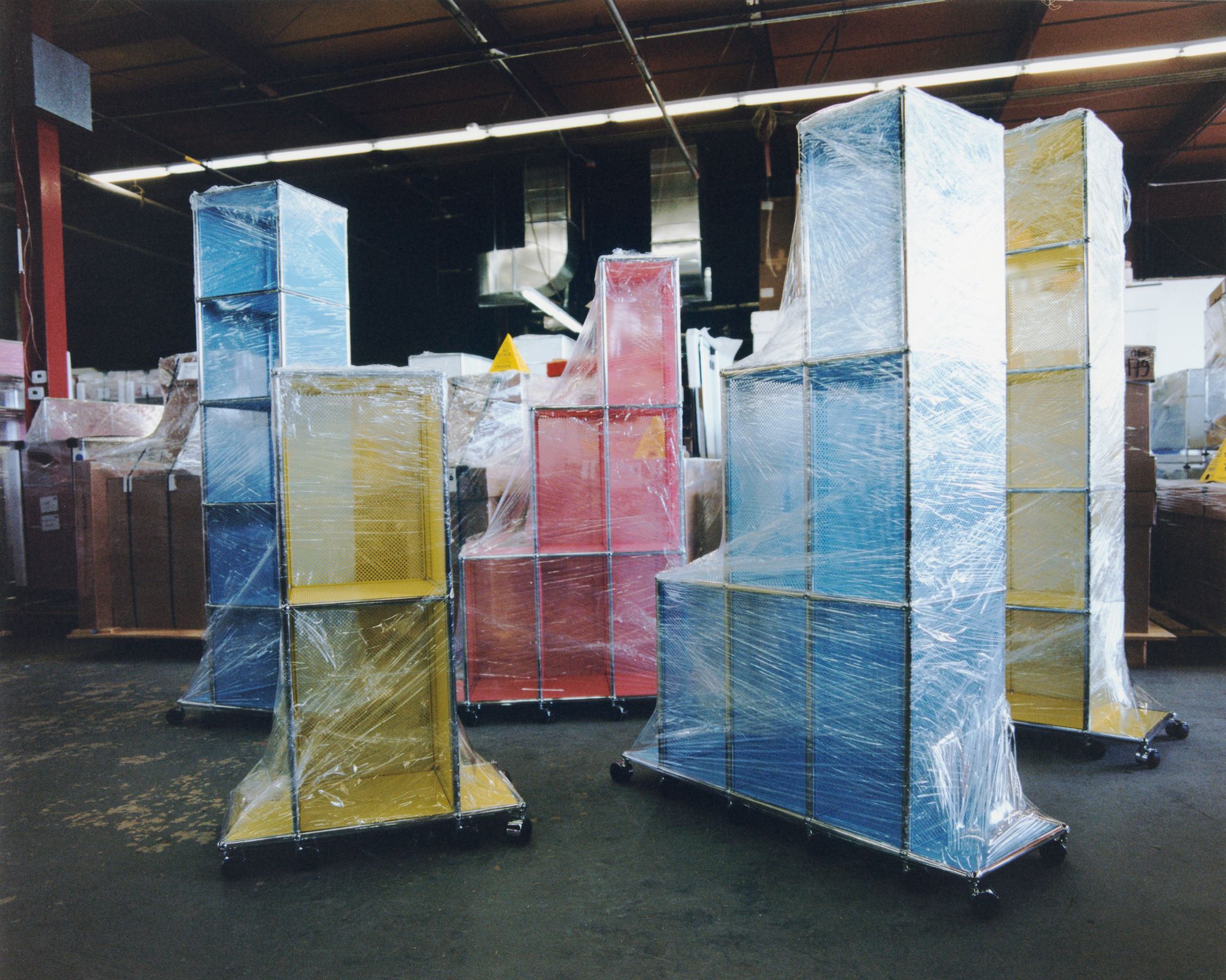
All the pieces you designed have a wheeled base. I would like to learn about this element of mobility within the design, your decision to have furniture — something we may understand as quite fixed — turn mobile, never fixed and in one place.
The wheeled base connects all six pieces both visually and conceptually, as well as adding stability to the taller structures, which wouldn’t be safe otherwise. Conceptually, the idea of physical and social mobility — whether real or implied — is a key characteristic of New York. And given the average New Yorker moves to a new apartment every three to five years, it certainly makes it easier if the dolly comes built into the piece. I was also inspired by how entire houses or buildings can be moved on trucks or hydraulic rollers, like the Indiana Bell Building, in 1930, which was pivoted 90 degrees onto the neighboring plot while 600 employees continued to work inside it.
Ben Ganz photographed by Lucas Creighton for PIN–UP
The USM NYC collection comprises five different types designed for both storage and relaxation. What functions did you imagine for each piece?
I was interested in creating a collection that oscillates between home and office. The Archival Tower for example, can be used as a dresser in a private space, as storage for tools in a workshop, or as an archive for drawings. The taller towers are intended as bookshelves, while the smaller ones can be used as desk cabinets or bedside tables. The Central Lounge, with its felt cushion, is the most domestic piece, a hybrid between a daybed and a coffee table. Though I imagined certain functions for each, ultimately it’s up to the user. The USM NYC pieces are a little showier than your average USM product, but their functionality and flexibility remain. That’s the fun of designing a modular collection like this, and I’m excited to see how it will integrate into different homes.
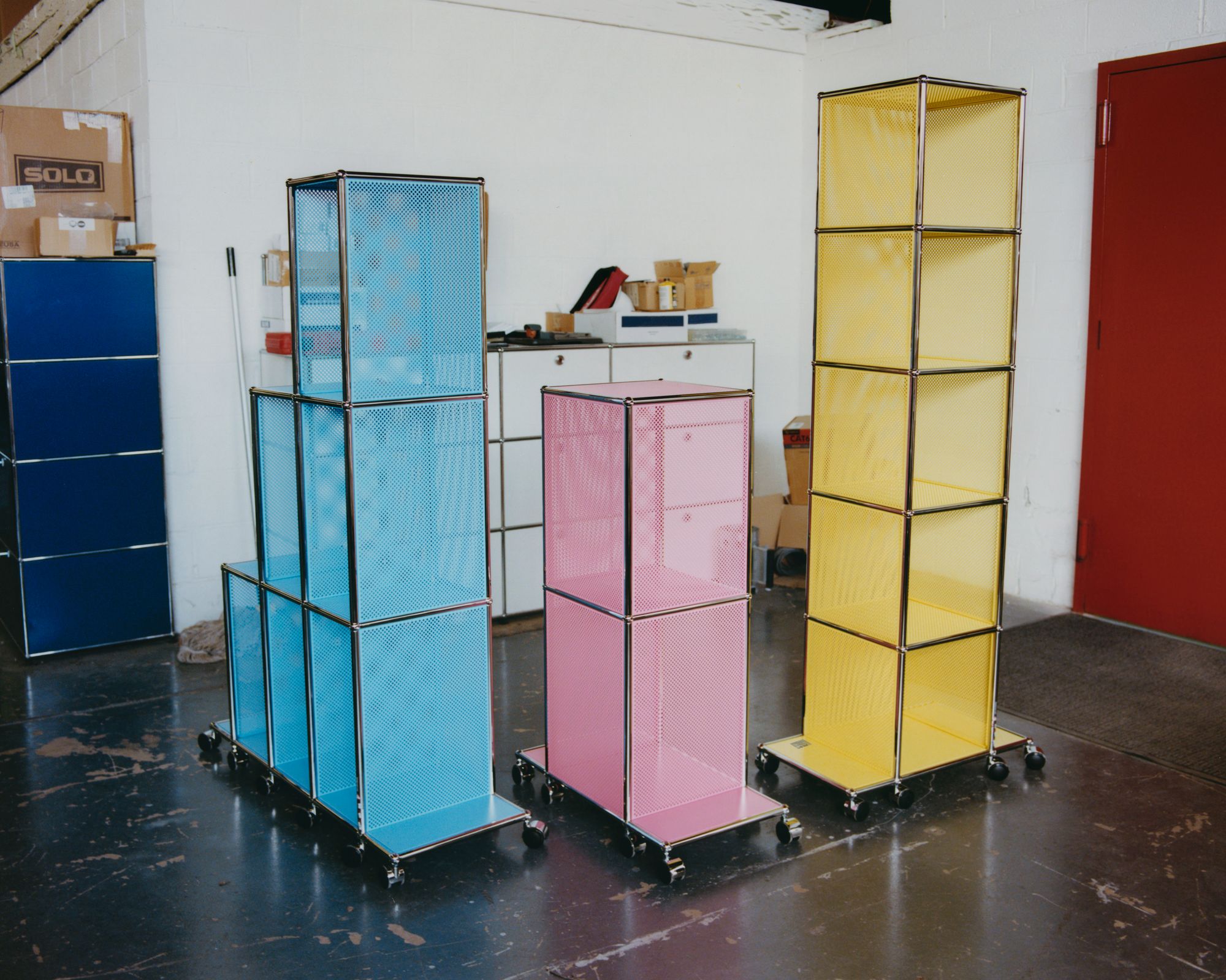
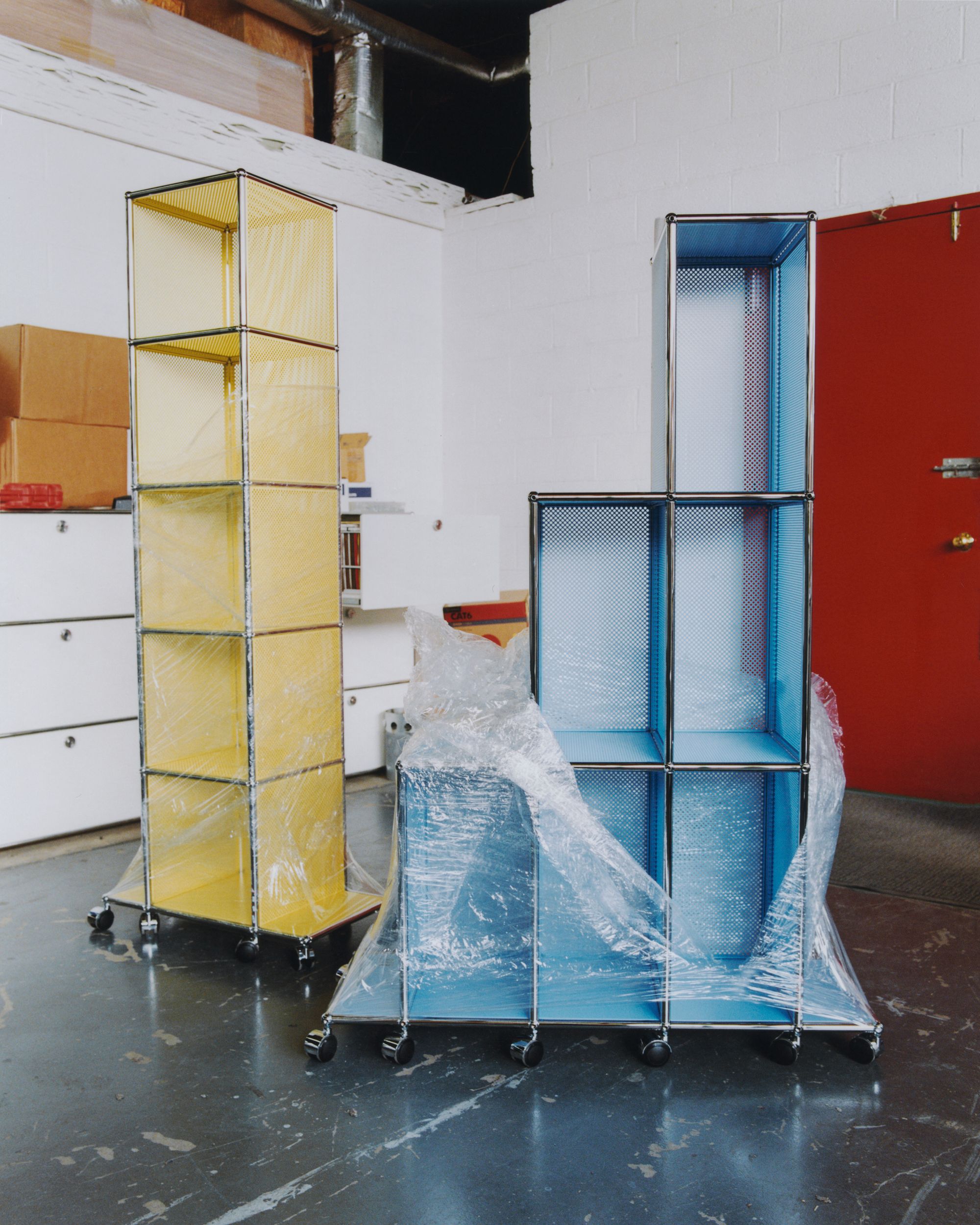
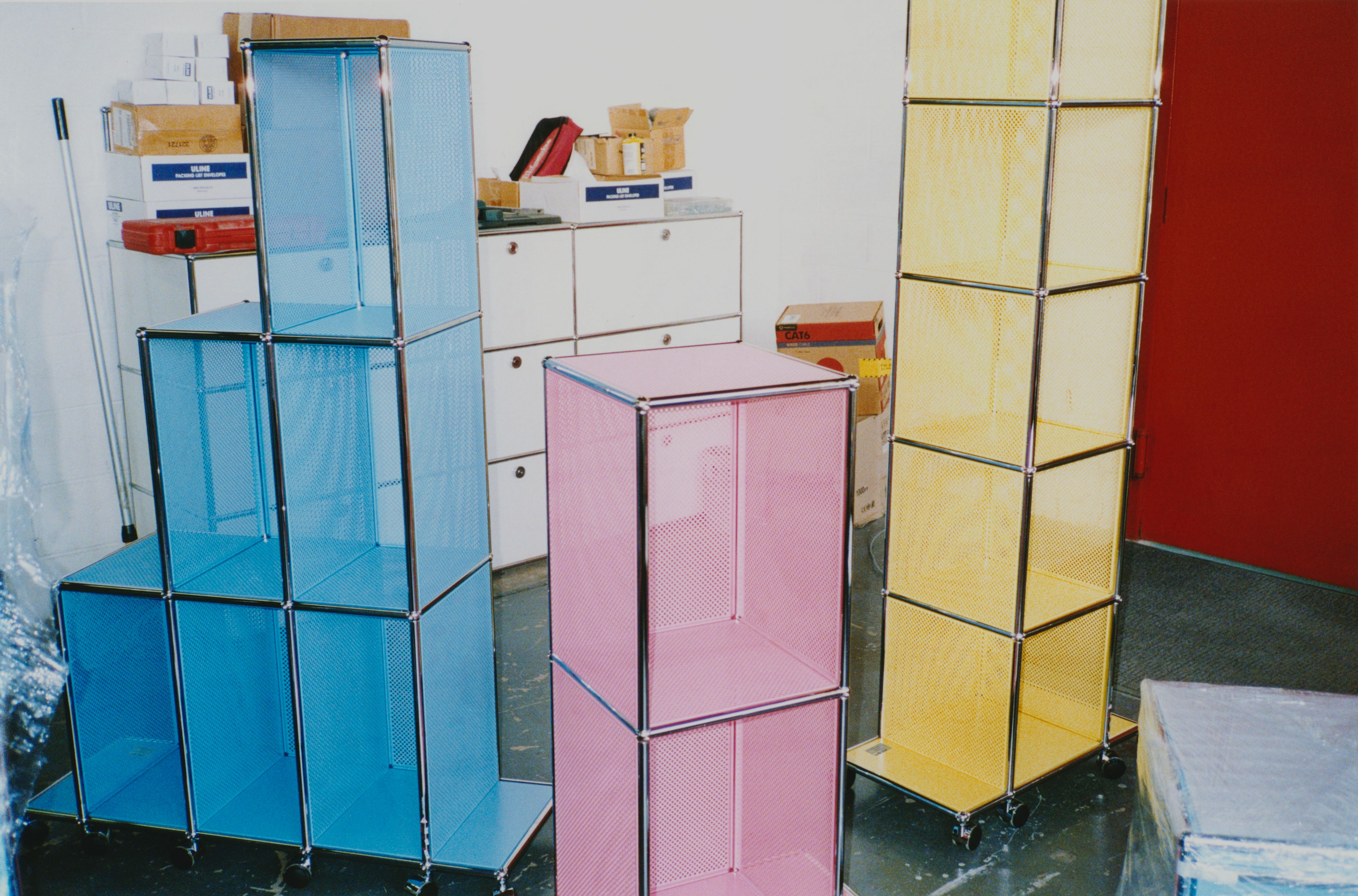
The fact that the five pieces are named Tower A through E reveals the main inspiration for the collection: New York City and its skyline.
Yes, I was interested in the dichotomy between the cold rationality of a Modernist design system and an almost clichéd, souvenir-shop representation of New York’s skyline. The term “image making” is so overused in art direction and fashion, but it was a part of my thinking — I wanted to see if an abstract system like Haller could be used to create a new image. There’s a long tradition of evoking the skyscraper and the skyline in furniture design — Paul T. Frankl’s Skyscraper bookshelves from the 1920s, for example, which used the skyscraper as a symbol of American modernity, or Gaetano Pesce’s iconic Tramonto a New York couch, which echoed a city in decline in the early 80s. Given that USM Haller’s origin is so directly connected to architecture, it made sense to me to continue this legacy. And the tower is a perfect symbol of New York, where the only place to build is up.
USM NYC by Ben Ganz photographed by Lucas Creighton for PIN–UP
USM NYC by Ben Ganz photographed by Lucas Creighton for PIN–UP
The collection comes in three colors: SoHo Yellow, Downtown Pink, and Uptown Blue. Can you speak about your color selection?
I like to introduce colors in my projects to provide a contrast with the minimal, sometimes austere formal language. For USM, my main aim was to bring a levity that’s not usually associated with the brand. We produced the pieces in new, bright colors with perforated panels, which augments the sense of lightness and reduces the amount of material used. The matte finish — another first for USM — was a way for me to counterbalance this and ensure the pieces still exude an air of seriousness.
What are the connections between the colors and the neighborhoods you named them after?
Uptown Blue stands for New York’s uniquely blue skies — so different from the hazy gray of central Europe — which I associate with Central Park’s unobstructed views. The yellow is the bright New York sun slicing through the urban canyons of SoHo, while Downtown Pink, for me, captures something very playful — party time. It was also inspired by Swiss psychotherapist Max Lüscher’s color theory, which was used to develop the famed Baker-Miller pink, intended to reduce hostile behavior. Hopefully the USM NYC pieces will have a similar effect.
USM NYC by Ben Ganz photographed by Lucas Creighton for PIN–UP
Who are your heroes or heroines in design? Who has inspired you?
Sheila Levrant de Bretteville is an idol and had a big influence on my education. I also admire Dieter Roth for his radical experiments in book design, Michel Majerus for his spatial use of typography, Frank Ocean for pursuing his vision unwaveringly, Cini Boeri for her subtlety, Marc Newson for his versatility, and Karim Rashid for his absolute insanity.
Finally, I would like to ask you about your unrealized projects. We know a lot about unrealized projects by architects, because they regularly publish them and often get them built later. Yet we hardly know anything about unrealized projects by artists and designers.
I have no single big unrealized project, but rather many small ones. There are at least 50 unfinished typefaces waiting to find the perfect context. I’m still trying to create a system for navigating my library more efficiently, rather than the current, thousand-tiny-Post-its mayhem. And, maybe because I’m Swiss, I’d love to design a watch.