
Pippa Garner, Kar-Mann (Half Human, Half Car), 1969. Fiberglass, urethane foam, metal, paint, wood, and other materials, dimensions variable. Courtesy the artist and STARS, Los Angeles.

Marne Lucas and Pippa Garner. Get Out, Get Under, 2015. Chromogenic print. Courtesy the artists.
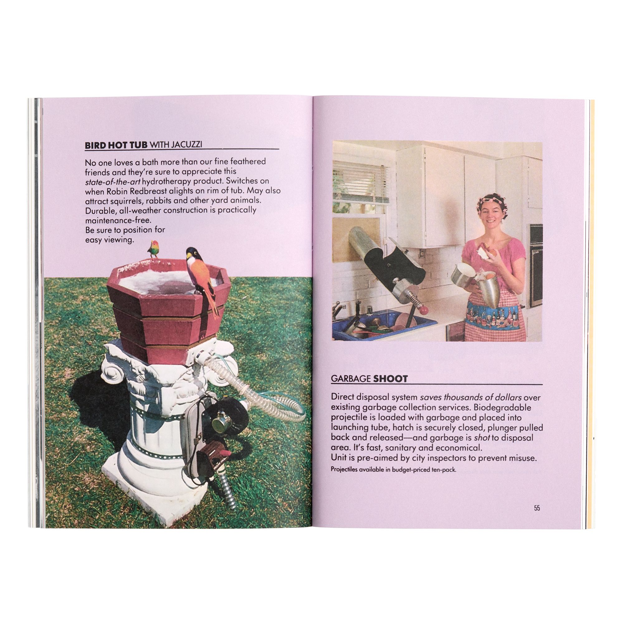
Spat out of gumball machines or found for a few cents on newsstands, Topps “Wacky Packages” trading cards were more popular in the 1970s than any other type, including baseball. Appropriately for a decade in which postwar boom met geopolitical bust in the United States, they parodied well-known consumer products: “Gulp Oil,” “Ajerx” cleanser, and “Crust” toothpaste, among hundreds of others. Neatly drafted colorful cartoons, they belong to the same graphic design family tree as bumper stickers, buttons, and slogan tees. Their “Gurgle” baby food card — with its tagline, “pre-chewed mush strained from the finest Grade ‘A’ sloppy mud” — was the kind of bait that caused many a spoofed company to issue angry cease-and-desist missives.
Emerging in the same decade, so much of artist Pippa Garner’s oeuvre evokes the delectable, subversive, kitschy approach of the Wacky Package universe — albeit that her works often edge R-rated whereas Topps plied a puerile PG. For decades, she has used similar pop cultural substrates as her canvas and made manipulating slogans her personal playground. Garner’s interest in satirizing the “traditional, wholesome image of the American man as an inveterate tinkerer” who produced “implements for easy living” scrambles the postwar mirage promulgated by cultural institutions like The Museum of Modern Art, where “Good Design” exhibitions came with a brochure that told visitors where they could go buy what was on display. Yet, Garner’s work is rarely read through this lens of design history, perhaps because it has often been written (narrowly, incorrectly) as a discipline of precise lines and Garner’s work is performed in social interstices that make her already interdisciplinary oeuvre even harder to place. Yet, her work is not sui generis from the vantage point of design history. Her conceptual and formal dexterity as an artist is deeply rooted in the practice of illustration and the history of visual communication. Consider this short essay, then, a paean to her overlooked design roots.
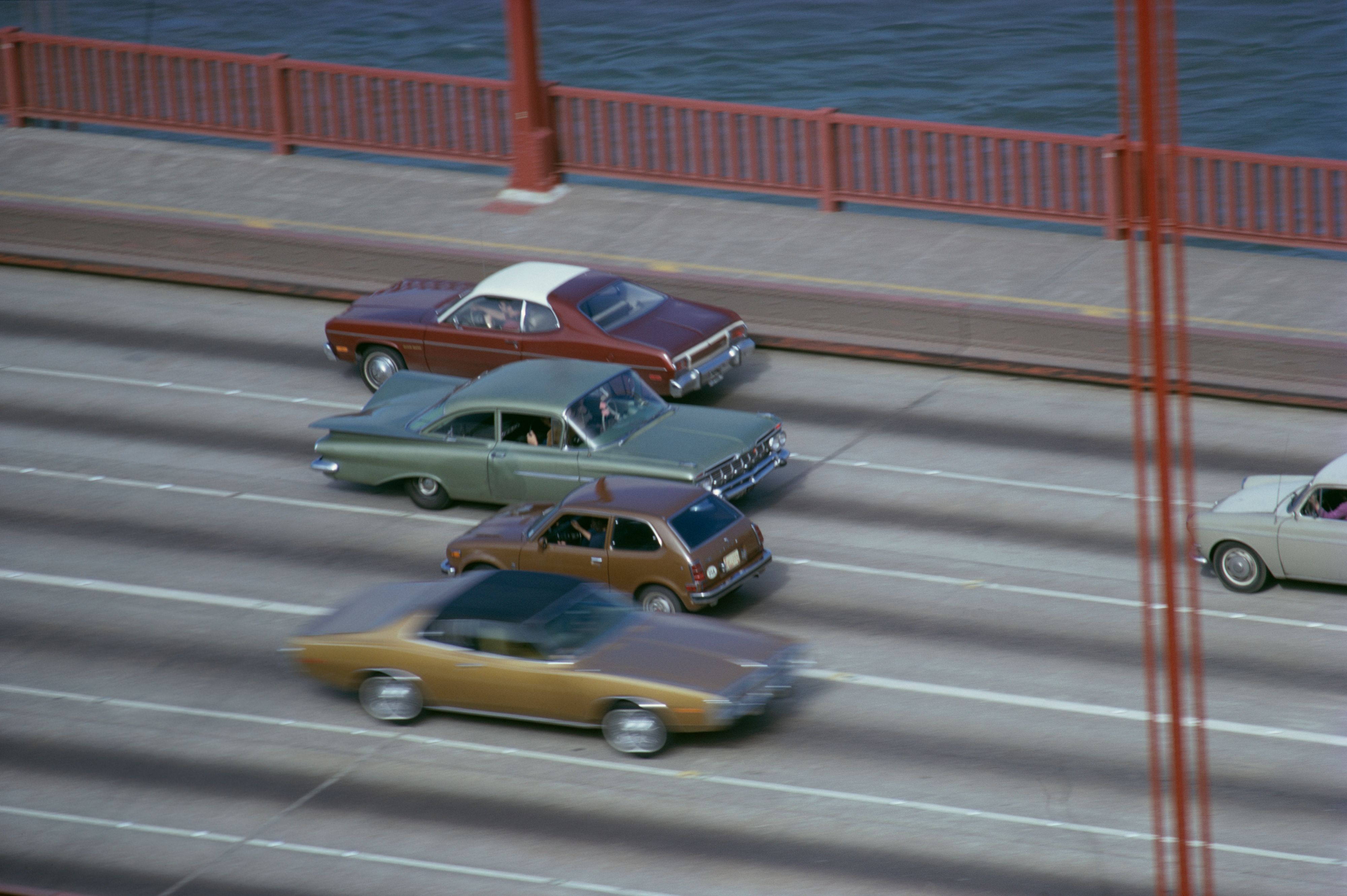
Pippa Garner, Backwards Car, 1973-1974. Performance documentation on Golden Gate Bridge, San Francisco. Courtesy of the artist and STARS Gallery, Los Angeles. Photo: Jeff Cohen.
As every word ever written on her work reminds us, what Garner serves is rooted in a parodic critique of consumer goods. The offspring of a postwar midwestern McCall’s ad man, she was immersed in the language and logic of design from the get-go, and understood the power of a well-placed advert, logo, or tagline. In her early twenties, Garner worked on a factory line before being drafted into the Vietnam War, where she became an embedded artist. Upon her return, she briefly studied technical drawing for automobiles before being expelled for injecting bawdy humor into her work. While she didn’t leave with a certificate, she took with her an enduring dedication to the car as a form of cultural expression and a means to poke and prod at restrictive social structures, from heteronormativity to capitalism.
Design has distilled some of its best consumer products from wartime technology, a process that Garner witnessed — and sketched — first-hand during her time in the 25th Infantry. The car is perhaps the most perfect expression of this distasteful truth. Vorsprung durch Technik, as they say. An artist whose commissioned illustrations were published in the back pages of Car and Driver for fifteen years, Garner approaches this history with an expertise that is both incisive and tender. Haulin’ Ass (2023) was made for her recent monographic exhibition at Art Omi, and debuted on the fiftieth anniversary of her earlier work, Backwards Car (1973-74), which was part of a seminal performance on the Golden Gate Bridge. For both, the artist took a pick up truck – a palimpsest of American identity in its ties to the working class, to the factory line, and to masculinity — and rotated the chassis 180 degrees so that, when driven, the vehicles looked as if they were going backwards. For Haulin’ Ass, the artist added a pendulous pair of “truck nuts” dangling from below the front grille. The surgical body flip and the addition of an appendage-as-accoutrement — itself the subject of a contested design history — made the automobile a puckish punchline that recalled Kar-Mann, the work that got Garner kicked out of school fifty years earlier.
Pippa Garner, Kar-Mann (Half Human, Half Car), 1969. Fiberglass, urethane foam, metal, paint, wood, and other materials, dimensions variable. Courtesy the artist and STARS, Los Angeles.

Pippa Garner with Nature Boy, ca. 1988.
Apart from provoking the very real possibility of a highway pile-up, these absurd acts of remodeling refused the polished perfection expected of a trip to the autobody shop. In this regard, the act of modifying or adjusting existing designs (what architects like to call adaptive reuse) in order to spurn social norms and expectations (what historians like to call iconoclastic) forms a common thread in Garner’s work. We find it in the artist’s extended performance of altering her own body through gender hacking. She even frames her gender transition as a consumer act, “something I could go and buy,” and which “grew more out of my obsessive interest in consumer technology… than any sense of having been cheated by nature.” While I am wary of invoking the empty promise of much speculative and critical design which usually tends to impotent navel gazing, it’s a position that contemporary bio-designers have also explored, perhaps most compellingly, in Mary “Maggic” Tsang’s video, Housewives Making Drugs (2015). Tsang’s project is a wry, subversive nod to the cooking show genre, but instead of tips on how to perfectly poach an egg, the fictional film’s trans-femme hosts, Maria and Maria, teach viewers how to distill hormones using readily available materials in a home kitchen. Like Garner, their explorations cover body and gender politics, and the contingent and unstable nature of access to healthcare in the United States, illustrating how to design around impediments to self-determination.
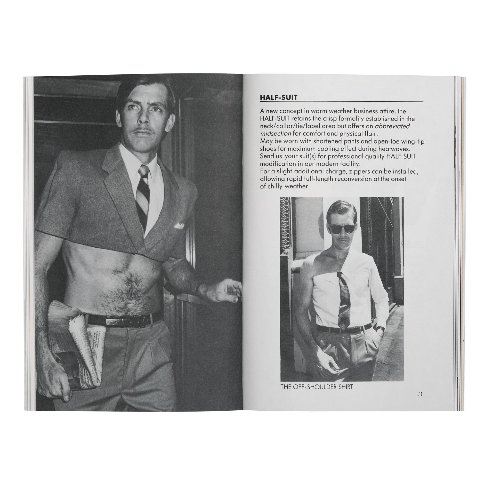
The midcentury in which Garner’s father plied his trade in the world of consumer advertising was one of so-called labor-saving devices that rarely lived up to their promise and usually caused their users — often women — to do more rather than less. A generation later, Garner took up that truth in a series of designed objects and systems that play on words and their connotative associations with the proficiency of a veteran copywriter. Sketched with skills learned in trade school, these inventions marry classic forms and kitsch applications that evade useability even as they employ the recognizable, straightforward visual language of patents, instructions, and user manuals. To wit: an off-the-shoulder business shirt, a tie that snakes from its wearer’s neck to become an apron, and a device for “finger skating” that helps a person balance upside down on two fingers to glide across the ice.
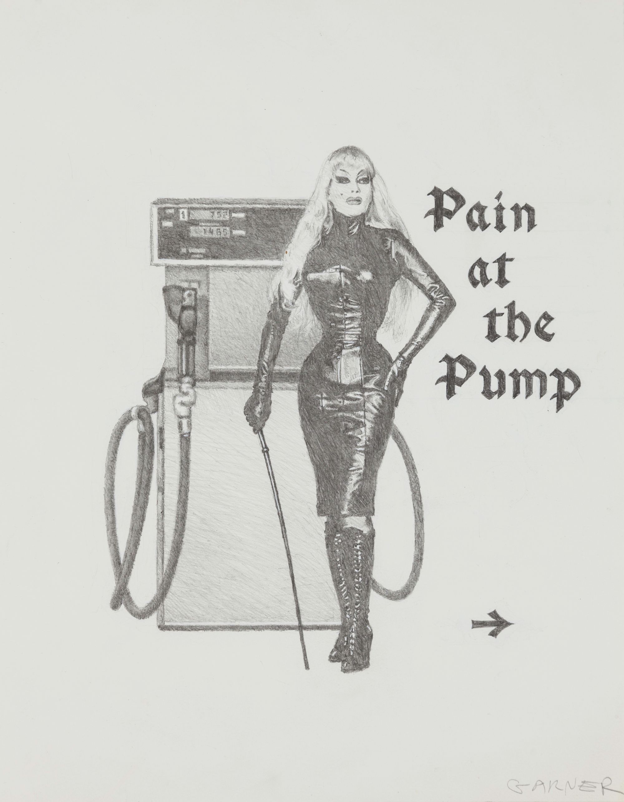
Pippa Garner, Untitled (Pain at the Pump), n.d. Pencil on paper, 14.5 x 11 in (36.8 x 27.9 cm). Courtesy of the artist and STARS Gallery, Los Angeles.
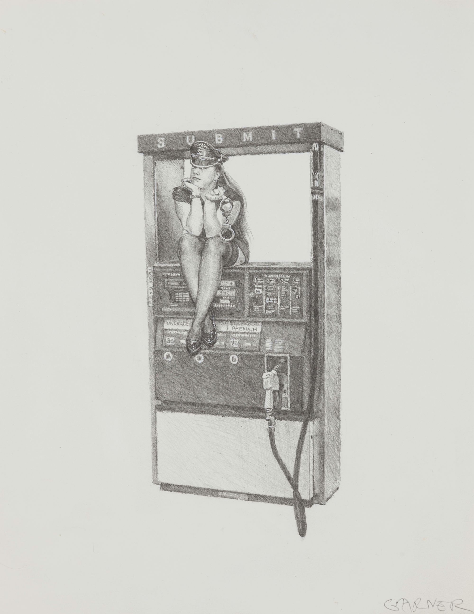
Pippa Garner, Untitled (Submit), n.d. Pencil on paper, 14.5 x 11 in (36.8 x 27.9 cm). Courtesy of the artist and STARS Gallery, Los Angeles.
In their earnest and clear illustrations, Garner’s “inventions” engage the form and content of texts that form the backbone of later twentieth century design history, including the Sears, Roebuck & Co. catalog, the hippie Whole Earth Catalog, and designer Victor Papanek’s 1973 DIY classic, Nomadic Furniture. Each contended with different attitudes to design and consumption. Over the decades, Garner made her own books that riff on this genre, gathering her propositions that never made it off the paper on which they were sketched: Better Living Catalog (1982), Utopia… or Bust! Products for the Perfect World (1984), Garner’s Gizmos & Gadgets (1987), and the zine Beauty 2000 (1992/2021).
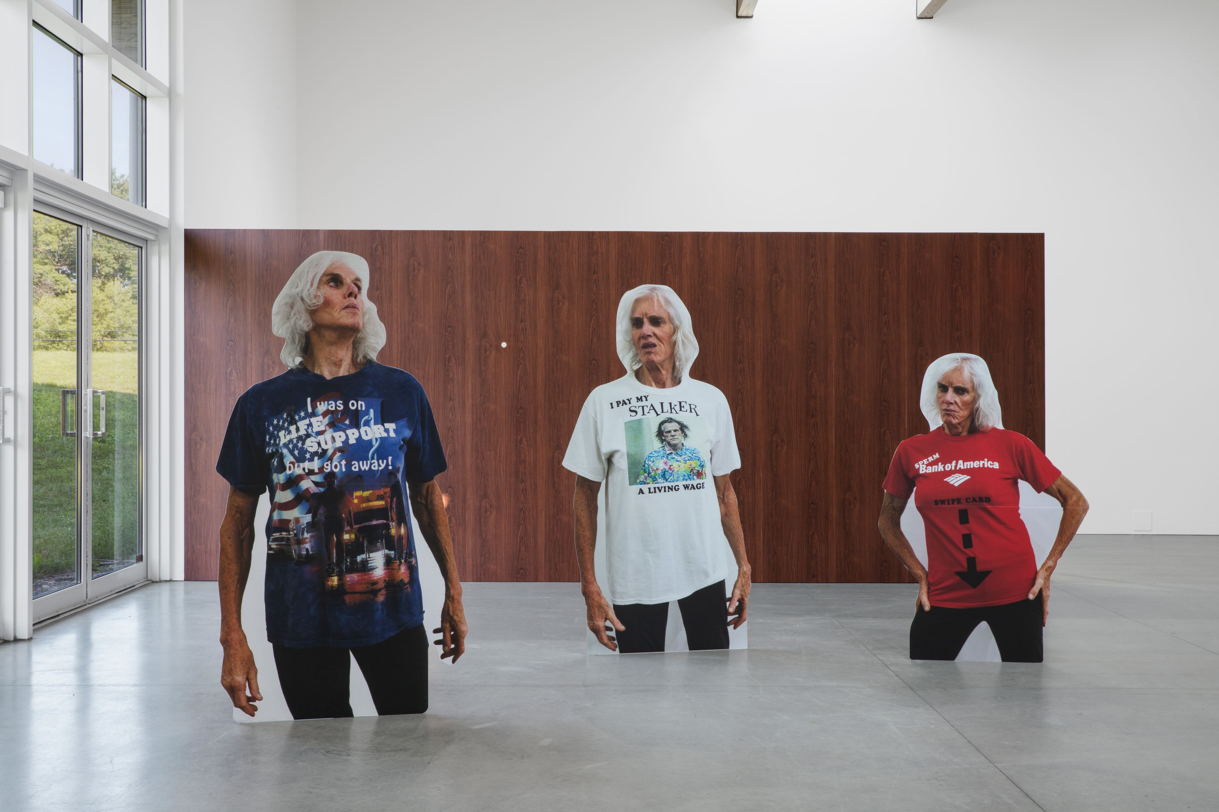
In their deliberate mockery of the attempts of postwar design to mandate norms of age, desire, and gender, Garner’s gadgets extrapolate the work of feminist design historians like Ruth Schwarz Cowan and Dolores Hayden, who critically interrogated patterns of consumption socially coded as feminine. Later works expand this vocabulary — Super Shuffle (2018) is a walker customized with bike streamers and — in a nod to her first obsession — a rearview air freshener and side-view mirrors. It is an explicit nod to aging, illness, and disability, subjects that also queer and distort dominant design histories and the technocratic impulse to streamline and solve. So too does the series Shirtstorm (2005–present), in which Garner takes on an ur-form of advertising, the T-shirt. It’s a design item that I once called in a fashion exhibition at MoMA, “the quintessential product of twentieth-century modernity and the ultimate sartorial and psychological blank canvas.” (I stand by my words.) Due to glaucoma-inhibited vision caused by exposure to Agent Orange in Vietnam, the artist turned to large font iron-on typefaces to regularly create slogan tees that would put even the most well-stocked truck store to shame. (“Swipe up / no minors” and “I like to frolic naked in heavy traffic” are two particular favorites.) After completion, she texts a photograph modeling the work to friends as a proof-of-life.
Pippa Garner, Better Living Catalog. Images courtesy the artist and Primary Information. Photos by Naoko Maeda.
Pippa Garner, Better Living Catalog. Images courtesy the artist and Primary Information. Photos by Naoko Maeda.
Understanding these works beyond artistic approaches to seriality, and as part of a wider current of designed reproducibility and obsolescence, recognizes their mass-produced raw material as inextricably tied to its affective outcome. This is driven home in Specimen Under Glass (2018), the image used for the cover of Garner’s most recent monograph Pippa Garner: $ELL YOUR $ELF, published by Pioneer Works and Art Omi (2023). In it, she presses her seventy-six-year-old face to the picture plane as if against a Xerox machine, her distorted mouth slightly agape and nose awkwardly bent. While a design that underwrites — literally — bureaucratic paperpushing by day, Garner’s portrait riffs on the after-hours, off-brand use of the photocopy to produce protest posters, pornographic zines, and the practical jokes of cubicle drones who copy their ass to slip the result into an interoffice envelope addressed to the corner office. She’s a perfect postmenopausal cover girl. Her bludgeoned selfie and razor cheekbones are framed by a shock of white hair and the titular exhortation to $ell your$elf. Like the rest of her forays into material culture, her knowing and controlled embrace of mechanical reproduction recognizes its ability to market, shape, and shill. In this case, as always, Pippa Garner is both producer and product, an omnipotent ouroboros that invites us to consume her body as a way to remake it anew — for our viewing pleasure, and hers, too.
Pippa Garner: $ELL YOUR $ELF, 2023. Installation view: Art Omi, Ghent, NY. Photo: Gregory Carideo.