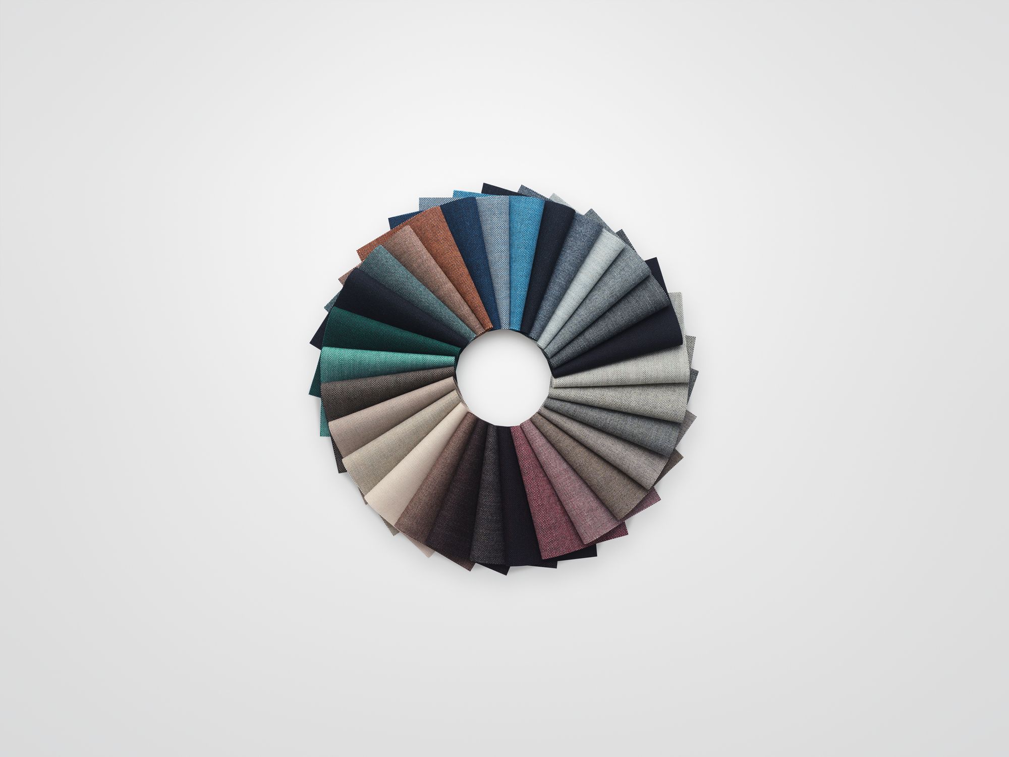
Made from 100 percent British worsted wool, the colorways of Techicolour’s muted mélange come from combining the bright colors of livestock spray with the natural hues of the sheep itself. Courtesy of Kvadrat.
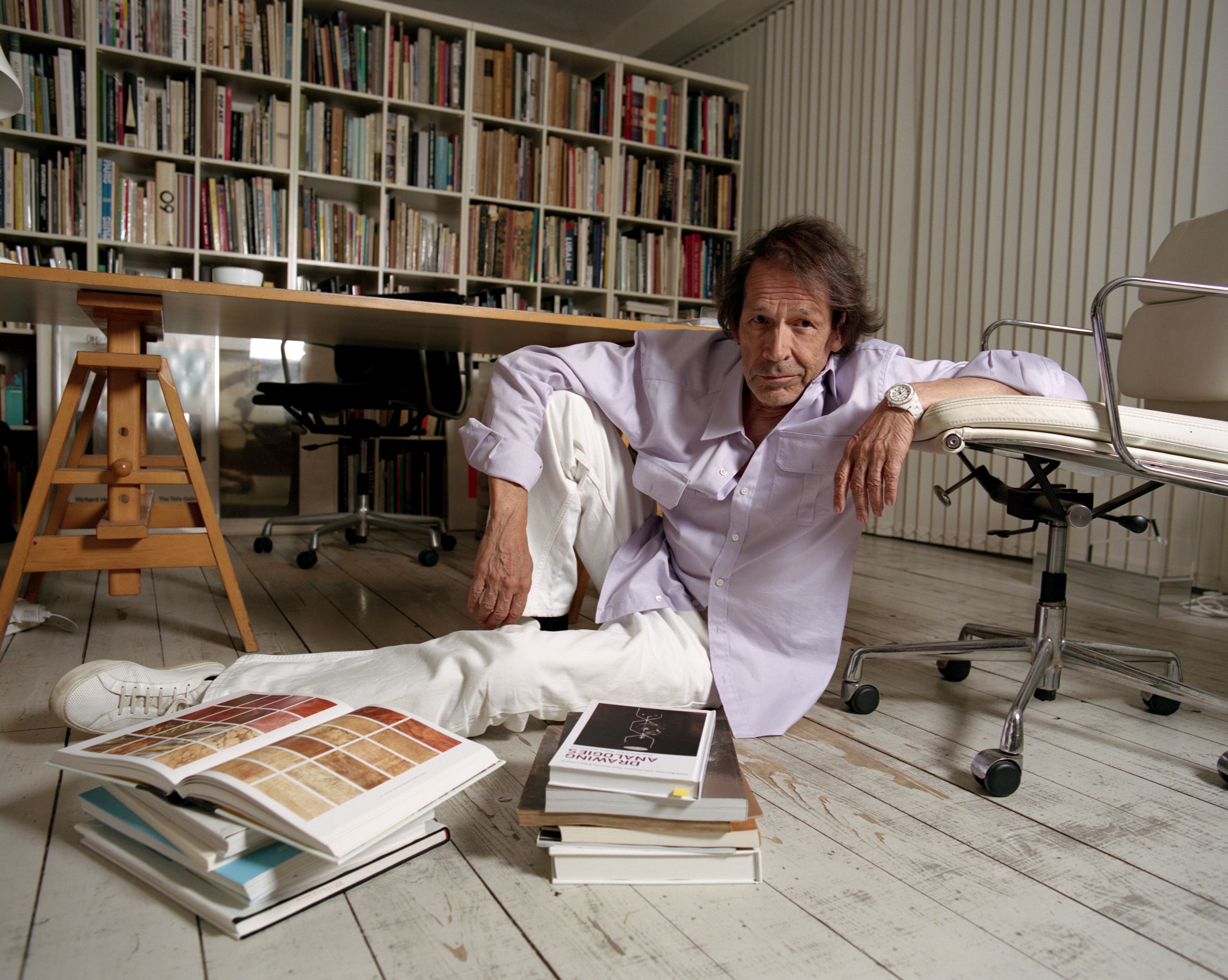
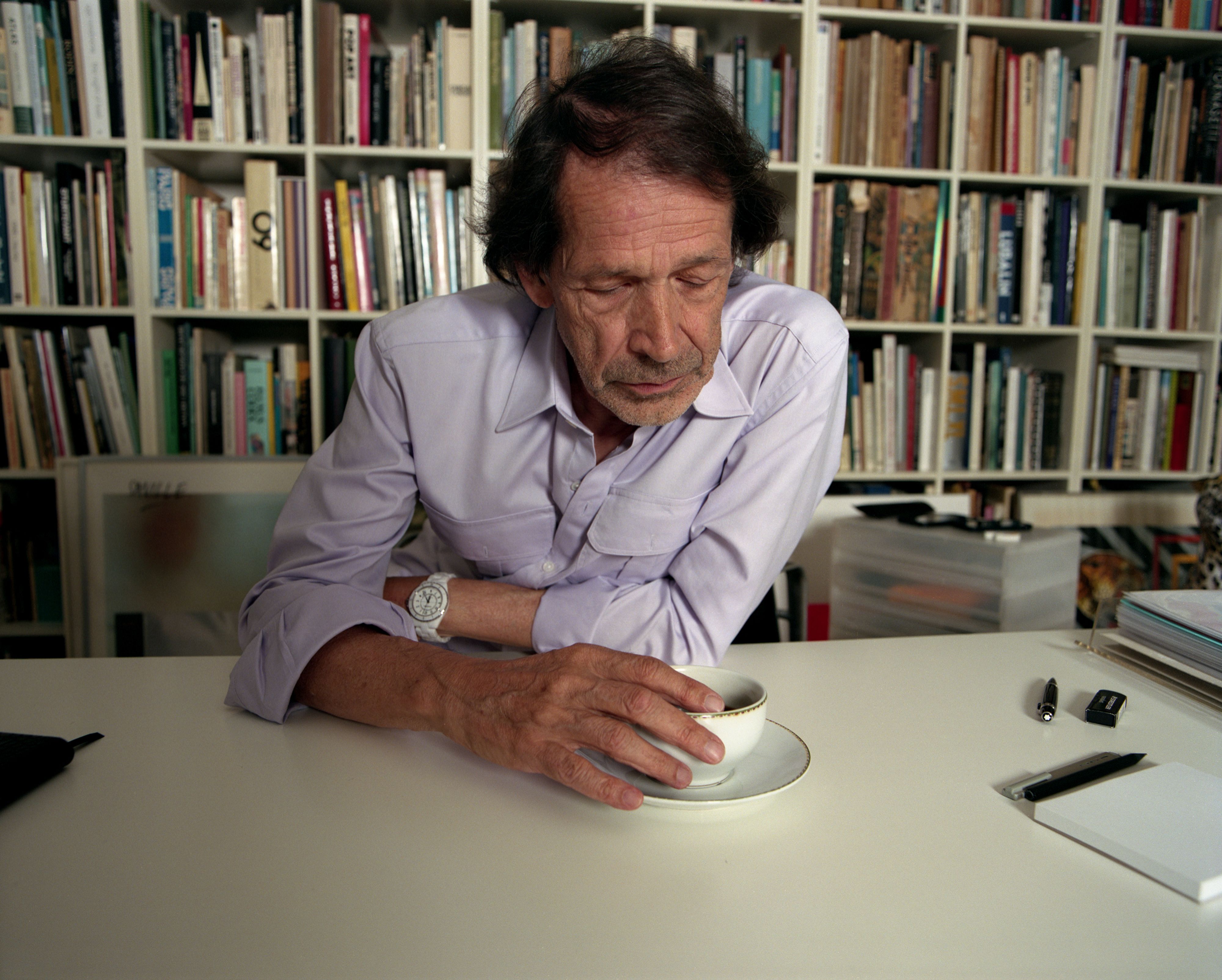
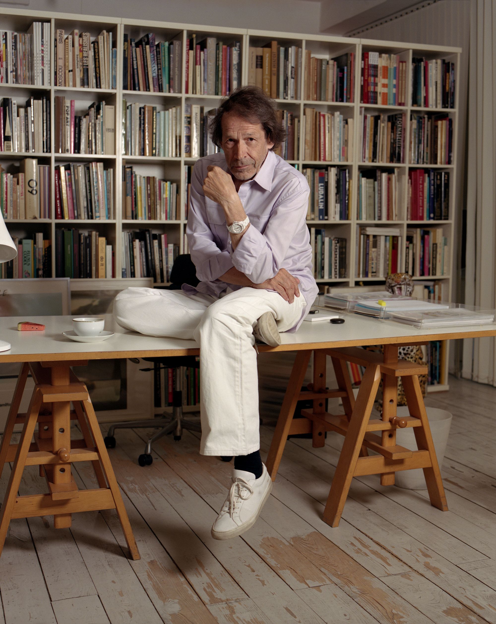
Peter Saville photographed in his London studio, which doubles as his home. Portrait by Kuba Ryniewicz for PIN–UP.
Peter Saville has had an unparalleled impact on visual culture over the past 50 years. His record sleeves for Joy Division, New Order, and Roxy Music are now icons in their own right — timeless artifacts that discreetly reference 20th-century art movements from Italian Futurism to the Bauhaus and Constructivism. In the late 1970s and 80s, Saville’s work was distinctly Postmodern: visual statements that charted a path into the future by interpolating the past. As his imagery filtered into the zeitgeist — from sophisticated contemporary graphic design to consumer goods and fast fashion — Saville admitted he was increasingly “fascinated by how fucked up everything was.” His designs took a more dystopian bent, moving beyond subculture and edging into the mainstream, including a brief stint as a partner at Pentagram. “I really do not like people changing things,” Saville says dryly. “I get very prima donna about that.” In 2006, he ventured into the public sector as creative director of his home city of Manchester. Since then, he has rebranded Burberry and designed England’s national football kit — major commissions for someone who never set out to be a graphic designer. Saville’s beginnings were anything but corporate. Growing up in the 1960s with a reverence for pop art, he saw record covers as his way to shape music’s visual culture. At Manchester Polytechnic (now Manchester Metropolitan University), however, he spent little time in the graphics department, preferring the company of the “cooler” students in product design, textiles, and furniture. At 70, the Mancunian has undeniably earned his cool stripes. He has also finally made his way into fiber arts with his new Technicolour collection for Danish textile company Kvadrat, with which he has been collaborating since 2004. Inspired by the bright, primary-colored markings on sheep in the British countryside — what he calls “rural graffiti” — that denote ownership, vaccinations, and lambing, the collection combines five vivid livestock spray tones with neutrals reflecting wool’s natural hues to create a surprisingly subdued palette of 30 mélange colorways. The innovation was made possible by a new yarn-spinning facility at Wooltex in Huddersfield. On a break from a factory tour, Saville reflects on learning to love his mother’s bourgeois taste, the singular design of his 90s bachelor pad in Mayfair, and fashion.
Made from 100 percent British worsted wool, the colorways of Techicolour’s muted mélange come from combining the bright colors of livestock spray with the natural hues of the sheep itself. Courtesy of Kvadrat.
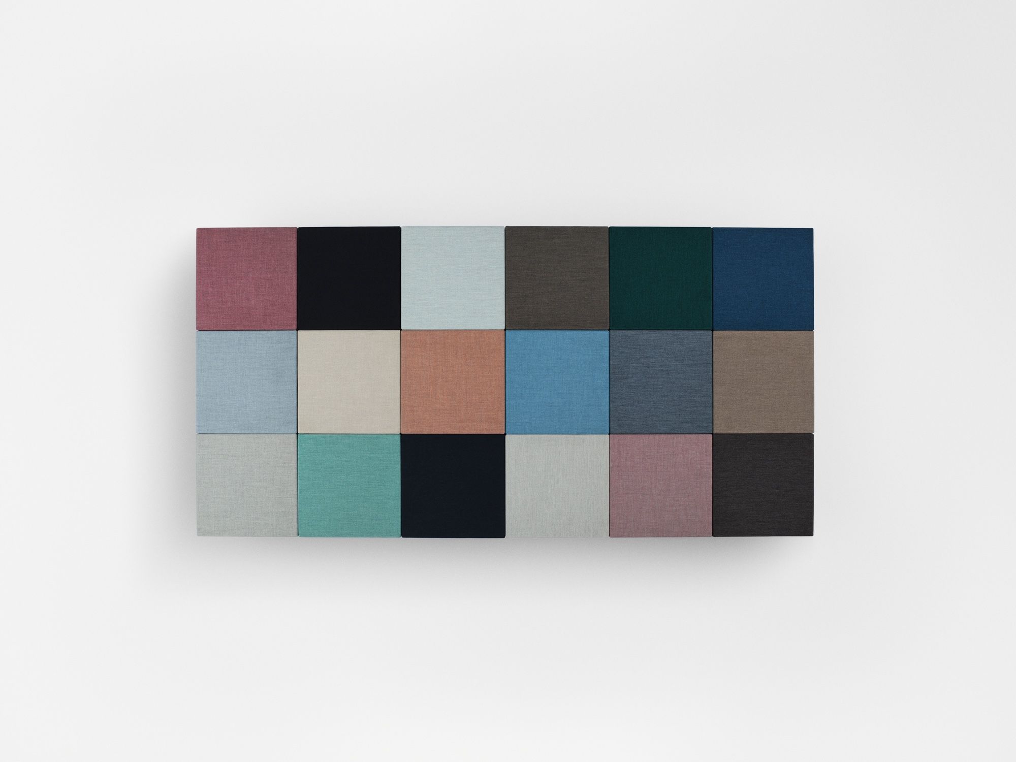
The color blanket for Peter Saville’s latest Technicolour collection for Kvadrat. Photo by Jannick Pihl Rasmussen. Courtesy of Kvadrat.
Peter Saville’s wool upholstery textile Technicolour for Kvadrat. Copyright Casper Sejersen. Courtesy of Kvadrat.
Rachel Hahn: I really like your suit. Did you get it tailored?
Peter Saville: It was actually ready-to-wear. Sample sizes used to always fit me, but that’s changed a bit as I’ve gotten older. This is from Sexton on Savile Row. It’s a classic Sexton jacket.
I have to ask, because we’re sitting in a textile mill in Huddersfield which has a long history of wool production and we just saw your wool collaboration with Kvadrat being made — is it wool?
It is wool. It’s an odd wool — gabardine. It’s really tough, so there’s a bit of utility to it. Edward Sexton was a legendary cutter in the 60s, and he worked with a famous guy called Tommy Nutter, who reinvented Savile Row for the pop era. Tommy and Edward made clothes for the Rolling Stones. Sexton made Bianca [Jagger]’s wedding suit. This jacket is a little bit theatrical, but you know, style.
You grew up in Manchester, not too far from where we are right now. Were you familiar with this area?
I always knew about the Pennines, which is where we are, and the sheep, the farms, and the textile industry here. Ironically, cotton was the fundamental product that came out of Manchester in the 19th century and made it the world’s preeminent industrial city. By the time I grew up there, there was this question of how a former industrial city might reconstitute itself. Factory Records, which I cofounded in 1978, was very much about that. I mean, it was really just some young people doing what they wanted to do. But looking at it in hindsight, it was a response to our environment. We were in this place and had two choices: you either made something of it, or you left. I did both. I left to follow my own interests, but we also created the possibility for people who didn’t leave to fulfill another kind of ambition in their lives.
Portrait of Peter Saville by Kuba Ryniewicz for PIN–UP.
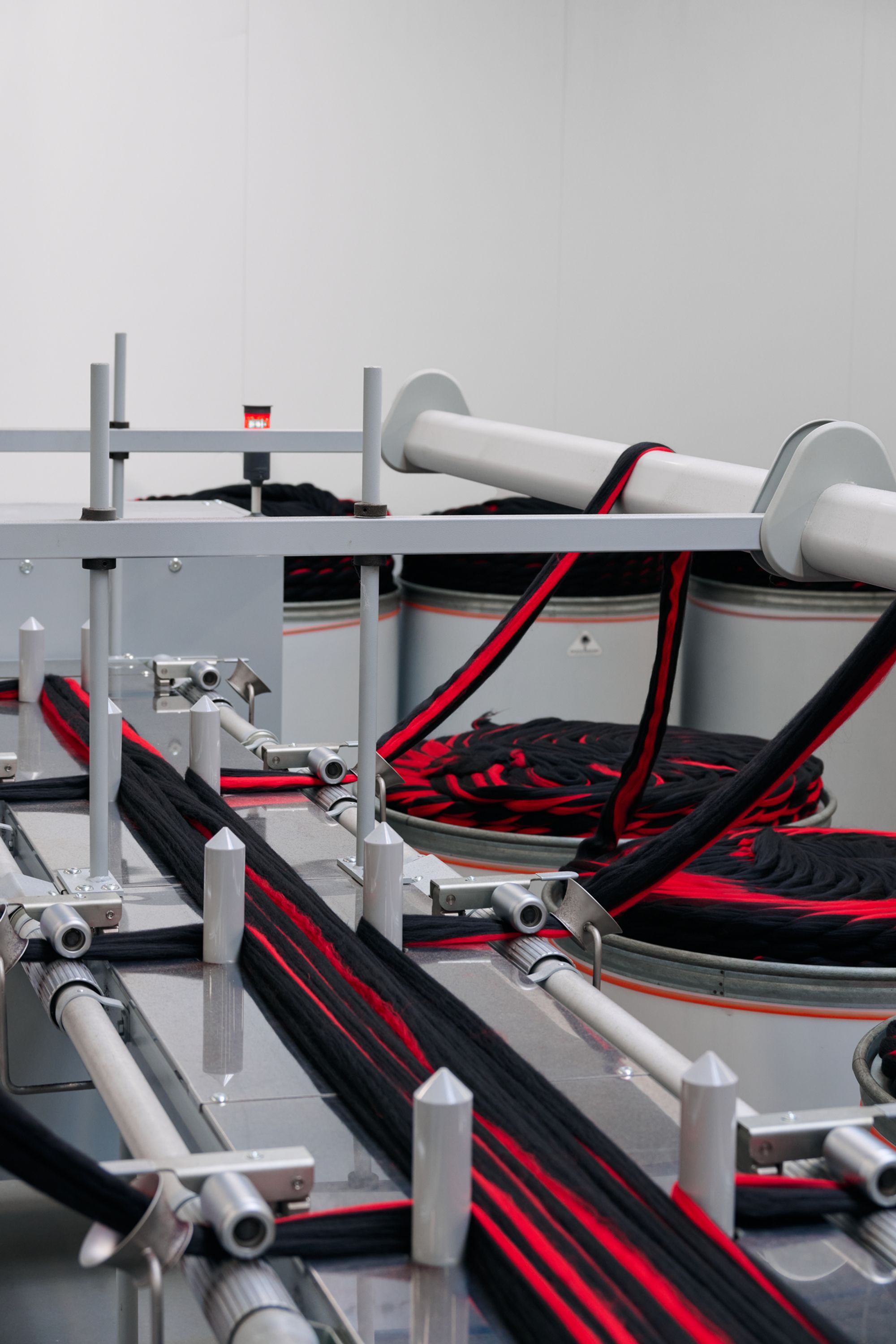
The color code of Peter Saville’s Technicolour is all possible thanks to a new yarn spinning facility at Wooltex, a textile mill in Huddersfield co-owned by Kvadrat that produces woven wool fabrics. Photo by Jannick Pihl Rasmussen. Courtesy of Kvadrat.
Inside the Wooltex production facility, where Technicolour is actively being made. Photo by Jannick Pihl Rasmussen. Courtesy of Kvadrat.
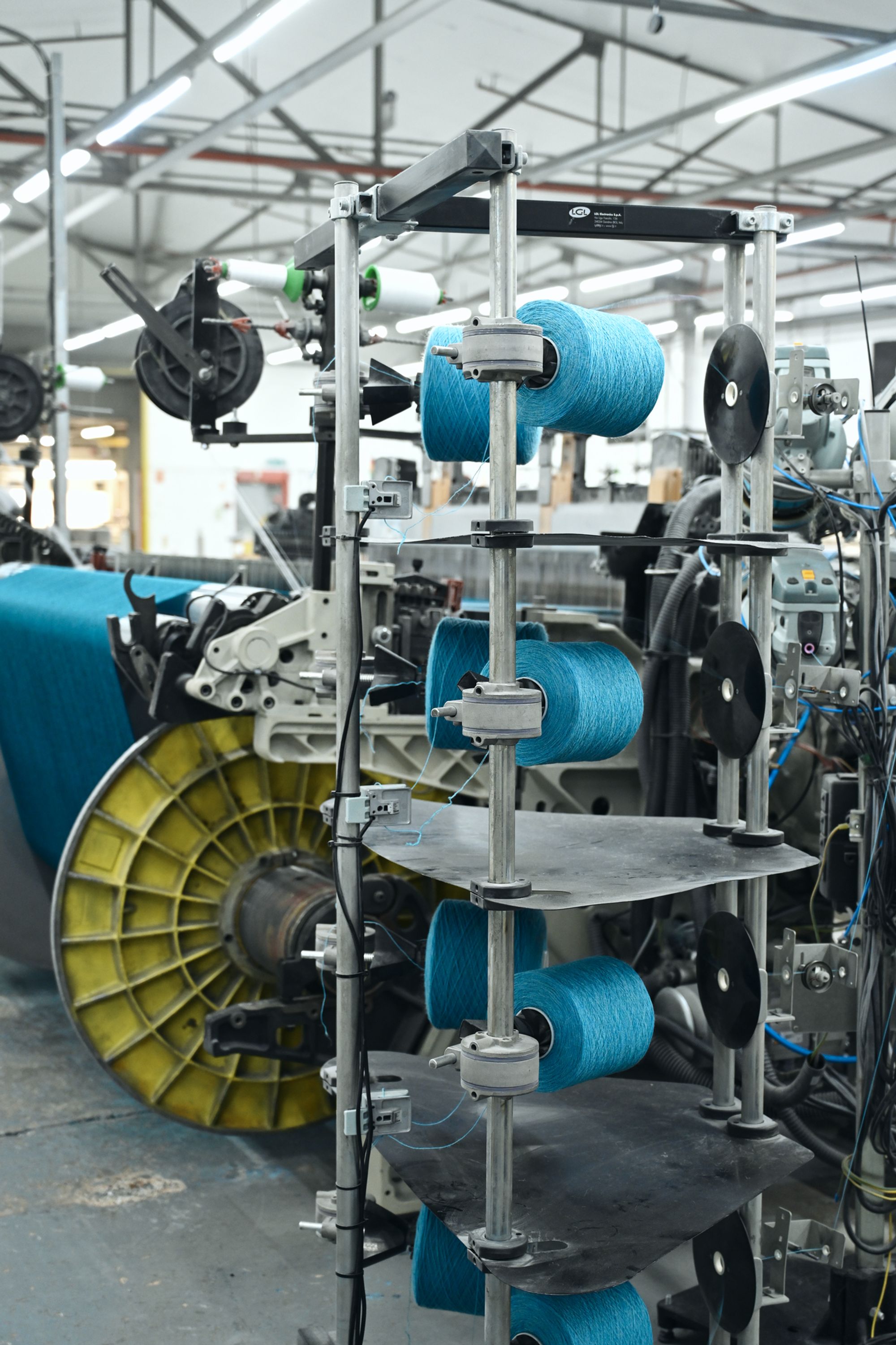
Inside the Wooltex facility. Photo by Jannick Pihl Rasmussen. Courtesy of Kvadrat.
Were the cooler kids that you knew in Manchester leaving for London?
I hadn’t started to notice that yet. I had the benefit of two older brothers. I was born in 1955, but I was able to witness the transformations of the 60s through them. Ironically, just when I was kind of old enough to go to the party, it was all over. The early 70s was a decidedly morning-after feeling. The drugs were as much harm as they were good. Sexual liberation had its consequences. The plastic furniture broke, and the waterbeds leaked. My coming of age in the early 70s was a reflective moment after this headlong rush into the future, which was basically the crucible of Postmodernism. We were suddenly curious about what of value had come before, and perhaps that some of the things that had been dropped for their newness needed to be retrieved.
You’ve mentioned Postmodern architecture as an influence on some of your work. Was there a particular building that was of particular interest to you?
There was an architecture bookshop in Kensington I used to go to when I was in college, and I picked up a little paperback book of Philip Johnson’s drawings for the AT&T building on Madison Avenue, which was not yet built. It was a skyscraper with this ornament on top, a broken classical pediment, which was causing incredible reverberations in the architectural community. I thought it looked amazing. At that time, I was learning about the range-left, constructivist, sans-serif world of the Modernists. I particularly liked Jan Tschichold. He subjected this beautiful classicism to the rigor and rationale of Modernist systems. I kept looking at these classical serif typefaces, thinking they were post-punk, but I was nervous about using them. Once I saw the AT&T building, I thought, “fuck it.” If he can put a broken pediment on a skyscraper in New York, I can use some Garamond.
You’ve never totally fit the label of graphic designer because your work always seems to communicate something about yourself as much as it represents your client’s interests.
I didn’t really want to be a graphic designer. My high school friend Malcom Garrett, who later worked for the Buzzcocks, and I studied graphic design just to make record covers — a farsighted idea for a couple of teenagers. We were both late to discover that record sleeves were not particularly highly regarded in the profession of graphic design, because there is no problem with a record cover. Design is problem solving. We were not that concerned with solving problems. We were interested in self-expression. Factory Records allowed that because there was no money or contracts. I did posters, graphics, and record covers without having to answer to anyone, including the groups.
Portrait of Peter Saville by Kuba Ryniewicz for PIN–UP.
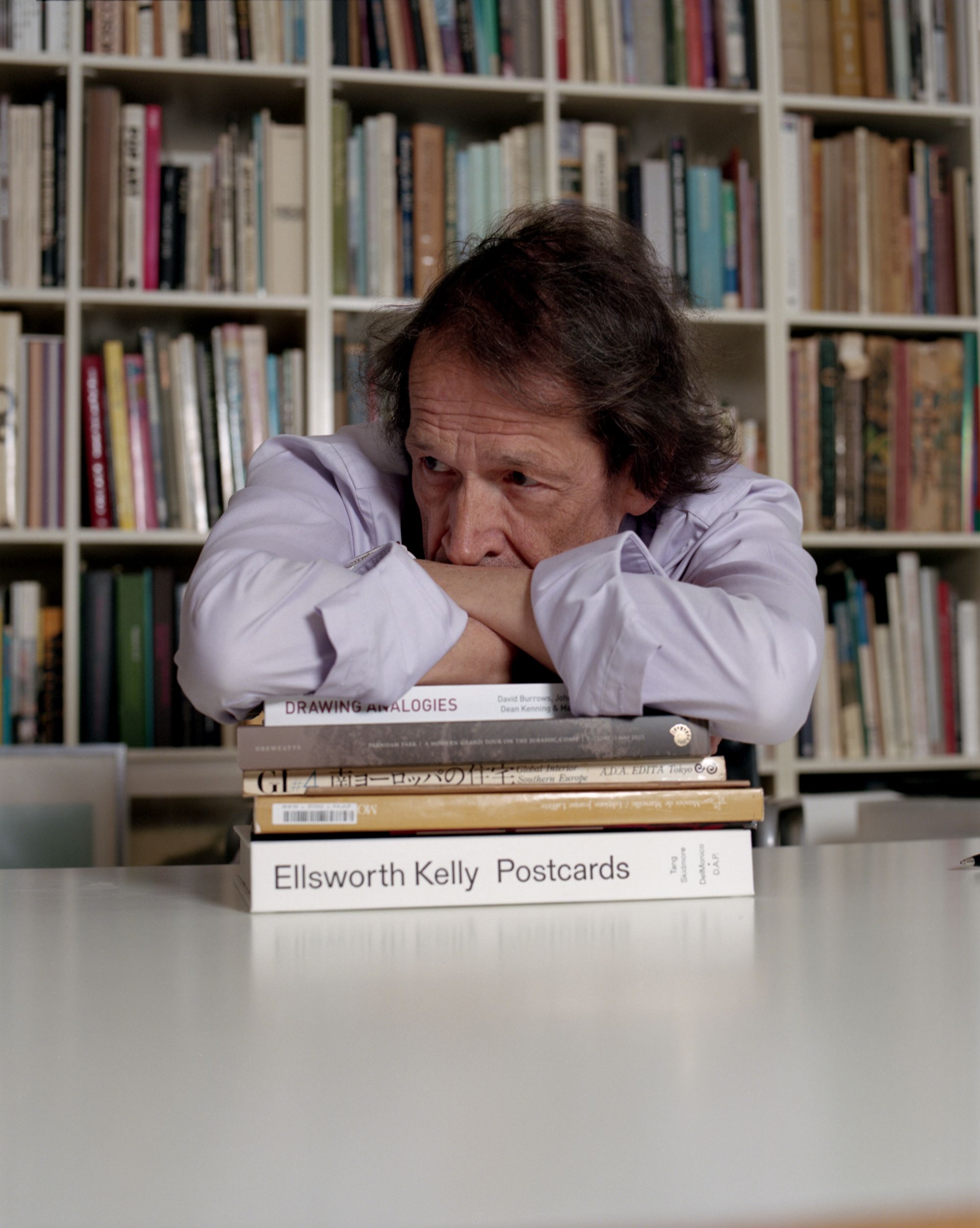
Portrait of Peter Saville by Kuba Ryniewicz for PIN–UP.
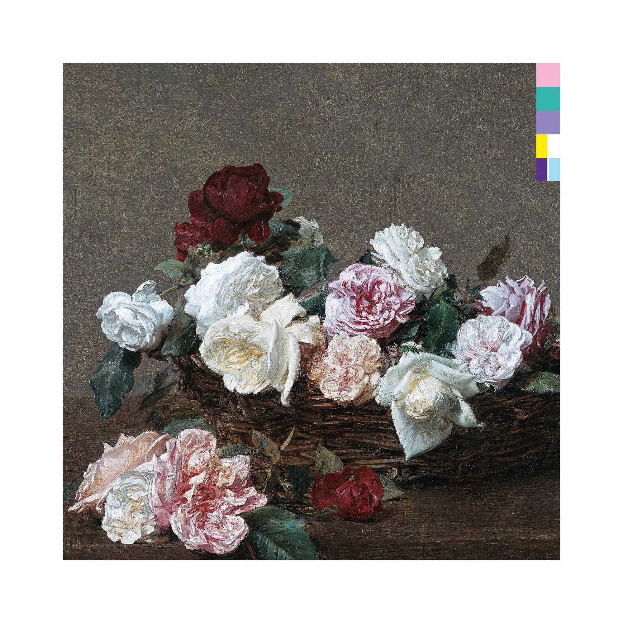
Front cover of Power, Corruption & Lies (1983) by New Order, designed by Peter Saville.
Back cover of Power, Corruption & Lies (1983) by New Order, designed by Peter Saville.

Joy Division, Unknown Pleasures, 1979, designed by Joy Division and Peter Saville.
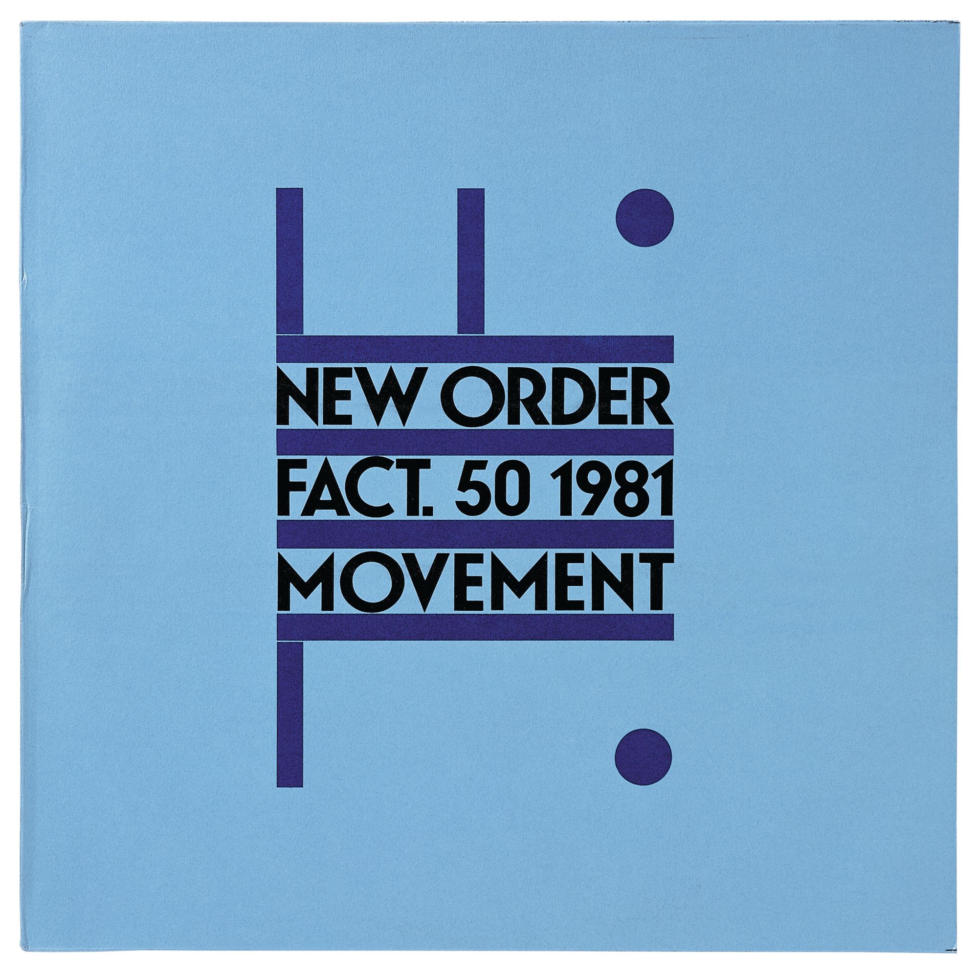
New Order, Movement, 1981. Design Grafica Industria.
You might be the only record sleeve designer in history who didn’t need approval from the artists.
At the beginning, there was collaboration. Bernard Sumner from Joy Division gave me the wavy lines for Unknown Pleasures [1979], but I put it together the way I wanted, which was not what they had asked for. I didn’t really want to put the name of the band or the title on the front, it just seemed too obvious. And then as New Order became a democracy of disagreement with no decision maker, the covers defaulted to me. I would try to involve them, but it was usually farcical. They just thought it was all very pretentious, which to some extent it was. New Order didn’t ever like the covers very much. They didn’t tell me they liked something until the 1993 single sleeve for Regret. I put some cowboys on the front. Bernard said, “You’re getting the hang of it.”
Your design work is rooted in semiotics, this interplay of signs, symbols, and code-making. Working with textile, like in this Technicolour project, seems almost like an antithetical process — it’s so tactile.
It’s different, but it’s the same. It is semiotics. With record covers, I was exploring concepts and ideas, and Technicolour is exactly the same. The idea I had about the graffiti in the countryside, and what happens if it makes its way into the finished product, is entirely abstract. It’s a pure concept. It’s not solving any problems. So in that sense, this collection is more similar to a Factory Records cover than almost anything I’ve done in the 40 years since.
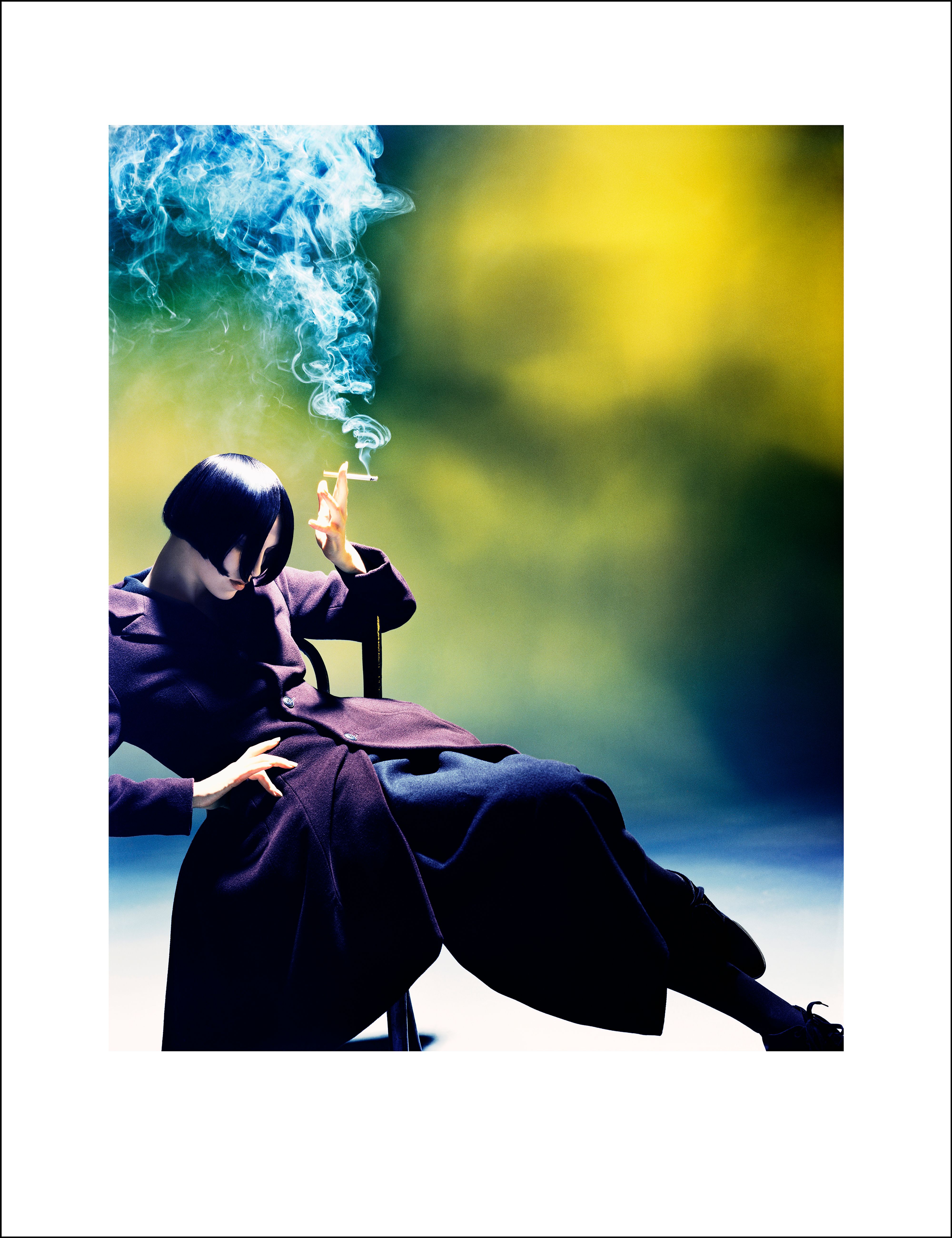
Susie Smoking. Susie Bick for Yohji Yamamoto, 1988. Image by Nick Knight. Art direction by Marc Asoli. Design by Peter Saville.
Your mom was an antique dealer, and you’ve referenced her taste — her “aspirational, middle-class antiques” — as informing your creative approach. Do you still find yourself picking up on threads of your mother’s eclecticism?
I made that comment in relation to the New Order album Power, Corruption & Lies [1983], the one with the Henri Fantin-Letour painting of roses on the cover. I had this notion that the present was this combination of where we had been, or memory, and this idea we have of the future. A few years later, I was sitting in my mother’s living room looking at the Royal Dalton and Worcester porcelain in the display cabinet, the Victorian landscape paintings, and the chintz furnishings, and I suddenly saw the Fantin-Letour painting. I thought of our family home as an enclave of bourgeois values, but it was surrounded by industry and technology, just like the front and the back cover — the floral still life and the technological coding. I thought, “Oh, fuck. This work that I thought was really progressive is actually just a summary of my life.” I’ve come to appreciate a lot of things that I had no taste for when I was younger — like brown furniture from the 18th and 19th century. I am an avid recipient of online auction house catalogues. Christie’s is by far the best. I used to be really frustrated by World of Interiors, but now it’s the only magazine I open with any enthusiasm. I am very much in awe and respect of the antique.
Do you find that your approach to interiors is changing as you get older?
I don’t have an interior. The only time in my 50 years of adult life that I’ve ever had a space was the Mayfair apartment in the 90s. My partner, Anna [Blessmann], and I are living in my design studio now. All of my furniture has been in storage since 2000: the Verner Panton three-tier Fun lamp, the beautiful de Sede sofa, the black lacquered bedroom suite. For the past 25 years, I’ve been waiting to be able to afford a place in London again. For now, it’s a choice between a desk or a dining table — the desk wins. My bed is a mattress on the floor. I’m 70 going on 17. The funny thing is that I have still been buying things along the way, but they go straight into the storage container, like this amazing, very minimal, late 19th-century black lacquer bureau plat that I bought in 2019. I haven’t seen it in six years, so I am looking forward to seeing it again.
Could you imagine Technicolour fitting in the Mayfair apartment?
The thing about the Mayfair apartment is that I don’t think that I would fit in there anymore. It was very much a moment — a kind of Studio 54, Halston, Tom Ford, Gucci moment. Lots of the pieces were already there. My friend Mike Meiré’s company funded it, because he shared it with me for work. I didn’t have any money. By the time I left in 2000, I wasn’t really feeling it anymore. That said, there are some colorways in the Technicolour collection that would work in there — some of the grays. I wouldn’t mind having the space again, but my approach now would be less singular, more pluralist. There’s one particular interior that I really like from a 1972 issue of Casa Vogue, with a modern sofa juxtaposed with the bits of classicism, a 60s or 70s sculpture, and other furniture that looks a little bit medieval.
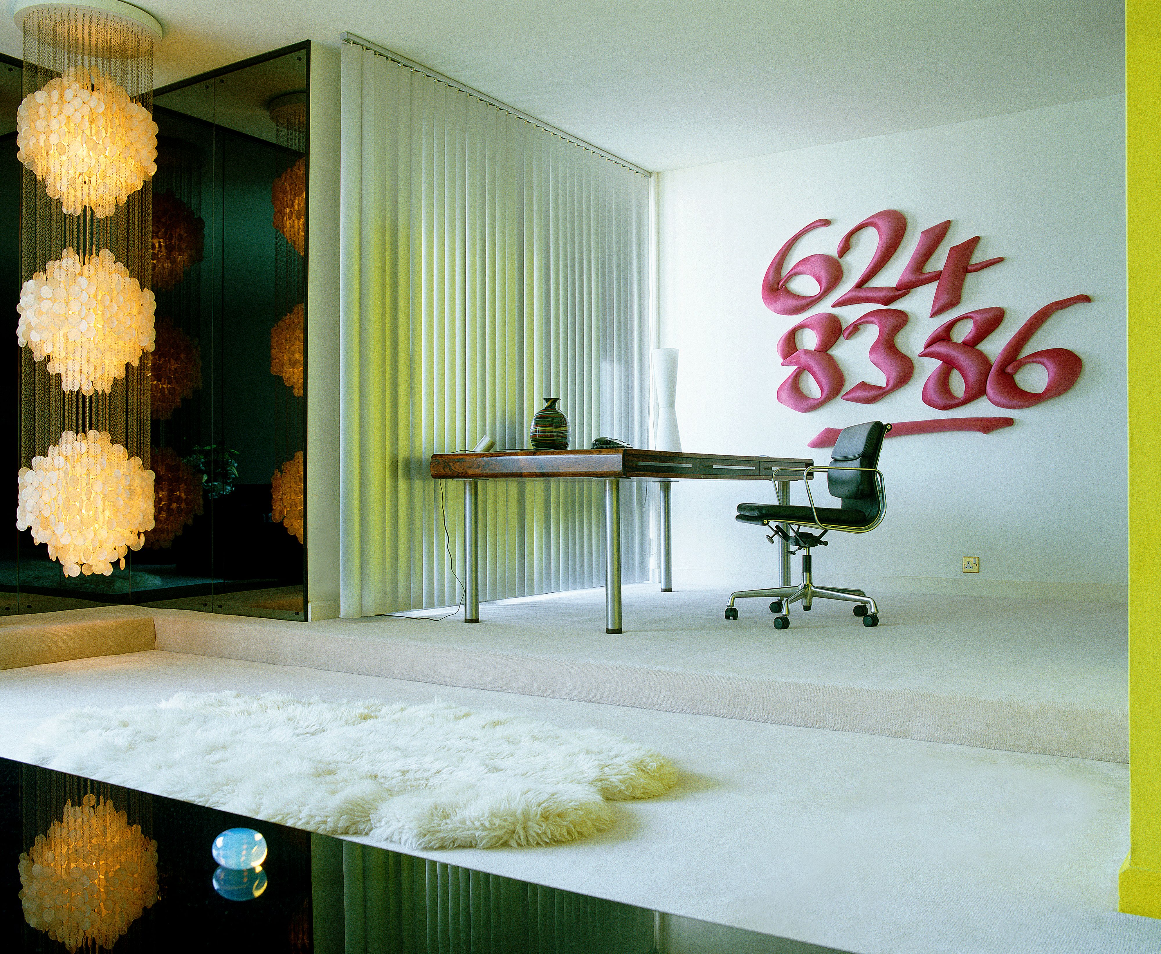
Peter Saville’s 90s Mayfair apartment, photographed by Henry Bourne.
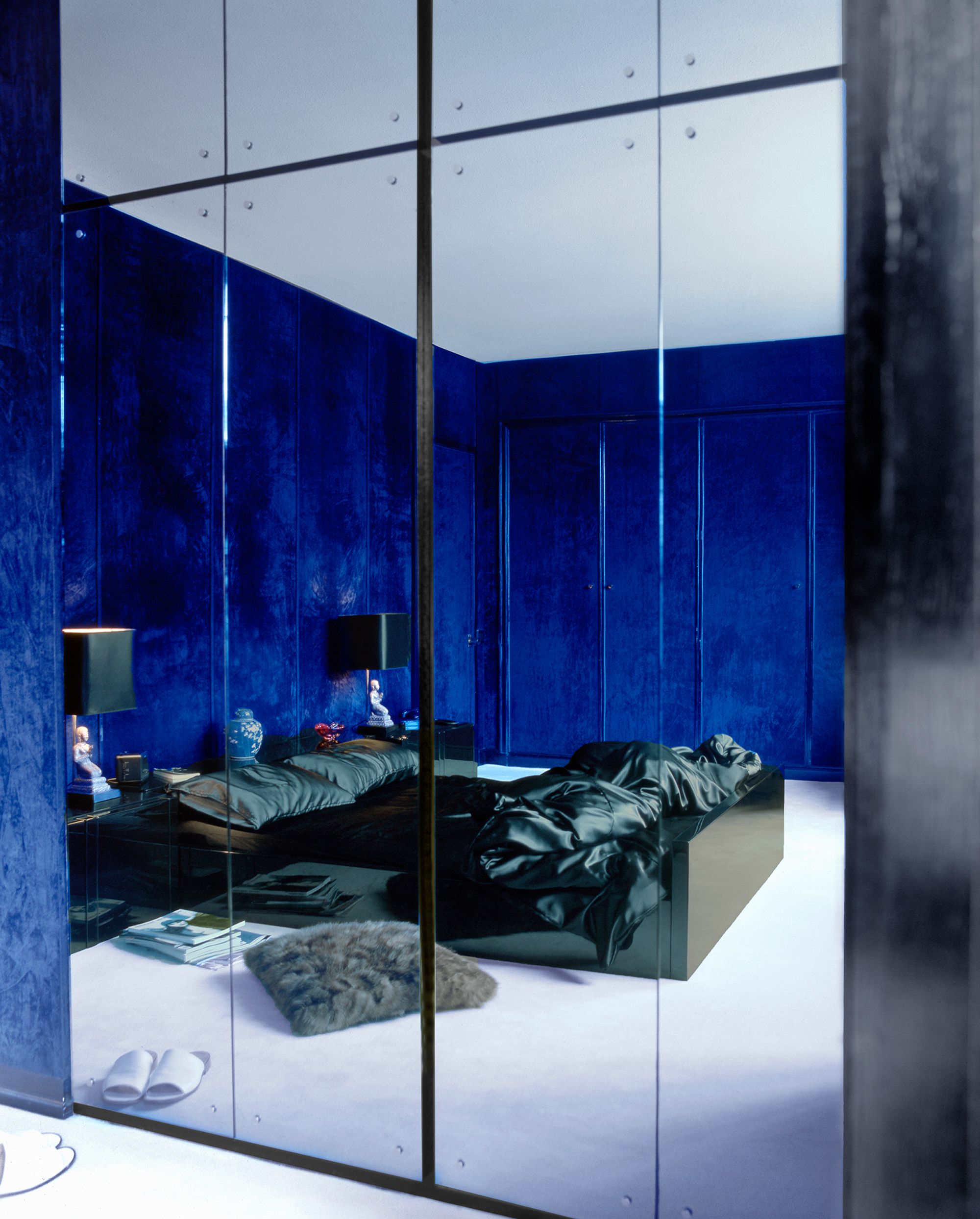
The Apartment, Mayfair London, 1995. Photography by Henry Bourne.
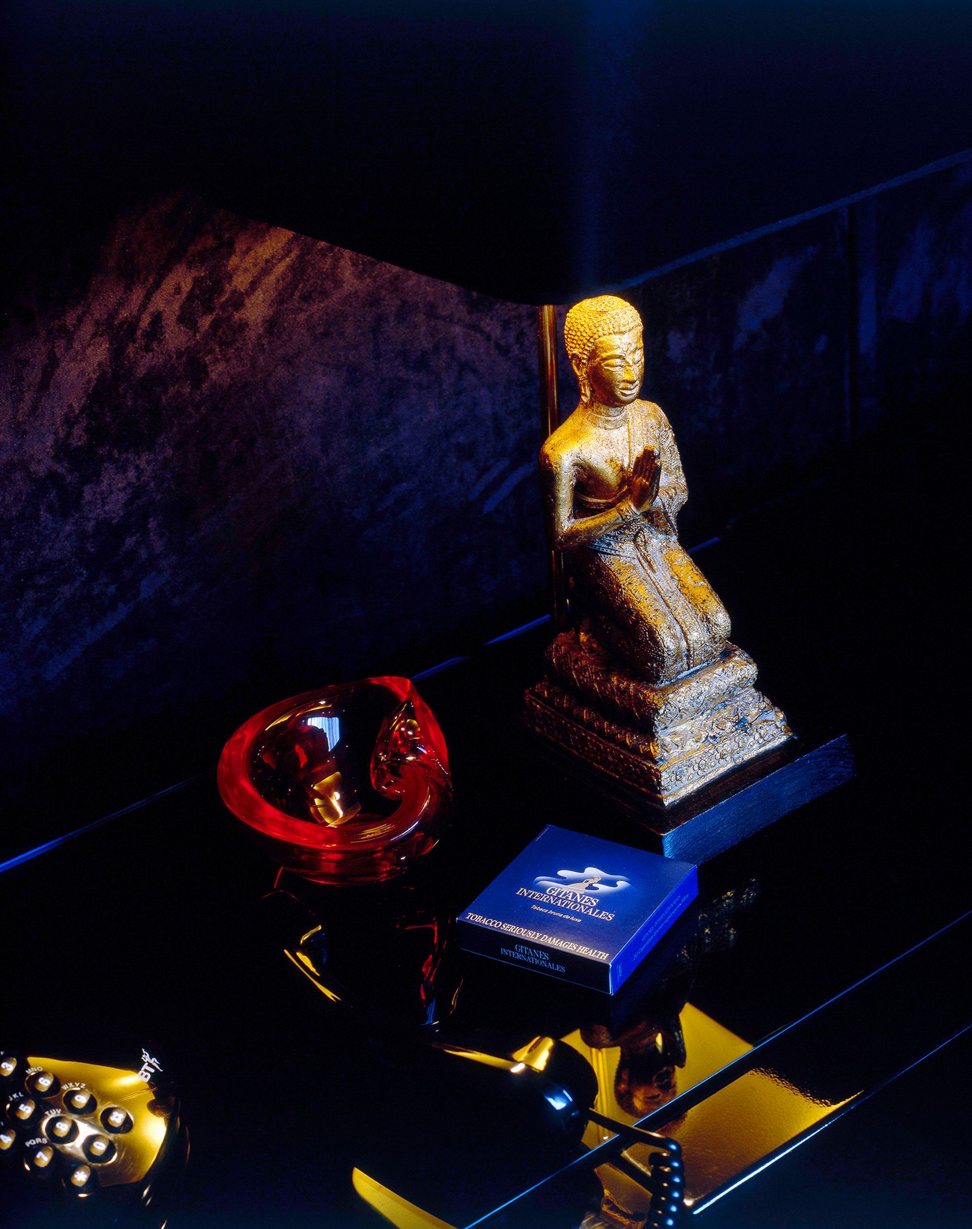
The Apartment, Mayfair London, 1995. Photography by Henry Bourne.
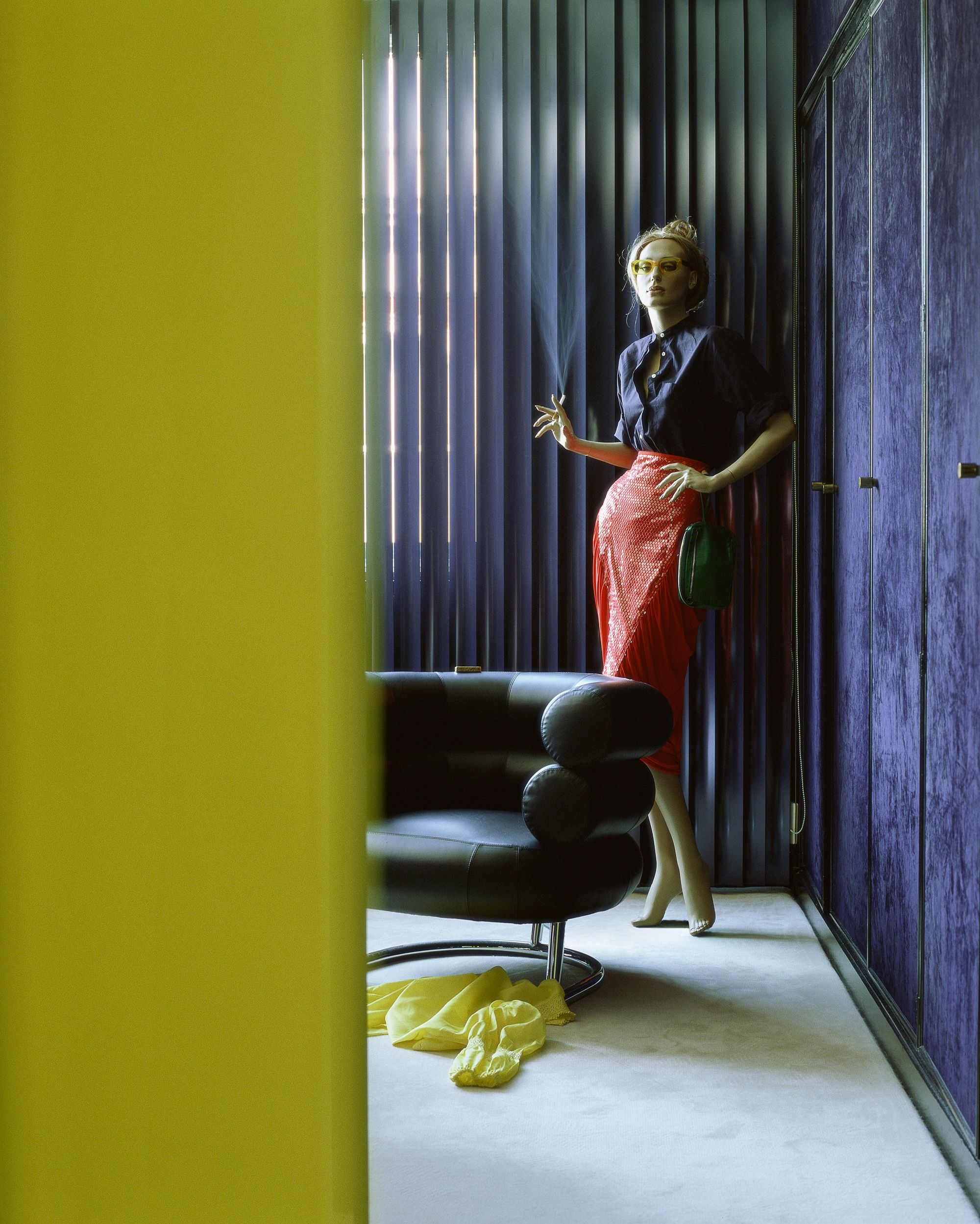
The Apartment, Mayfair London, 1995. Photography by Henry Bourne.
How has your idea of design changed over the years?
I don’t find it very interesting. There’s too much of it. It’s mass entertainment now. There is nothing worse than going to the fucking Salone in Milan. I’m over gratuitous production — production for no reason other than a new cycle of marketing. But I do like when I see a solution to something, when I see something modern. Every so often you see something that tells you what time it is, and what moment you’re living in — I’m not over that.
But then there’s someone like Raf Simons, who is doing interesting things within those fashion cycles and explicitly referencing your work. You brought Raf Simons into the Kvadrat world, correct? How would you describe your working relationship?
Have you ever heard the phrase “spooky action at a distance?”
No.
Quantum entanglement is when particles, even at different ends of the universe, appear to be intrinsically linked with one another. Einstein did not feel comfortable with this idea, so he referred to it as “spooky action at a distance.” That’s me and Raf. We have never sat down to work on anything together, but there’s definitely some entanglement going on at a distance.
When you see younger designers taking up ideas you pioneered, does it give you pride? It’s a double-edged sword — the visual language you’ve created has also trickled downstream into more commercial branding.
When I appropriated a look, identity, or aesthetic, I tried to do it with a degree of respect and in an interesting way. When I did Futurism for New Order’s Movement [1981], I remember thinking that Filippo Tommaso Marinetti would actually like New Order — they would have been the Futurists’ house band. I didn’t realize that respectful appropriation was a subtlety that many people would not appreciate, and this would open the door to a raiding of the cultural canon for all the wrong things. Officially, I don’t actually have any children. And yet, I do have lots of children. Every week I somehow encounter someone who I’ve influenced who says thank you. But I don’t have to be responsible for them — that’s quite a relief.
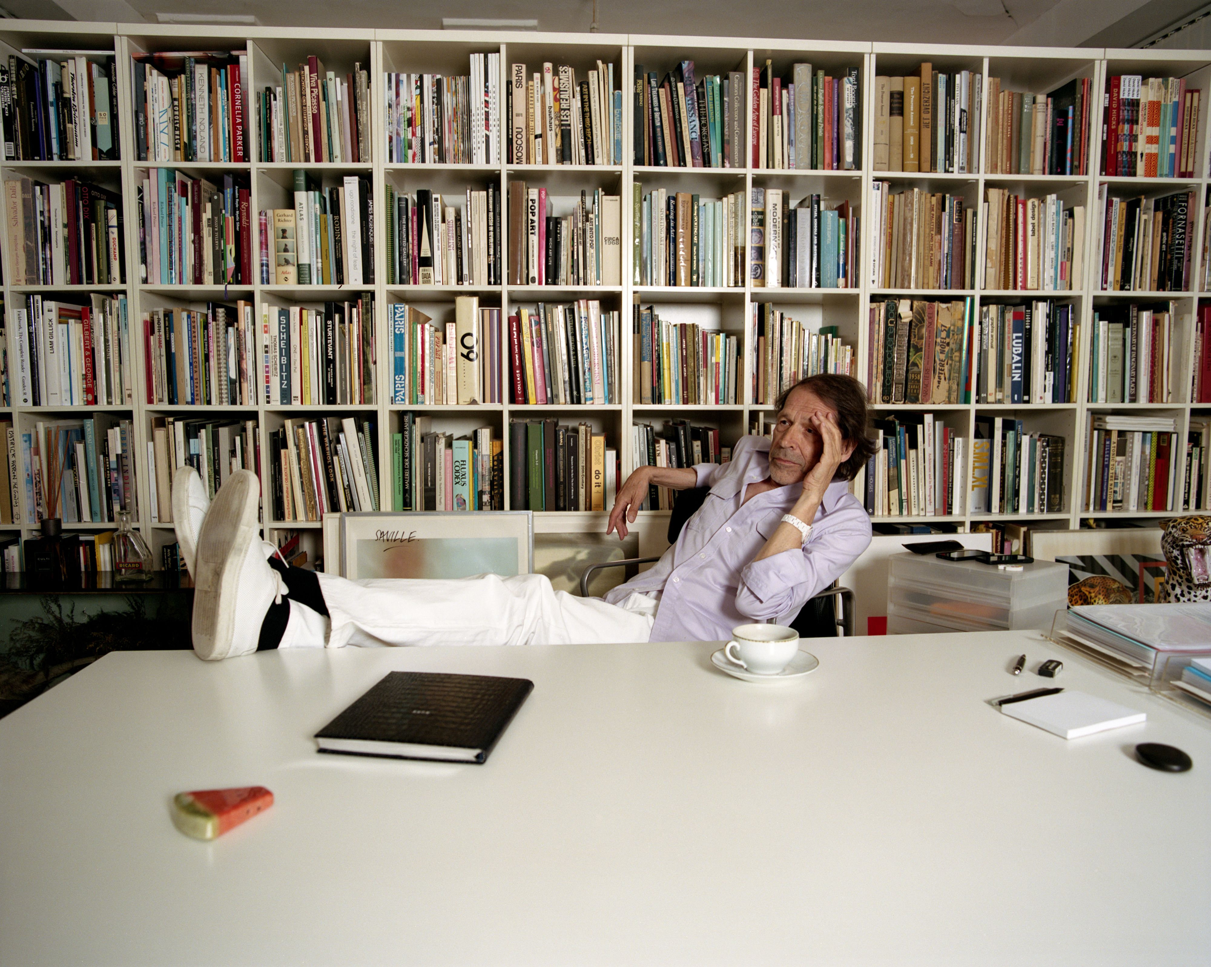
Portrait of Peter Saville by Kuba Ryniewicz for PIN–UP.