Exhibition view of “Diagrams: A Project by AMO/OMA”. Fondazione Prada, Venice. Photo: Marco Cappelletti. Courtesy: Fondazione Prada.
Exhibition view of “Diagrams: A Project by AMO/OMA”. Fondazione Prada, Venice. Photo: Marco Cappelletti. Courtesy: Fondazione Prada.
What produces criminals and prostitutes? Epilepsy, apparently. The unambiguous graphic depicting the visual field of “born criminals” appears in an 1897 edition of Cesare Lombroso’s revolting text L’Uomo Delinquente (The Criminal Man). It has all the trappings of diagrammatic objectivity: a gridded plane of concentric circles mapping eye movement, labels, and scales. Data! Thankfully, the garbage nature of Lombroso’s eugenicist theory that criminality is racially determined and genetically manifest has long since been discredited. Now, placed in a swanky vitrine in OMA’s new Diagrams exhibit at the Fondazione Prada in Venice, Lombroso’s graphic serves as a warning. Don’t eat everything you’re fed.
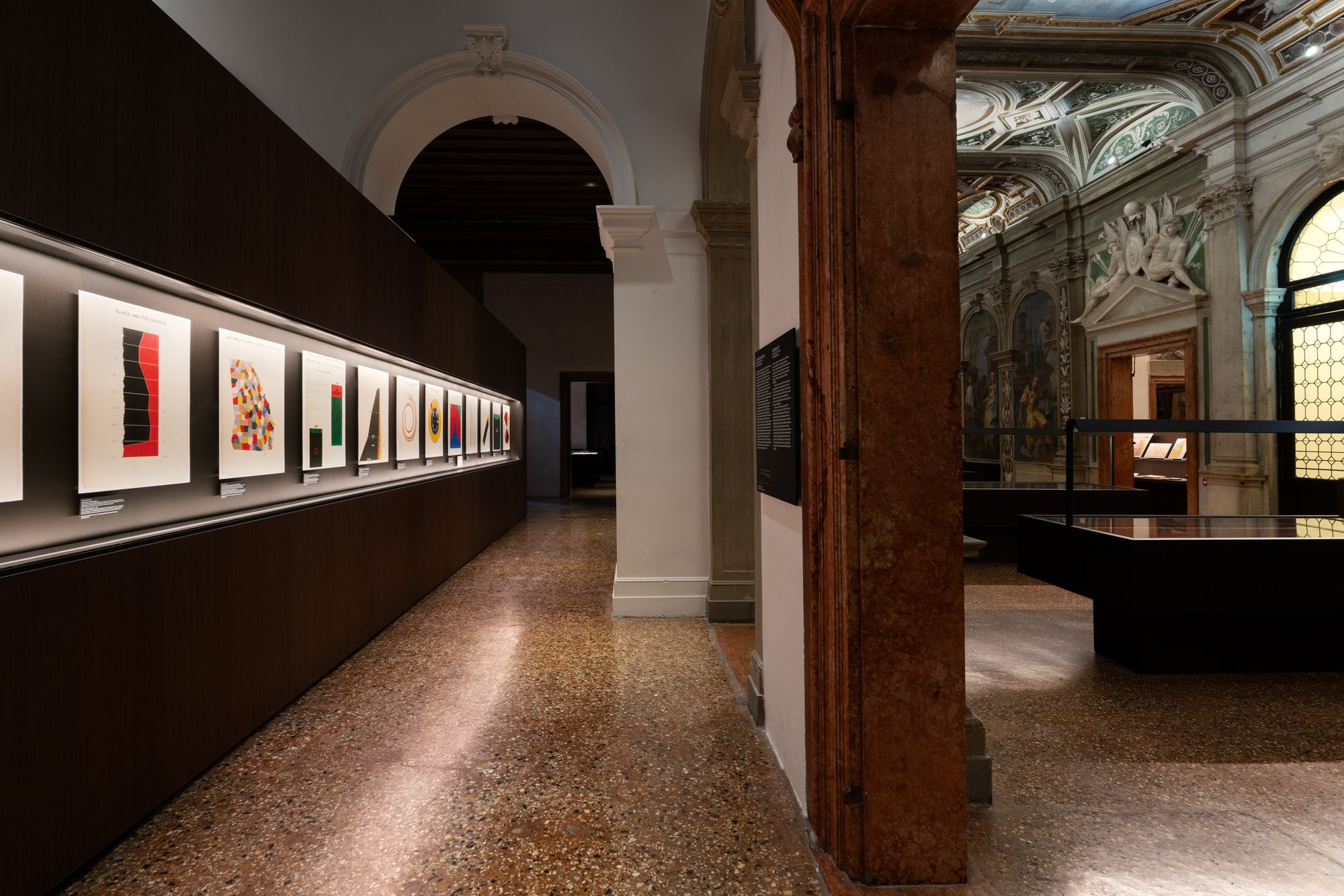
Across the Palazzo gallery is a very different kind of race science. For the 1900 Exposition Universelle in Paris, American sociologist and activist W.E.B. Du Bois created 58 brightly colored diagrams that convey the revolutionary changes in Black social and political life in the U.S. since the end of slavery in 1865 while still delineating the still-present economic disparity between African Americans and whites. Du Bois’s proto-Modernist graphics steal the show and, on their own, would make a trip to OMA’s archival tour-de-force worthwhile.
Exhibition view of “Diagrams: A Project by AMO/OMA.” Fondazione Prada, Venice. Photo: Marco Cappelletti. Courtesy: Fondazione Prada.
Exhibition view of “Diagrams: A Project by AMO/OMA”. Fondazione Prada, Venice. Photo: Marco Cappelletti. Courtesy: Fondazione Prada.
Exhibition view of “Diagrams: A Project by AMO/OMA.” Fondazione Prada, Venice. Photo: Marco Cappelletti. Courtesy: Fondazione Prada.
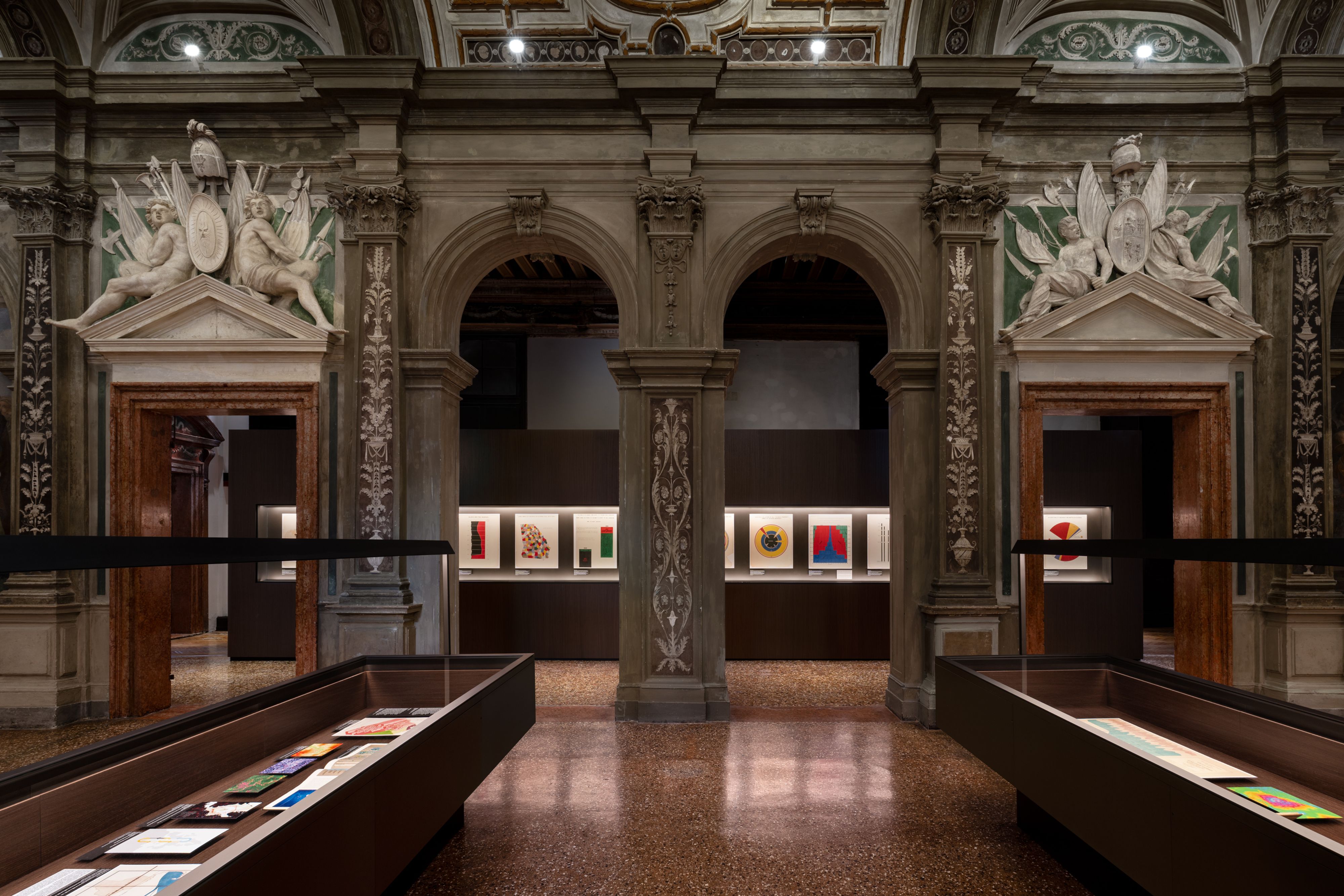
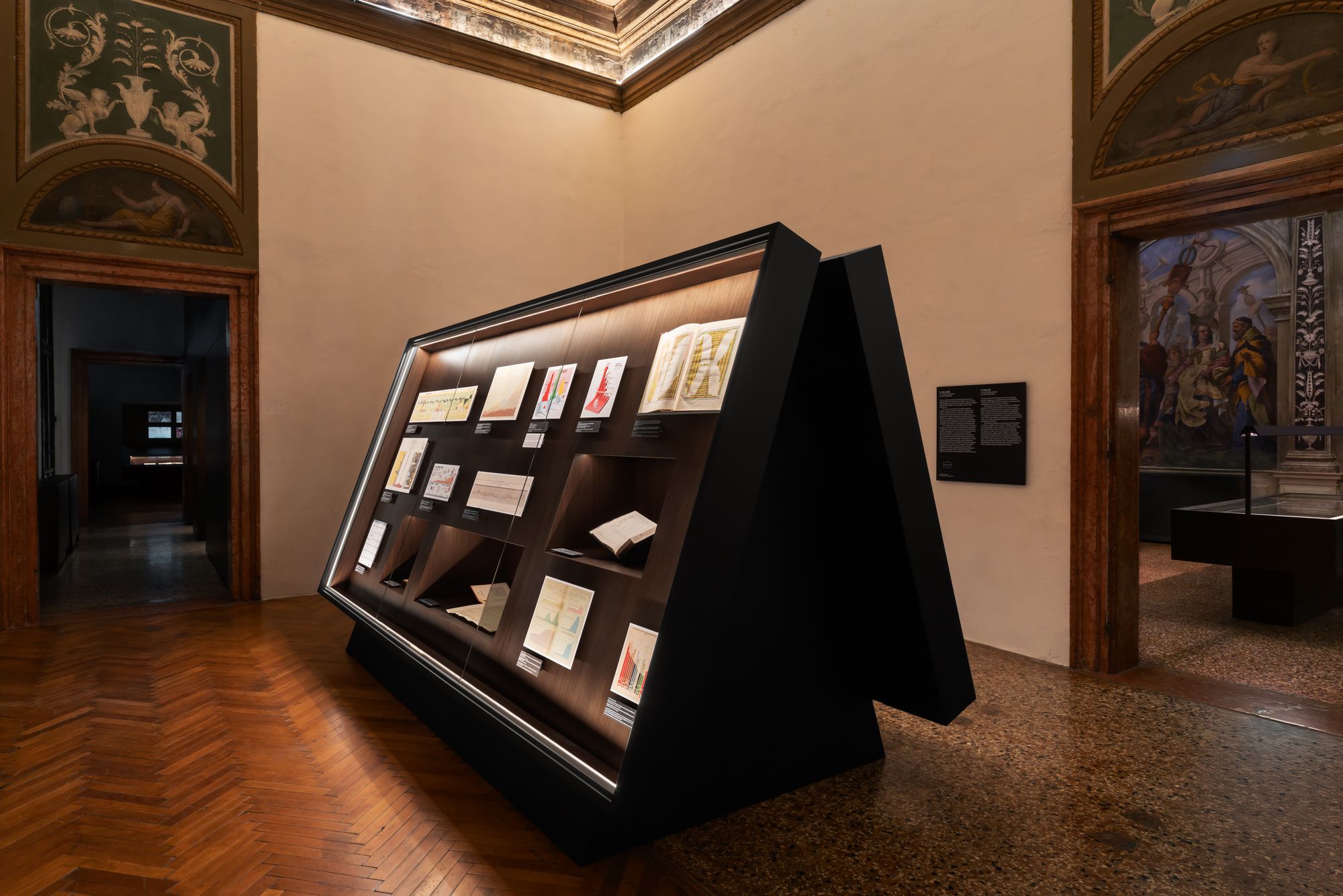
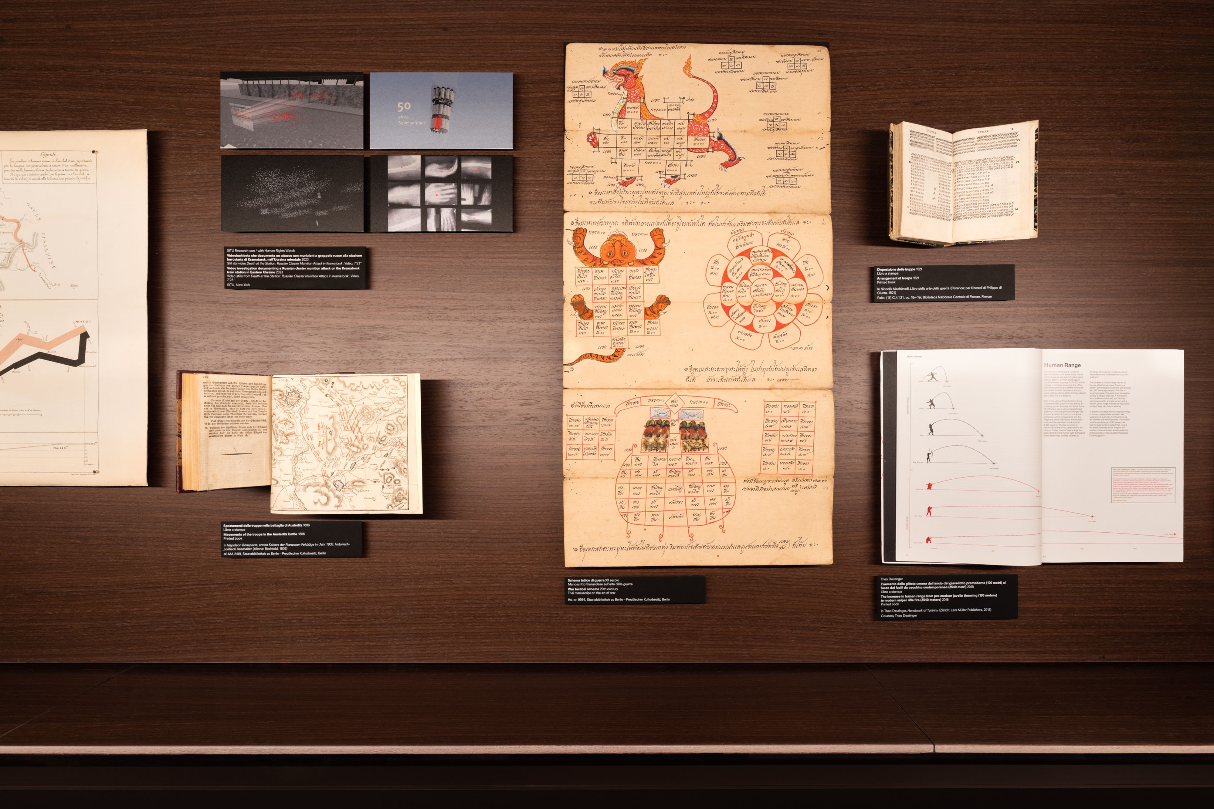
Instead of uplifting their own graphic-friendly practice, OMA juxtaposes a broad and deep selection of “diagrams” from 1200 C.E. until today in a stunning exhibition that hammers home both their value and their risk. Infographics nerds will rejoice at the sheer quantity of maps and charts to gawk at. The more than 300 items — some original artifacts, some reproductions — span nine thematic “urgencies”: the built environment, health, inequality, migration, environment, resources, war, and truth and value. OMA pulled off a rare feat — they made a wonky show feel sexy. The way it’s installed befits a luxury fashion house, with dim lighting, sleek custom cases and a playful Irma Boom-designed catalogue.
Total body (PET) multiparametric imaging sits next to esoteric, Buddhist organ charts, underscoring astonishing leaps in medicine over the past millennium and our enduring fascination with mapping the internal workings of the human body. Army formation diagrams by Machiavelli share space with Hiroshima bomb-impact sketches. Lombroso sits uncomfortably near Du Bois. As Rem Koolhaas, associate architect Giulio Margheri, and the rest of the OMA team state pointedly in their exhibition texts, the “aura of objectivity” is not the same as the real thing.
Unlike Koolhaas’ sweeping Countryside show at the Guggenheim, Diagrams avoids big Rem pronouncements on the state of the world or the grandeur of his project’s ambitions. “In my view, the diagram has been an almost permanent tool,” he offers in a catalogue interview. It’s almost a non-statement. Unless you’re quite thick, only equating diagrams with Microsoft Excel, humans have always communicated information visually. Architects surely know this.
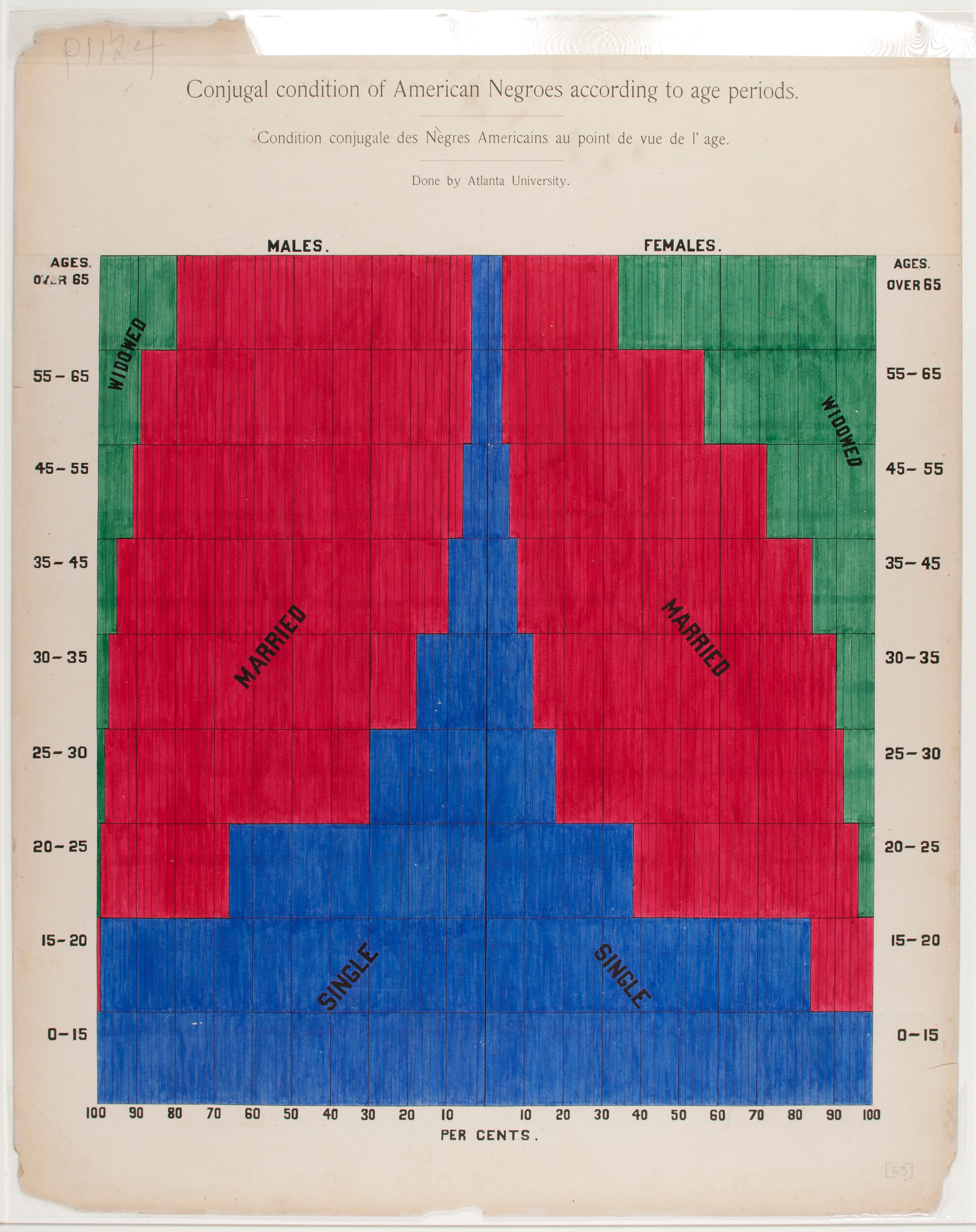
W.E.B. Du Bois, Conjugal condition of American Negroes according to age periods, c. 1900. Exhibition copy of a statistical chart illustrating the condition of the descendants of former African slaves now in residence in the United States of America, Atlanta University. Ink and watercolor on paper. Daniel Murray Collection, Prints and Photographs Division, Library of Congress, Washington, D.C. Courtesy Library of Congress, Prints and Photographs Division Washington, D.C., Daniel Murray Collection.
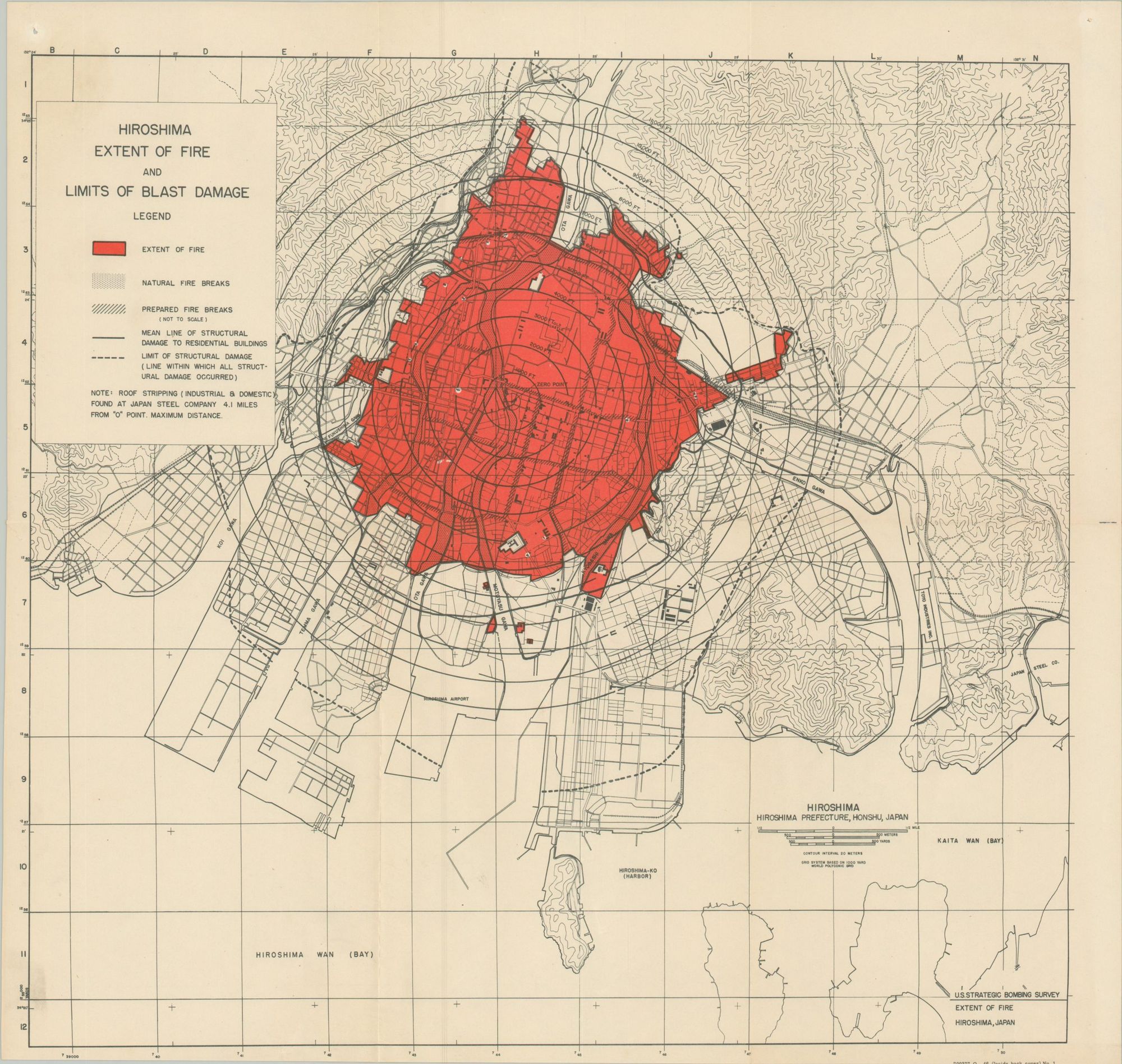
Hiroshima extent of fire and limits of blast damage, 1946. In The United States Strategic Bombing Survey, The Effects of Atomic Bombs on Hiroshima and Nagasaki (Washington, D.C.: Chairman’s Office – Government Printing Office, 1946). Printed book. Courtesy of Curtis Wright Maps.
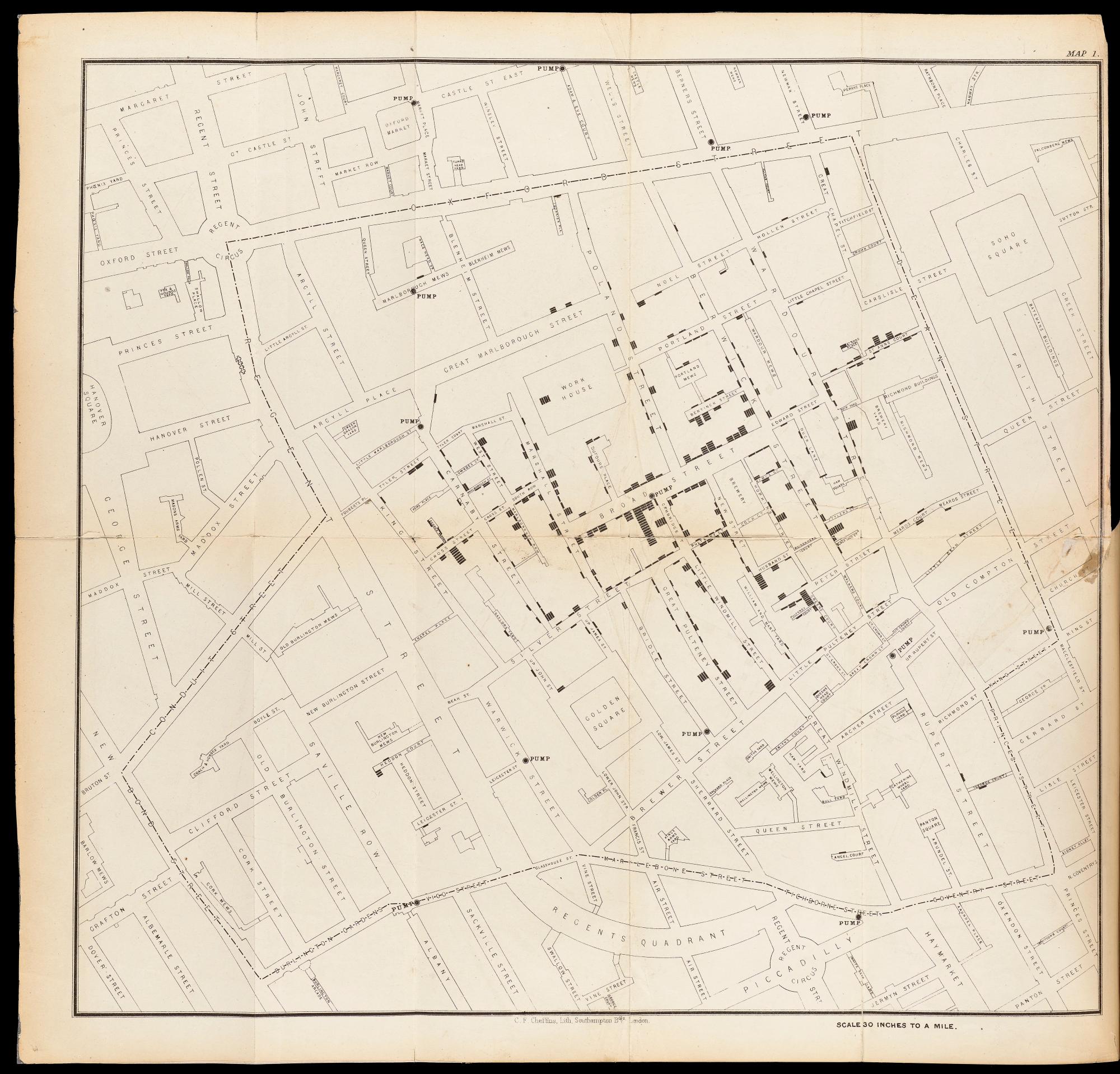
John Snow, Map of the 1854 cholera epidemic in London 1855. Originally published in On the Mode of Communication of Cholera (London: C.F. Cheffins, 1855). Printed book. Wellcome Collection, London.
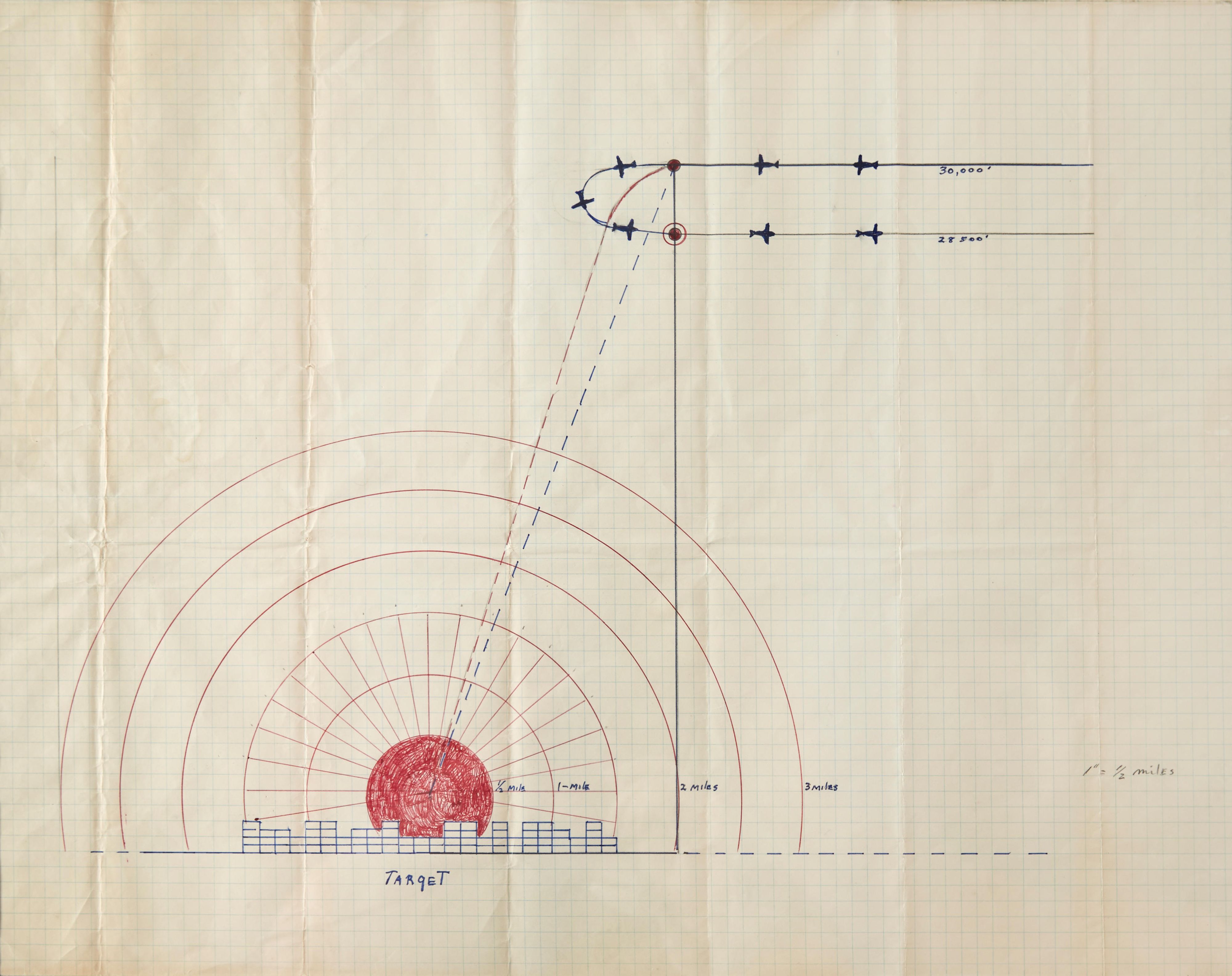
Robert A. Lewis, Bombing plan for the dropping of the atomic bomb on Hiroshima [August 6, 1945], 1945. Drawing, pencil, and ink on paper. Courtesy of Bonhams.
Koolhaas continues: “this means that [diagrams] not only exist by default in any new medium but can also be applied to virtually any area of human life.” Any area! While hardly a revelatory observation, it jives with the thematic pacing of the show, where as much space is dedicated to topics like “Migration” and “Truth” as the “built environment.” OMA inserts itself only eight times across the whole show. When I spoke with Magheri, he pointed out how certain topics, like environmental sustainability, are hard to trace further back than the 19th century, while others, like astronomical charts, are ubiquitous across both geography and time.
Tribute is paid to the diagram greats. You’ll find Le Corbusier’s sketches on sun movements and his Study for La Ville Radieuse, as well as sociologist Ernest Burgess’s accursed concentric zone model of Chicago (1925) that has influenced bad land-use policies over the past century of American urbanism. Diagrams like these moved the needle — sketches that launched 1,000 buildings.
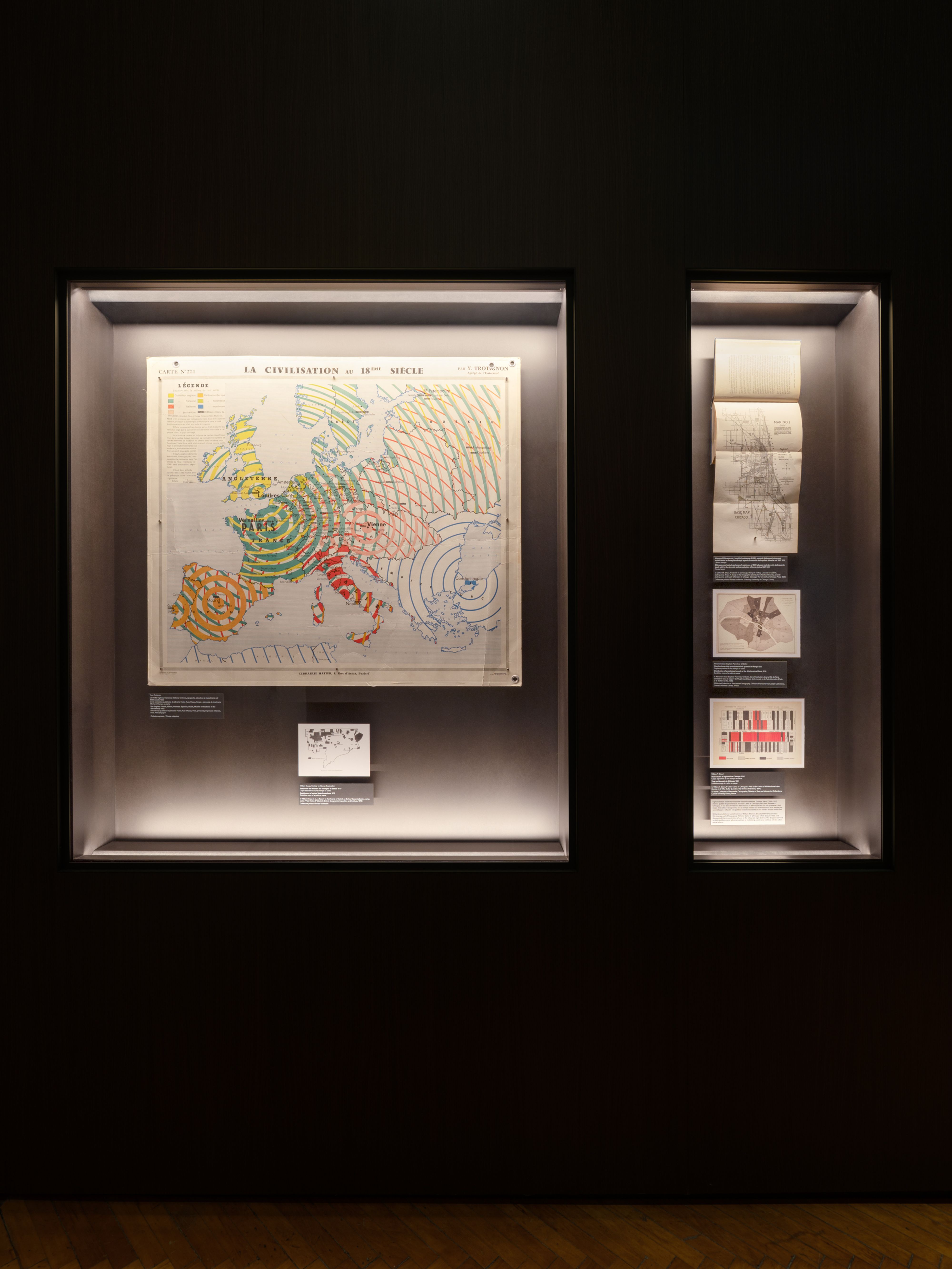
Other entries are more niche, or just plain beautiful. Take, for example, John Auldjo’s multi-color map of Vesuvius’ lava flows over the centuries (1832), or Atmos Lab’s heat concentration maps of the iconic tube staircase snaking up the façade of the Pompidou (2024). But, how important is aesthetics when it comes to diagrams? Margheri, head honcho of the OMA research, scoffs at the question. “It’s distracting. Sometimes you look at stuff and say, ‘Oh, this is great.’ Then you look at the information, it’s like… eh.” A textbook “eh” example is Yves Trotignon’s map of spheres of “civilizational” influence in 18th century Europe. It’s visually stunning, yet politically dubious. How can Trotignon claim that fat bands of French influence emanate across the European continent while “Muslim” civilization has little to no mark on the Balkans? Unsurprisingly, the Franco-centric map is taken from literally a textbook that was distributed to French school kids in 1950.
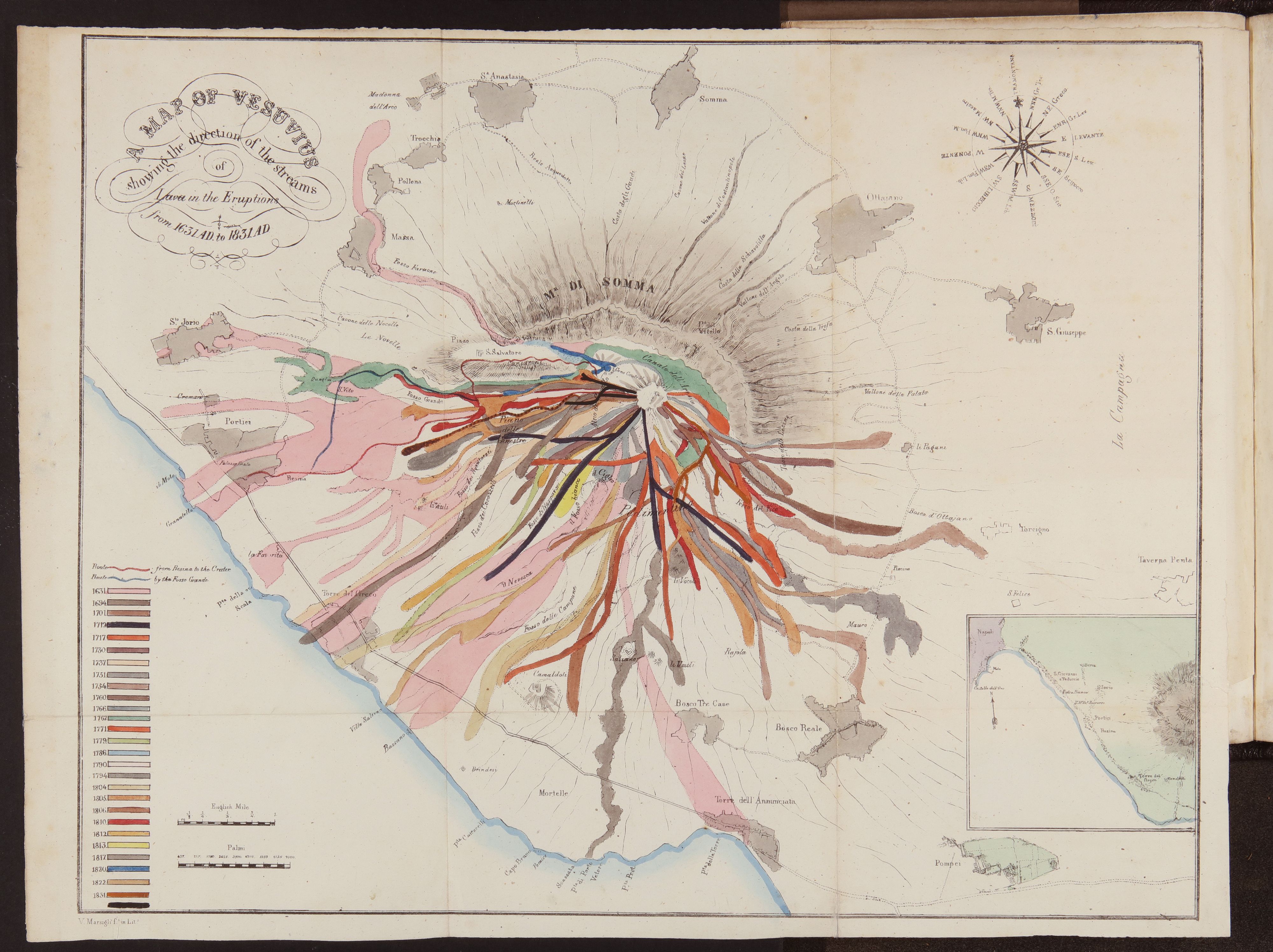
John Auldjo, Map of Vesuvius showing the direction of the streams of lava in the eruptions from 1631 to 1831, 1832. Exhibition copy from a printed book. In John Auldjo, Sketches of Vesuvius: with Short Accounts of Its Principal Eruptions from the Commencement of the Christian Era to the Present Time (Napoli: George Glass, 1832) Olschki 53, plate before p. 27, Biblioteca Nazionale Centrale di Firenze, Firenze. Courtesy Ministero della Cultura – Biblioteca nazionale centrale di Firenze. Any unauthorized reproduction by any means whatsoever is prohibited.
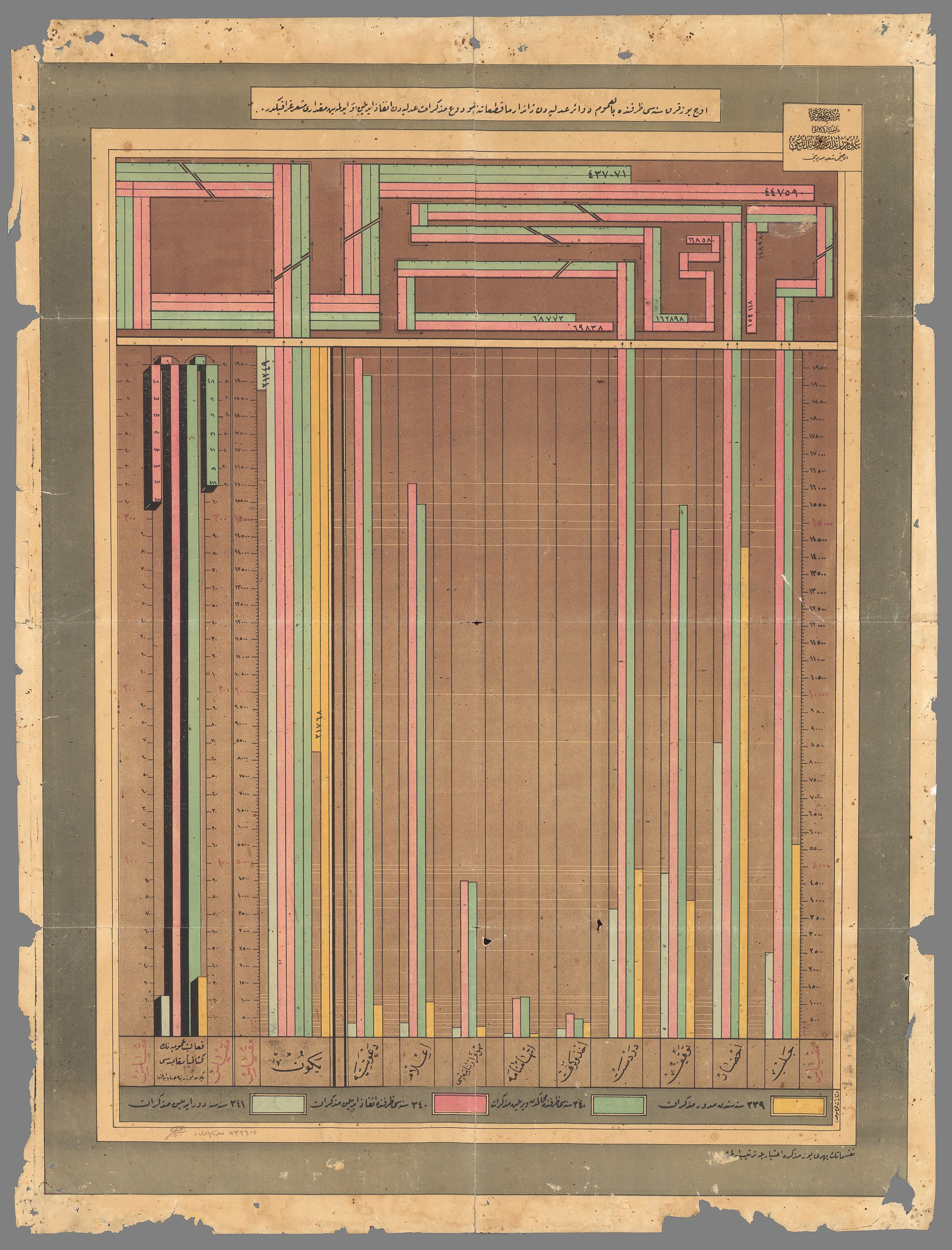
Republic of Turkey Ministry of Internal Affairs, Statistical chart for the year 1340 [1924] given by the Ministry of Justice to Police Departments, recording the number of people released and not released by the Courts, 1924. Exhibition copy of a print on paper. David Rumsey Map Collection, David Rumsey Map Center, Stanford University Libraries. Courtesy David Rumsey Map Collection, David Rumsey Map Center, Stanford University Libraries.
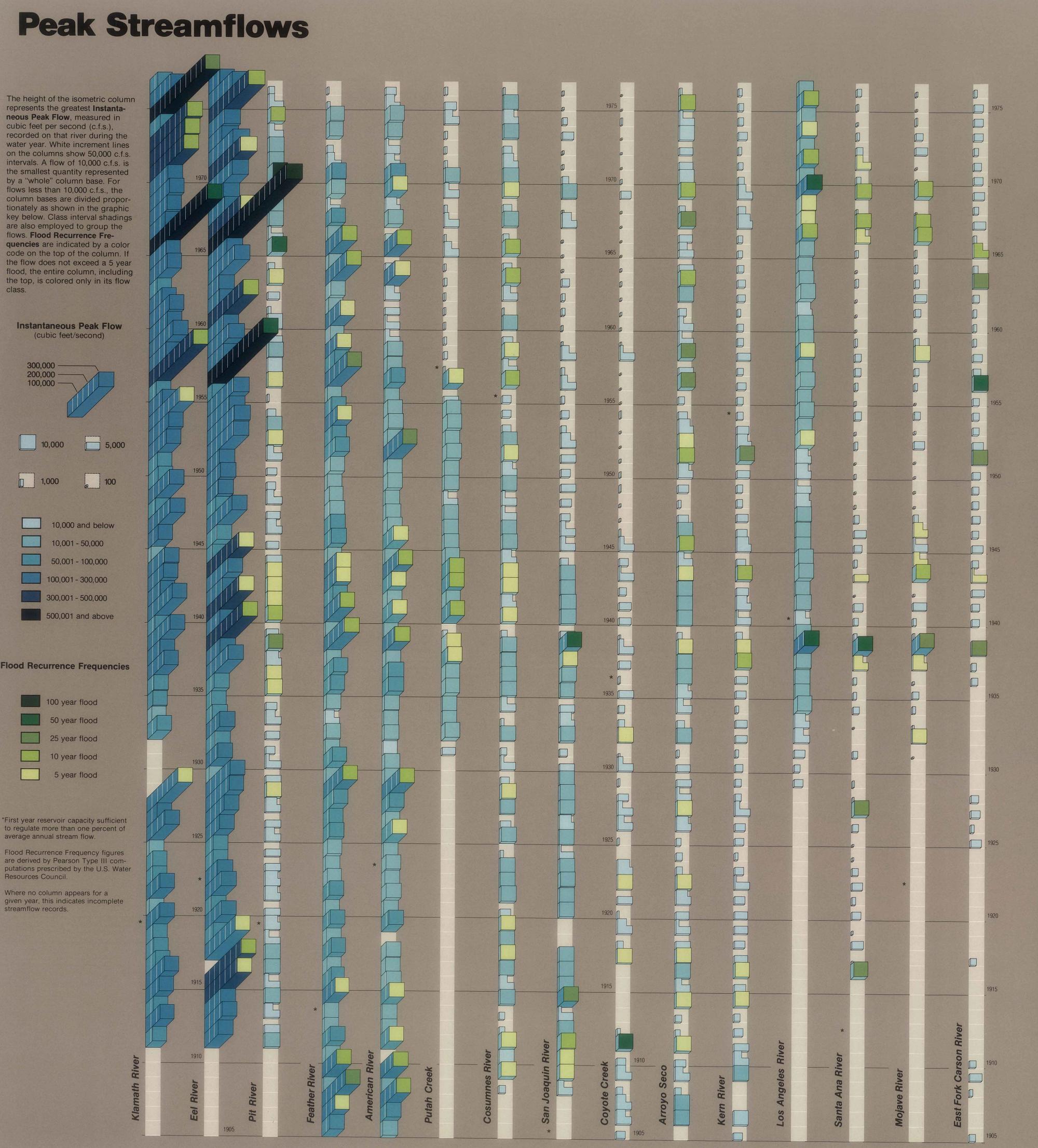
Peak streamflows in California from 1905 to 1975, 1979. Printed book. In William L. Kahrl, William A. Bowen, Marlyn L. Shelton, David L. Fuller, Donald A. Ryan, Stewart Brand, The California Water Atlas (State of California, Sacramento, CA: Governor’s Office of Planning and Research, 1979). Private collection. Courtesy California Governor’s Office of Planning and Research.
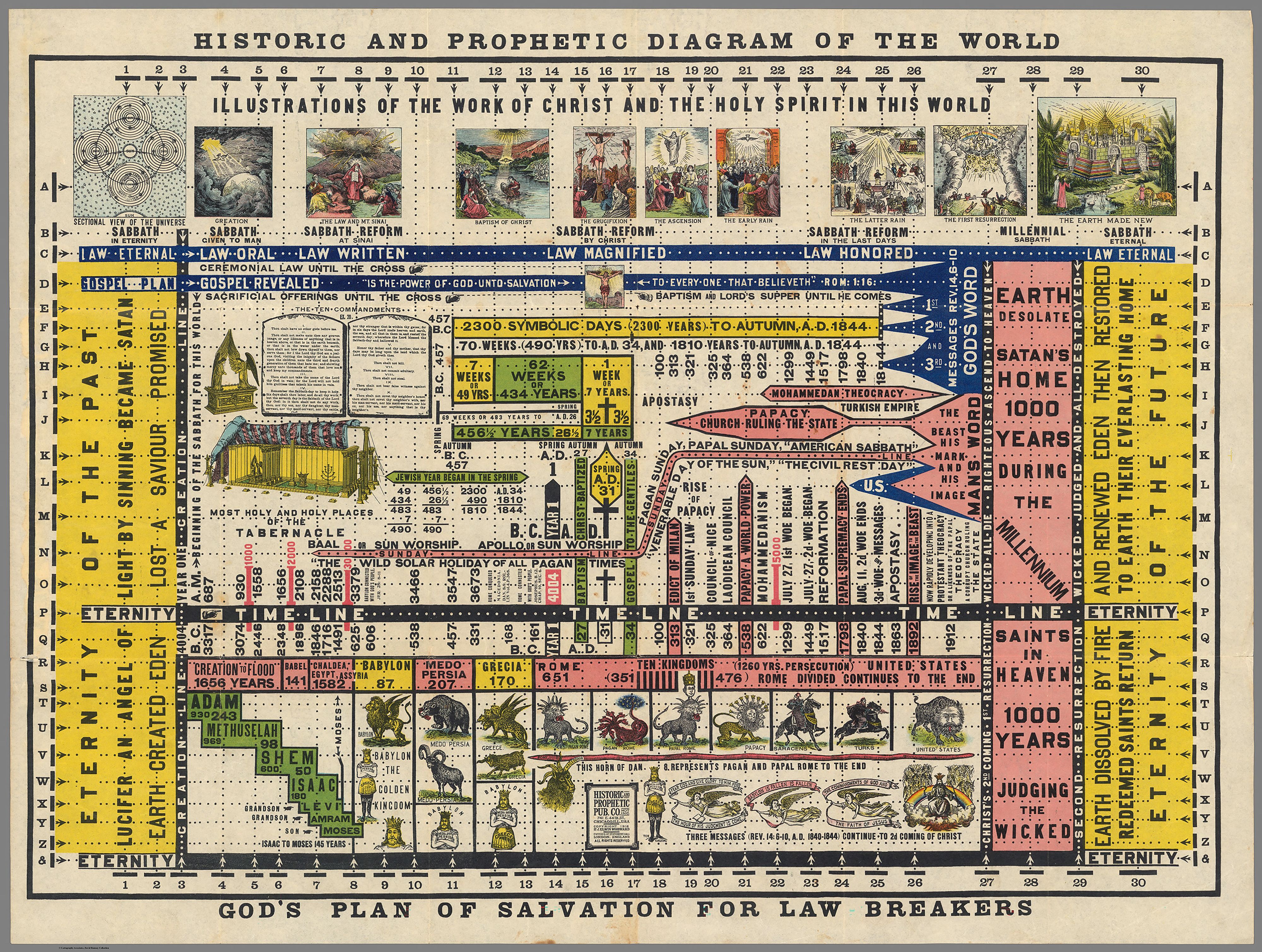
Elwin J. Woodward. Historic and prophetic diagram of the world: God’s plan of salvation for law breakers, 1912. Colored lithograph, exhibition copy. David Rumsey Map Collection, David Rumsey Map Center, Stanford University Libraries. Courtesy David Rumsey Map Collection, David Rumsey Map Center, Stanford University Libraries.
With this question of beauty in the balance, Margheri and team aimed for a middle ground between visual style and bite. “We get excited when things are beautiful, but I think it’s even more exciting where things are meaningful or instrumental to some achievement.” He cites John Snow’s 1854 map of London, which pinpointed a cholera outbreak around the Broad Street water pump. It discounted the predominant miasma theory that disease was spread through bad air. Mundane looking, but revolutionary.
When asked about the difficult task of selecting which visualizations would make the cut, Margheri admits, “There was so much that we could have selected. It’s not that we selected the best stuff in the end. We selected things that made sense in this moment.” It’s unfortunate then, in the section on “war,” that there is very little pertaining to the bombing out of Gaza and Ukraine, aside from one pre-October 7th diagram of an airstrike by SITU Studio. The IDF is certainly keeping their genocidal plans close to their chests, but many more compelling graphics from sources like Forensic Architecture and the BBC do exist.
What the content-rich show lacks is a sharp curatorial perspective or call to action beyond the humble suggestion that yes, diagrams are an enduring human artform, and it would be wise to be literate in them. “There is no such thing as an innocent map,” observes Philippe Rekacewicz, the French critical cartographer, in a catalogue essay. His incredibly childike, colored-pencil maps of migration flows contain biting indictments of the racist European establishment. Another accompanying essay by researcher Kate Crawford comes to the same conclusion. “The idea that data can speak for itself is highly problematic. Data is never neutral,” she wrote. Crawford was awarded this year’s Silver Lion at the Venice Architecture Biennale for her Arsenale contribution Calculating Empires: A Genealogy of Technology and Power Since 1500. The 24 meter-diagram “follows the relationship of technology and power across five centuries of empire in order to give a deeper historical understanding of the current tech oligarchy”. There we go — a clear intent. Diagrams are made by people, with subjective interests, trying to make a point. What then is the point of this exhibition?
Exhibition view of “Diagrams: A Project by AMO/OMA.” Fondazione Prada, Venice. Photo: Marco Cappelletti. Courtesy: Fondazione Prada.
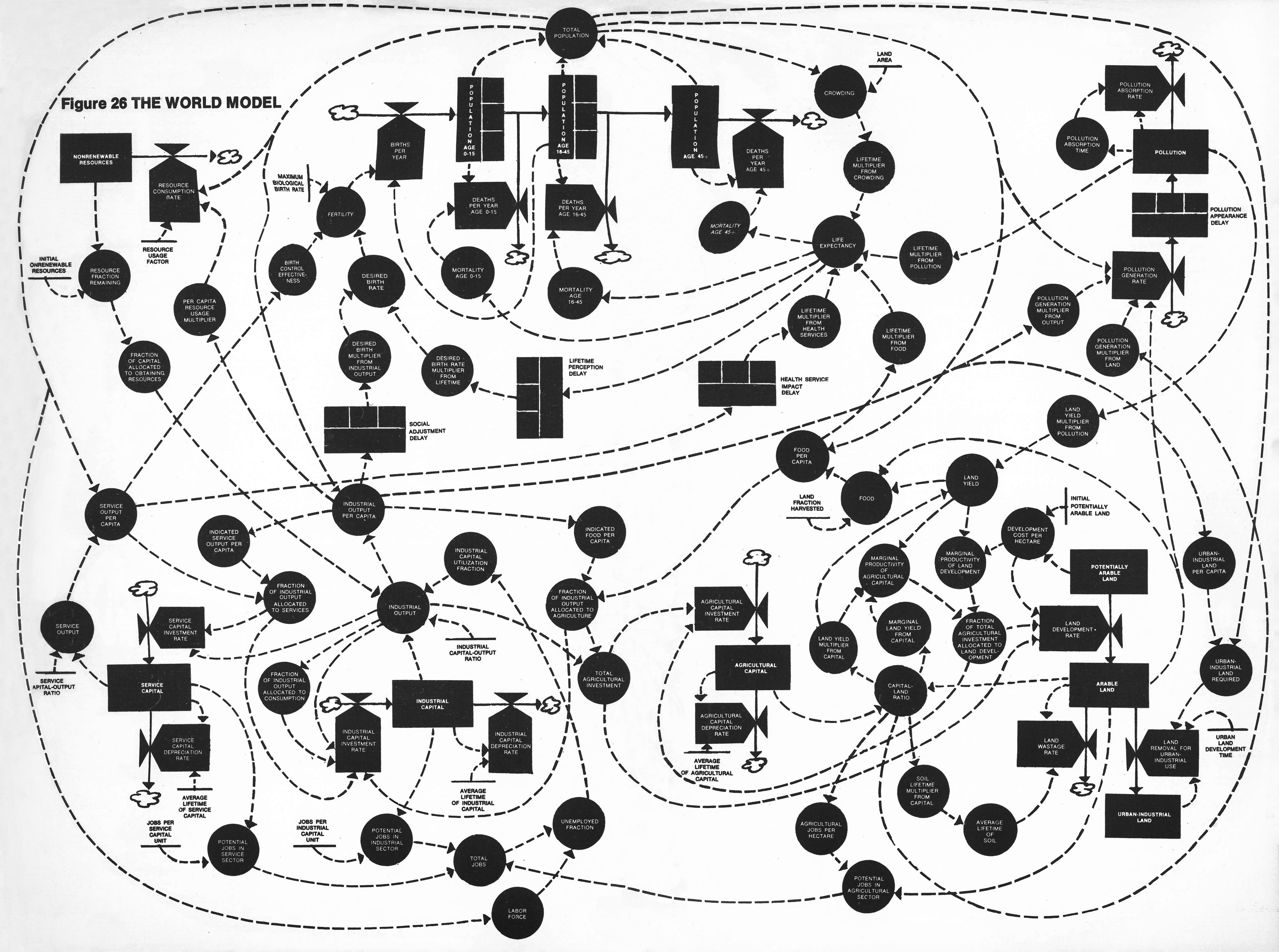
The world model, 1972. Printed book. In Donella H. Meadows, Dennis L. Meadows, Jørgen Randers, William Behrens III, The Limits to Growth. A Report for the Club of Rome’s Project on the Predicament of Mankind (New York: Potomac Associates – Universe Books, 1972). Private collection. Courtesy of the authors via System Dynamics Society.
As artificial intelligence scans and remixes all corners of possible data into new visualizations dumped into our feeds, and consistently makes unfounded claims, it’s worth reflecting on the future of diagrams. Within hours of Trump floating his intention to annex Greenland and the Panama Canal, I was recommended an AI-generated video full of charts, maps, and a doom-coded Animoji explaining why Trump’s plan, historically speaking, made sense. Algorithmic computation runs on zeros and ones, not persuasive diagrams. Diagrams are a human product, for human eyes, to make sense of a human world. What happens when we lose authorship? OMA’s show might not have the answer, but it dishes a thoughtful serving of diagrams for all of us geeks to chew on — carefully.

AMO/OMA. Model for the “Diagrams” exhibition, Ca’ Corner della Regina, Venice. Courtesy AMO/OMA, photo by Frans Parthesius.