JF’S HIT LIST

12 Design Objects for Each Month of the Year

by Angel Harvey-Ideozu, jf

jf, formerly known as Jenna Fletcher.

Right in the midst of the 2020 COVID lockdowns, a seller of 60s and 70s modern furnishings cropped up on Instagram under the name Oswalde. Churning out fun, pop imagery — sometimes of limbs holding, lifting and throwing iconic design pieces — its founder, Jenna Fletcher, opened design up to a new, younger market. She showcased the Italian and Japanese design greats alongside rising Black contemporary designers, such as Nifemi Marcus-Bello and Andu Masebo. Two years later, and with Oswalde influence duly spread, the project shuttered, and its owner quietly exited the internet. Holed up in a studio for the last year and a half, jf, the artist formerly known as Jenna Fletcher, has spent the time since privately making art. Engaging with industrial remnants such as bagasse ash — the fine, silica-rich residue left after sugarcane stalks are burned for fuel — her work explores how such altered materials hold memory and complicate ideas of permanence, value, and decay. When PIN–UP started to plot a design round-up to bring the year to a close, her name was first on the list. From the Barbadian Monkey Pot, which the collector-turned-artist speaks about with deep reverence for its connection to her heritage, to Tobia & Afra Scarpa’s “sexy” Vanessa bed, here is jf’s twelve-item long list of her favorite design items — one for each month of the year.

Enzo Mari for Danese, 16 Pesci puzzle, 1957.


I think this is such an interesting piece of design because I’m not sure it’s widely known that Enzo Mari made these. It speaks to such a playful levity and respect for the natural world. His other designs are so industrial, utilitarian, and overtly practical, although there is playfulness in places. For a designer to make a kids’ puzzle is very beautiful and humble in a way. I think we need more designers making kids’ toys instead of leaning into the overt functionality [and seriousness] of design. I saw one the other day at this beautiful shop in L.A. called Object on Melrose. They have a couple. They’re just beautiful. I just really need to have some kids so I can buy one! But also, why do we reduce a puzzle to being a kid’s item? Photo courtesy of Casati Gallery, Chicago.

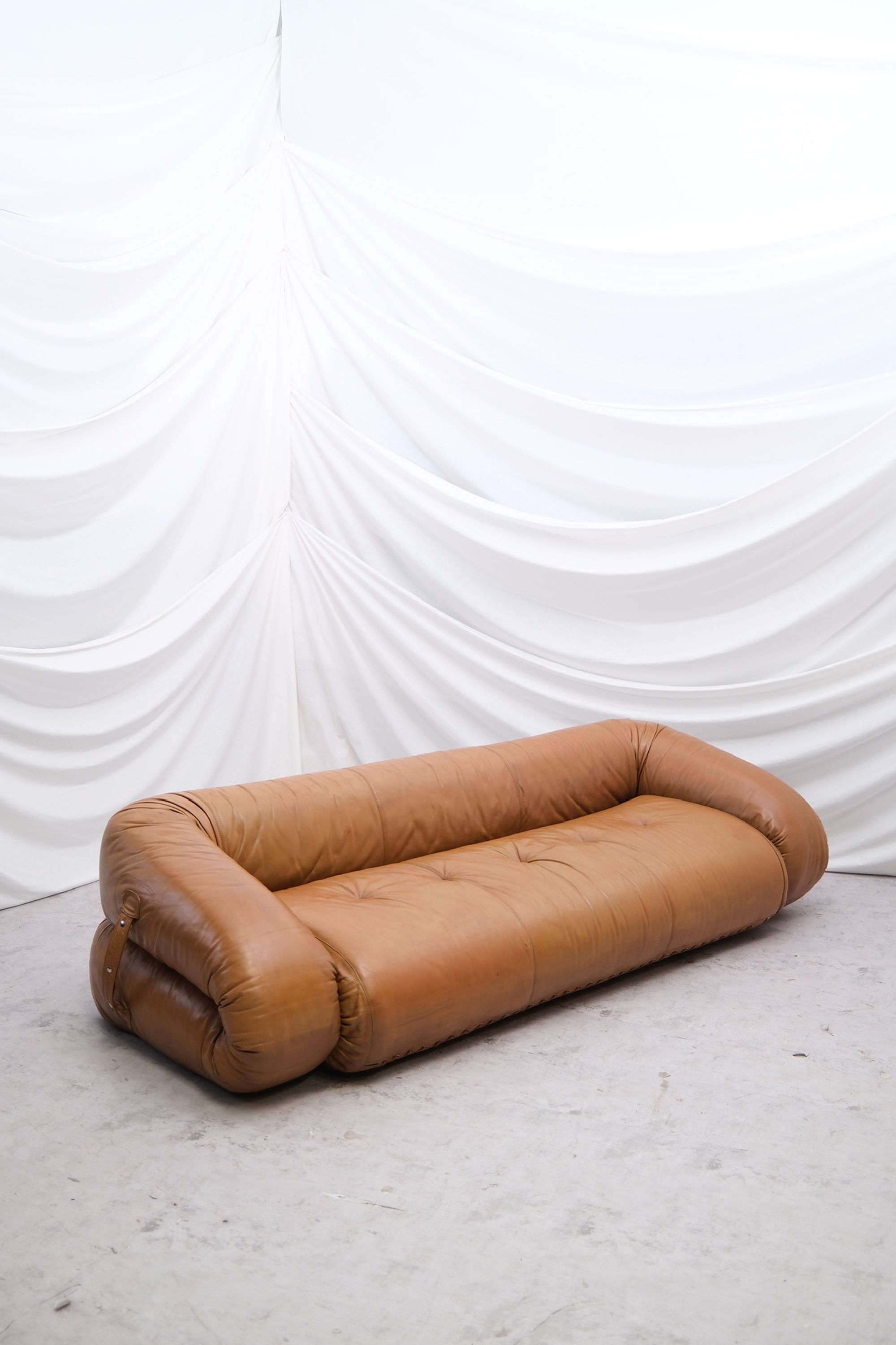
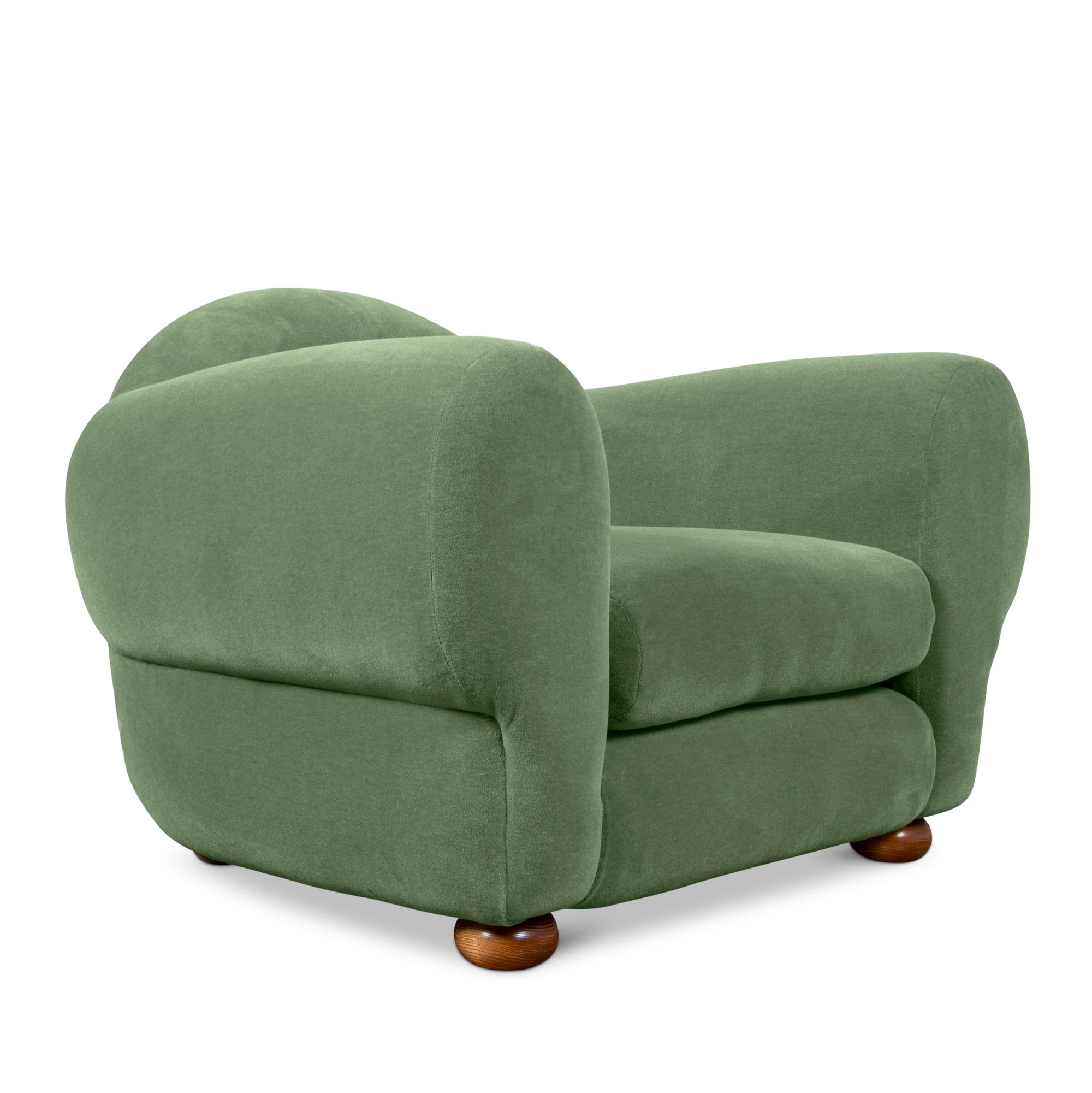
Commune for George Smith, Muffin collection, 2024.


They’re so good. I love this nod to the deco-y, Jean-Michel Frank-y kind of design language. I think it’s the perfect chair. She’s a curvy girl. She looks good in any house. Commune is a sleeper interior design company for us Europeans. I feel like in America they have quite a respected reputation. But they just do some iconic shit. And I think collaborating with George Smith is quite [wild]. When you think about Smith, you think about those chesterfields and those ye olde English designs, but this is super modern and fab. I’m dying for one. I want it in this dusty green color. It reminds me of the sofas in the rooms at Chateau Marmont. But also, it kind of looks like it’s washed out a bit — like it’s been through 60 years of people smoking on it. It’s also a testament to how the sun has California in such a chokehold — the very materiality of furniture has no other option than to weather and fade, and the color dissipates. I heard something on a podcast about how, in California, one of the biggest luxuries is shade, because of the omnipresent, never-ending sunlight. Whenever I’m driving around L.A., I think about that: which neighborhoods have trees and who gets to experience the shade. Photo courtesy of Commune and George Smith.

Barbadian Monkey Pot, 16th century.


I only recently discovered these. I don’t want to spoil anything, but I’ve been working with a form of industrial debris only found in Barbados and spending a bit of time on the island, trying to learn more about our materiality as a country, which is how I stumbled across these monkey pots. I have a mini one. I’m sure that the design was probably imported by some nefarious interlopers, but it’s essentially our riff on the water jug. It’s unglazed earthenware, so evaporation from the outside cools the water inside. Allegedly, people used to hide their valuables in them. Hydration and valuables. The two essential plinths of keeping yourself alive. In my research, I’ve stumbled on a number of our ingenious ways of purifying water. We had these huge, carved limestone vessels that are literally dripstones because limestone is porous. The monkey pots, I think, are a really amazing example of my ancestors prioritizing hydration, which I’m very proud of. I’m sober, so I’m a water aficionado. It’s a huge thing in our house, but also a huge thing to my Bajan people. Photo courtesy of jf.

Alessandro Becchi for Giovannetti Collezioni, Anfíbio, all sizes, 1969.


These are perhaps an obvious choice because they’re quite ubiquitous now, but I don’t mind being obvious. [My partner and I] have a couple. With this list, I’ve chosen things that I own or yearn to own. The search for a sofa bed that was practical and chic — the two plinths of design — was never-ending for me until we found these. They’re an amazing piece of design in their construction and materiality. They’re also phenomenally uncomfortable to sit on as a sofa, which I think is a key attribute to an object being a central piece of design: that it’s actually just fucking uncomfortable. I advocated very heavily for us to get one of these. We got a camel-colored, dusty brown three-seater, and after a couple of months we were like, we can’t sit on this. You can’t lie on it, can’t cuddle on it, can’t do anything on it. So we moved it. The armchair is very practical, though. We have a brown one and we let our three-year-old niece sleep on it when she stays over. She obviously doesn’t understand that she’s sleeping on a piece of design. She’s lying face down, and we’re like, “Agh!” But we use it, and I think that’s key. Photo courtesy of Pino Interiors.

Josef Hoffmann for Bieffeplast, letter tray, 1905.


We have one of these in our loo. We keep incense matches in it, which I think is quite luxurious for a bathroom. It’s very us. I really relate to [Josef] Hoffmann’s preoccupation with the grid and geometry, going against [Henry] van de Velde’s use of curvy motifs in Art Nouveau. I love lining things up. I find that repetitiveness really fascinating. I think his Bieffeplast pieces are so simple and special. I’ve had this piece for a long time. When we moved into our new house last year, we riffed on its [square-perforated] design and had some door handles made for our bedroom cupboards, which are very good. It just came to me one day. It’s such a thrill. A hollaback to some of my favorite pieces. Photo courtesy of Béton Brut.

Rei Kawakubo, Rare chair no. 33, 1991.


My approach is that I don’t think this is a chair. Or is it? It’s like how [Rei] Kawakubo says she doesn’t make clothes. Her runway pieces aren’t clothes — they’re ideas and propositions. But it’s really a dress. [Laughs.] She hasn’t made a chair, but it’s a chair, so I think there’s some playfulness there. I think that in this context she is overtly challenging our notions of comfortability — what we need from a chair or what we idealize in a chair. She made a number of these in the early 90s. Some of them are more overtly practical. This one subverts all of that. I’m sure people do sit on it, but you’re not going to. I’m giving the design the benefit of the doubt. It’s interesting to interrogate what seating is and should be. And I think that this sort of violently reductive form of a chair is really beautiful in a way. It’s sort of an affront to approachability, which is really important to consider through her oeuvre. But I’m a [Rei] super fan, so I’m fighting for this one. [Laughs.] But I do understand the pretence in this instance. It’s not lost on me. Photo © A1043 / Yann Bohac.

Eileen Gray, pair of black-lacquered screens, c. 1922–1925.


Just perfect. I really enjoy lacquered items. I got into a bit of a fight in my head about whether this was art or design. I’m obsessed with screens. They’re so weird and beautiful. I love the idea of dissecting spaces — warping, splicing, and repeating space. This is the epitome of a perfect screen. Screens often correspond to height and humanity, and it’s interesting that these don’t. They’re super tall. Eileen Gray is top five designers. Ever. The lacquer is one of my favorite finishes. Ever. My art and visual practice right now explores a lot of screens. I relate to their confrontation with human corporeality. A screen is confronting and authoritative in the way it dissects a room, but it’s also very secure.

Sori Yanagi, Sori Yanagi cookware, 1974 onwards.


I love cooking. It’s how I feel okay again. My design problem is going to a restaurant and being like, how can I recreate this at home? We went to Peru earlier this year, and I came back with some very good ideas and ingredients. I think this suite of kitchenware is so beautiful and well designed, especially the kettle. I have a connection to it. We’re on our second one because it’s an actual kettle that you put on a gas stove. You have to watch it. We burnt the first one out and almost ruined our kitchen in doing so. It takes concentration and dedication. It doesn’t whistle. It doesn’t make a sound. It’s a real duty of care, hovering and caring about something as simple as boiling water. It’s quite spiritual. The dedication to this kettle makes me feel alive. I saw that Jonathan Anderson also has it and I’ve never been so jolted in my affirmation and happiness. I usually think it’s horrible when someone else has something that I have. In fact, it’s something that I strive not to ever feel — in my clothing, in the ceramics that we source. I’m gatekeeping the color of our house because I just absolutely do not want people to have the same walls as us. But the little Jonathan Anderson fan girl in me was like… [Screams.] Photo courtesy of Jihen.

Shiro Kuramata, Issey Miyake stores, 1980s.


These stores are just an exemplary demonstration of restraint. The use of star terrazzo in the store interiors reflects [Shiro] Kuramata’s belief that the material is the voice. That is a philosophy that I think is just above all: the material is the content of the furniture itself. Star terrazzo is really interesting as a material, and the continuity of its application into the table, the table top, the table legs, walls, cladding, the floor — that all-encompassing execution is so fucking effective. It's so reductive and so simple, but it becomes very futuristic. That kind of polarity is wild. The metal mesh used for cladding and for structure, for pillars, just fucking blows my mind. A subheading for this input would also be the Kuramata-designed bottles for the Issey [L’Eau d’Issey Extract Edition Shiro Kuramata] perfume, which is a continuation of these philosophies. His objective was converting liquid into object, and I think that’s fucking brilliant. Perfume bottles are these pieces of design that are so ubiquitous yet overlooked. It’s not very modern to collect perfume bottles anymore, but in the 90s, that was a really effective place to demonstrate the continuation of a design idea. Look at the [Jean Paul] Gaultier perfume bottles. They’re like horcruxes. Not to fucking quote Harry Potter. It’s exemplary restraint and I stand by that. I have a table that was designed by one of Kuramata’s interns, Michele Barro Savonuzzi. The legs are this metal mesh and the top is a beautiful piece of veneered, blue timber.

Tobia & Afra Scarpa for Gavina, Vanessa superking bed, 1959.


Again, we have this bed. I had to sort of re-engineer the slats with an emergency, CNC-cut MDF design to reinforce the mattress and make it remotely sleepable, because the bed basically doesn’t have any slats. Now it’s the most comfortable bed in all the land. It’s ginormous. It’s one of those pieces of design where the form is such a reduction of what a bed frame can be. I’m a campaigner for sexy beds. There aren’t really that many beautiful, well-intentioned beds out there. I think they’re an afterthought. This is skeletal and it’s really beautiful. It kind of hovers above these sort of really thin legs. I personally am a big fan of this bed because I get to sleep in it every day. I’m a very happy person. Photo courtesy of Béton Brut.

Ingo Maurer and Ron Arad, aR-ingo floor lamp, 1984.


This is a submission from Alva, my partner. They have this lamp at Dr. Karen Doherty’s clinic, where she gets facials, and she always comes home from there, going on and on about this lamp which makes her feel things. I think Max Radford did the clinic’s interiors. To me the lamp looks like a Himalayan monal. It’s so sassy. Ingo Maurer and Ron Arad are really interesting because they’re both very divisive. People either love them or hate them. I’m not sure where I stand on that binary, and we’re not in the business of trashing anyone’s name, but Maurer is so interesting because, in my subjective opinion, some of his work is the most divine thing, then some of it makes me want to poke my eyes out. His oeuvre is just so intense and spans so many wild ideas. But the coming together of these two designers on this lamp is really interesting. Photography by Sophia Aerts. Courtesy of Jacqueline Sullivan Gallery.

Toni Cordero for Artemide, Ecate table lamp, c. 1990.


I’m a lamp guy. We have like 400 lamps in our house. We are the generation of no overhead light. There’s a meme where someone says that overhead lighting is homophobic. [Laughs.] Chainmail is also my favorite historical material. I have to fight Alva about how much I try to insert chainmail into our lives. Like, why can’t we have a chainmail shower curtain? Why can’t we have a chainmail couch pillow? I think about the Paco Rabanne chainmail bags and tops quite a lot. I have some work that uses chainmail. It’s interesting to use in the context of this lamp, because it almost diffuses the light, but that’s not even totally possible. Light is such an intangible thing. It’s not a gas or an object. It’s visible radiation, and its manipulation is so well explored in lamps, interiors, and design. Adding the heaviness and the constraint of chainmail to that is so interesting. Also, the protective element of it is so well juxtaposed with the ethereality and lightness of light. Going back to my preoccupation with geometry, the tessellation of form in the measured webbing and netting of chainmail is really amazing. It’s liquid, in a way. I really love this lamp and I need one really badly. Image courtesy of Spazio Leone.