BERLIN CHINA: Marguerite Friedlaender’s Famous Porcelain Vase Reinterpreted by Five Contemporary Artists
When Marguerite Friedlaender’s Halle vase made its debut in 1931, its nudity was something of a sensation. Rendered in stark white porcelain, the vase’s lack of adornment shone the spotlight on the primal geometries that define its elegant form, a minimalist nod to Friedlaender’s six years of training at the original Bauhaus in Weimar. Over 70 years later, the vase remains one of her most important creations for Berlin’s Königliche Porzellan-Manufaktur (Royal Porcelain Manufactory, generally known as KPM), which has produced some of the world’s finest china since it was founded by Frederick the Great in 1763. For the Berlin issue, PIN–UP asked five contemporary New York artists to use Friedlaender’s iconic form as a canvas to pay homage to her extraordinary legacy as a ceramicist — and to create a vibrant link between Berlin, Friedlaender’s former home, and the U.S., where she emigrated in 1940. The results run the gamut from playful to pastoral from geometrical to downright gory. Would the vase’s famously perfectionist creator approve? Surely yes, as long as one of her maxims was respected: “Any design as a decoration must be well drawn, well-placed, and the lines must live.”
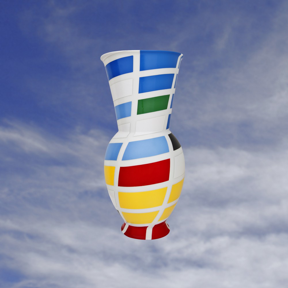
Sarah Morris
Sarah Morris’s ultra-flat, geometrically rigorous paintings adorn both public spaces and the lobby walls of some of the world’s biggest corporations. It’s a fitting duality for an artist whose work is explicitly concerned with exploring “the codes and power structures of architecture and cultural symbols,” as well as “the structures of control and global socio-political networks.” Morris decided to apply the contours of New York’s Condé Nast Building (Fox & Fowle, 1996–99) onto the Halle vase’s surface, creating a tension between the elongated rectilinear modules of the curtain-wall system and the supple platonic geometries of the vase’s profile. “The regularity of the painted surface provides no clear foreground or background, only surface, analogous to the building it depicts,” Morris explains.
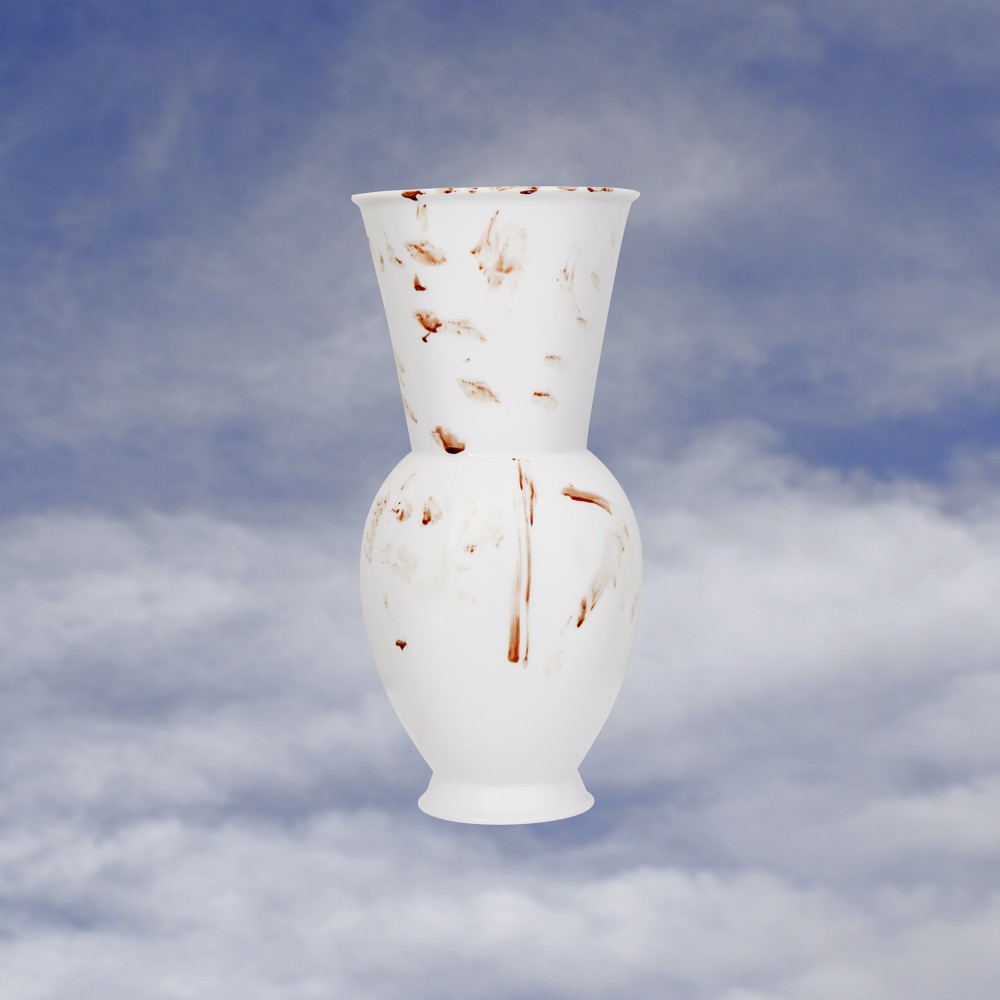
Mariah Robertson
“I realized the vase was perfect, and didn’t need anything from me,” Mariah Robertson sighs, recalling half-a-dozen botched attempts to engage with its classic form. Robertson — whose psychedelic C-prints often depict a whirl of nudes and sundry objects bathed in a kaleidoscope of gorgeous, translucent colors — resolved to keep the original vase and submit a doppelgänger. But homemade versions cracked, and a pile of broken thrift-store ceramics wouldn’t pass for KPM quality. An imperfect specimen half-baked in a cake and painted silver also wasn’t convincing. During a final attempt at duplication, Robertson cut her thumb, and in a fit of frustration wiped the blood all over the vase, a visceral expression of the futility of attempting to improve on perfection.
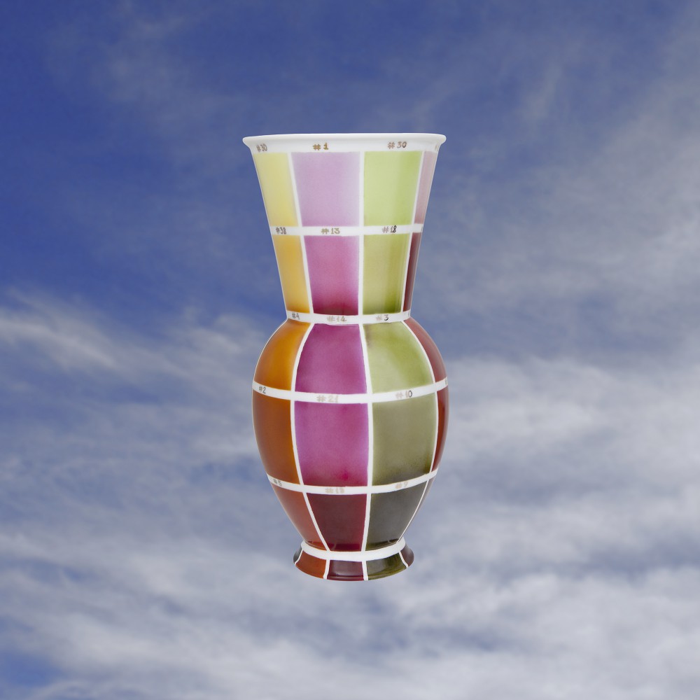
Kerstin Brätsch
Equally at home with both painting and performance, Kerstin Brätsch moves fluidly between media. She found the inspiration for her Halle vase in the traditional technique of porcelain color sampling. “Each porcelain factory has its own shades and color samples, so it knows which paint reacts to which temperature,” she explained. “As a painter, I wanted to work with that medium in an exemplary way, but using the structure of the given medium of porcelain.” So she teamed up with a restorer for the painstaking task of transferring a precise grid of different-hued rectangles onto the vase. The hand-applied patchwork of tones, each coded with a silver identifying number, is both chromatically expressive and refreshingly whimsical.
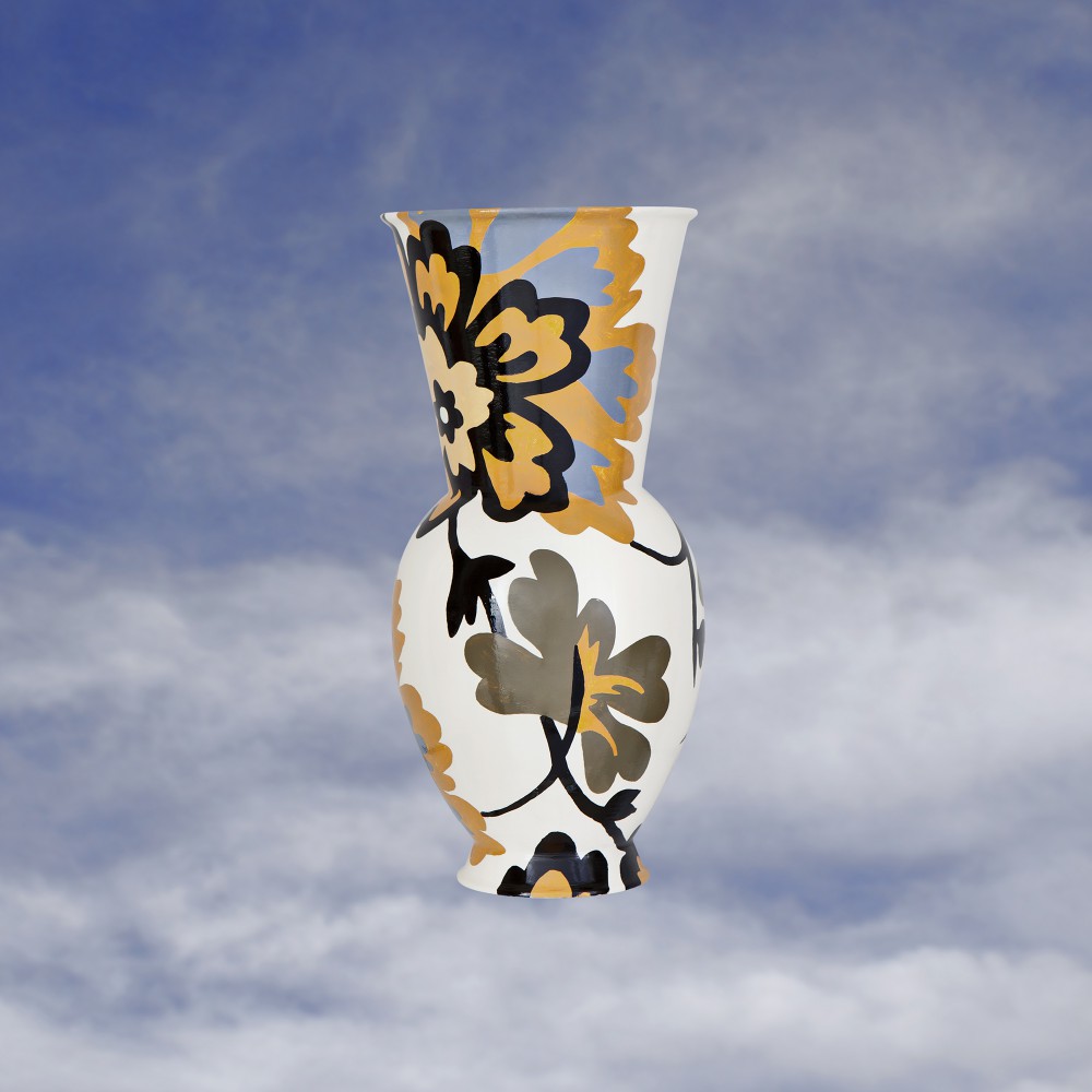
Mickalene Thomas
The floral pattern that adorns Mickalene Thomas’s Halle vase will be familiar to anyone who’s ever encountered her lush, textural portraits. The motif, which is based on a leftover remnant of upholstery from a couch that belonged to Thomas’s grandmother, frequently appears in the background of her canvases, and she knew immediately on receiving the vase that she wanted to apply the pattern to it. But the task was not as straightforward as one might think. Thomas set out to accentuate the vase’s silhouette, flattening its contours and “transforming the three-dimensional form into an image,” which required an adjustment in the scale of the familiar flowers. A joyful burst of blue and gold at the neck of the vase is set off by pristine white porcelain exposed throughout.
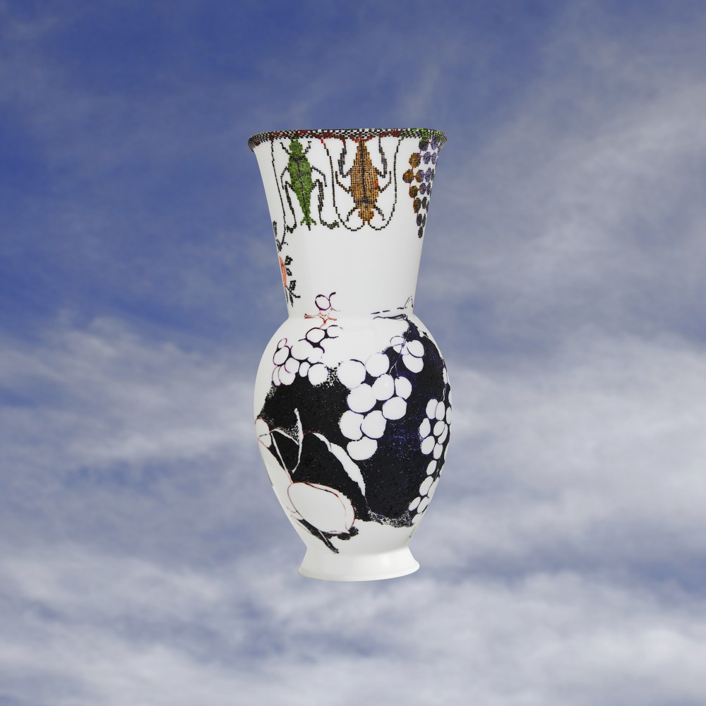
Sabine Steinmair
Adapting to the smooth porcelain curves of Friedlaender’s vase was second nature for Sabine Steinmair, who delights in rendering her delicate images and intricate motifs onto smooth surfaces. Steinmair typically works on glass or transparent methacrylate, though she’s just as comfortable with upholstery — in 2010, she embellished an Alvar Aalto armchair with intricate, multi-hued embroidery. Indeed, the artist is fascinated by “small detail, bits and pieces” and “ideas that can come from any visual field.” She used the stark white blankness of the Halle vase to craft a striking study in figure and ground: her plump grapes and delightful insects bring to mind both high Hellenic classicism and the irresistible haze of a late-summer afternoon.
Text by Kevin Greenberg
Photography by Lyndsy Welgos
Video edit by Anthony Valdez
Original article taken from PIN–UP 12, Spring Summer 2012
Special thanks to Gea Politi, Bernard Dubois, Daniele Balice, Christine Mangold (KPM), and Nina Hagen Band.